‘International Public Procurement Big Data Platform’ Brochure Design Click to read English version
导语:本宣传册围绕”数据驱动,链接全球”主题,通过系统的视觉识别设计和逻辑化的信息架构,将复杂的国际公共采购大数据概念转化为直观、专业且具有科技感的视觉语言,有效传达平台核心价值。
✅ 市场验证:国际公共采购大数据平台

“国际公共采购大数据平台”宣传册设计说明
一、设计主题与核心理念
本宣传册的设计主题围绕“数据驱动,链接全球”展开,旨在通过视觉语言,将“国际公共采购大数据平台”塑造成一个专业、权威、智能且具备全球视野的行业赋能者形象。
核心理念是“化繁为简,洞察价值”。国际公共采购涉及海量数据、复杂流程和多元主体,设计的首要任务是将这些复杂信息进行结构化、可视化的梳理,让目标用户(中国企业)能够直观、快速地理解平台的核心价值——即如何利用大数据扫除信息壁垒,精准匹配商机,并提供从信息到实操的一站式解决方案。
二、视觉识别系统(Visual Identity System)
- 色彩策略:主色调采用深邃的“科技蓝”,象征着专业、智慧、信赖与全球化。这种色彩选择直接关联到科技、数据和商务领域,能够有效建立用户对平台专业性的认知。辅助色采用明亮的“数据流光蓝”和白色,用于图表高亮、文字信息和背景,形成强烈的明暗对比,既突出了关键信息,又营造出数据流动的科技感和未来感。
- 版式布局:整体版式采用网格系统,确保信息排布的严谨性和秩序感。封面设计以平台Logo和核心视觉元素“数据地球”为主体,简洁而富有冲击力。内页则采用左右分栏或上下分区的布局,左文右图或上文下图,逻辑清晰,引导用户的阅读视线流畅地从一个信息点过渡到下一个。留白的运用恰到好处,避免了信息过载带来的压迫感,提升了阅读体验。
- 字体选择:标题字体选用硬朗、现代的无衬线字体,笔画粗壮有力,传递出平台的实力与权威感。正文字体则选择清晰易读的无衬线字体,保证在不同字号下的可读性。中英文字体搭配和谐,符合国际化平台的定位。
- 图形元素:核心图形元素是“数据网络”和“地球”。通过点、线连接构成的网络结构,覆盖在地球模型之上,直观地传达了“大数据”和“国际化”两大核心概念。图标设计采用简洁的线性风格,与整体科技感保持一致,用于清晰地标识不同的服务模块(如投标服务、合规服务等)。
三、核心页面设计解析
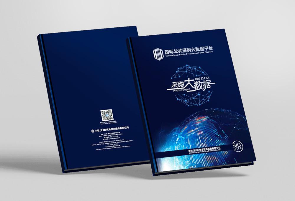
- 封面(第1张图):封面是整个设计的灵魂。深蓝色的背景上,发光的“数据地球”成为视觉焦点,象征着平台掌控全球采购数据的强大能力。平台名称“采购大数据”与英文“BIG DATA PROCUREMENT”组合,字体设计具有现代感,与下方的数据网络图形相呼应,整体营造出一种深邃、智能且充满力量的视觉感受。
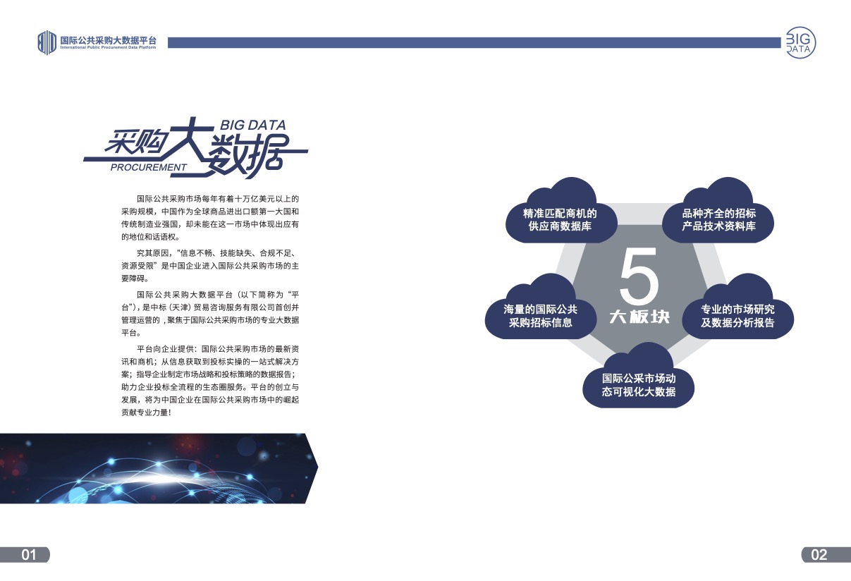
- 平台概述页(第4张图,页码01-02):此页作为开篇,左侧通过精炼的文字阐述了平台的背景、使命和价值。右侧则用“五瓣花”式的图形,将平台的五大核心板块(海量信息、供应商数据库、技术资料库、市场研究、动态可视化)进行图形化总结,让用户在第一时间内对平台的服务体系有一个宏观的认知,设计手法直观且高效。
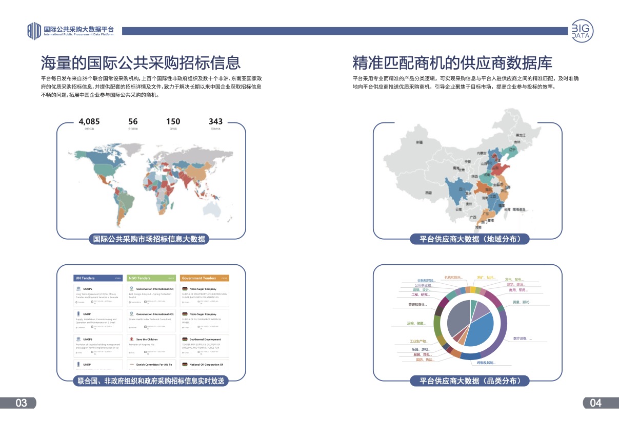
- 数据展示页(第3张图,页码03-04):此页是“化繁为简”理念的集中体现。左侧通过世界地图和数据(4085、56、150、343),直观展示了平台信息来源的广度和深度。右侧则通过中国地图和饼状图,分别展示了供应商的地域分布和品类分布,将抽象的“大数据”转化为具体的、可感知的视觉信息,有力地证明了平台的资源实力。
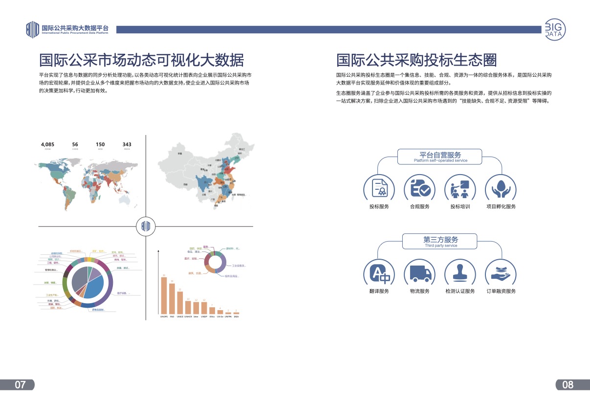
- 服务生态页(第2张图,页码07-08):此页重点阐述平台的服务体系。左侧的“市场动态可视化大数据”部分,通过多种图表(柱状图、饼图、环形图)的组合,展示了平台的数据分析能力。右侧的“投标生态圈”则通过流程图和图标,清晰地划分了“平台自营服务”和“第三方服务”,构建了一个完整的服务闭环,让用户清晰地看到平台如何帮助他们解决从“信息获取”到“投标实操”的全过程问题。
四、总结
本宣传册的设计,从主题构思到视觉执行,始终围绕“专业、智能、全球化”的品牌定位。通过统一的视觉语言和清晰的信息架构,成功地将一个复杂的B2B大数据服务平台,转化为一个易于理解、值得信赖的商业伙伴形象,有效地传达了其“助力中国企业走向世界”的核心价值。
English Version
“International Public Procurement Big Data Platform” Brochure Design
✅ Market Validation: International Public Procurement Big Data Platform
“International Public Procurement Big Data Platform” Brochure Design Description
I. Design Theme and Core Concept
The design theme of this brochure revolves around “Data-Driven, Connecting the Globe,” aiming to shape the “International Public Procurement Big Data Platform” into a professional, authoritative, intelligent, and globally-minded industry enabler through visual language.
The core concept is “Simplifying Complexity, Revealing Value.” International public procurement involves massive data, complex processes, and diverse stakeholders. The primary design task is to structurally and visually organize this complex information, enabling target users (Chinese enterprises) to intuitively and quickly understand the platform’s core value—how to leverage big data to eliminate information barriers, precisely match business opportunities, and provide an end-to-end solution from information to practical operations.
II. Visual Identity System
Color Strategy: The primary color scheme employs deep “Technology Blue,” symbolizing professionalism, wisdom, trust, and globalization. This color choice directly relates to technology, data, and business sectors, effectively establishing user recognition of the platform’s professionalism. Secondary colors include bright “Data Stream Blue” and white, used for chart highlights, text information, and backgrounds, creating strong light-dark contrast that highlights key information while evoking a sense of technological and futuristic data flow.
Layout Design: The overall layout utilizes a grid system to ensure rigorous and orderly information arrangement. The cover design features the platform logo and core visual element “Data Globe” as the main focus, simple yet impactful. Interior pages employ left-right column or top-bottom partition layouts, with text on the left and images on the right, or text above and images below, providing clear logic that guides users’ reading flow smoothly from one information point to the next. Appropriate use of white space avoids the oppressive feeling of information overload, enhancing the reading experience.
Font Selection: Title fonts use strong, modern sans-serif typefaces with bold, powerful strokes conveying the platform’s strength and authority. Body text fonts choose clear, readable sans-serif typefaces ensuring readability at different sizes. Chinese and English font combinations are harmonious, aligning with the international platform positioning.
Graphic Elements: Core graphic elements are “Data Network” and “Globe.” Network structures composed of connected points and lines overlaid on a globe model intuitively convey the two core concepts of “Big Data” and “Internationalization.” Icon design adopts a clean linear style consistent with the overall technological feel, used to clearly identify different service modules (such as bidding services, compliance services, etc.).
III. Core Page Design Analysis
Cover (Image 1): The cover is the soul of the entire design. Against a deep blue background, the glowing “Data Globe” becomes the visual focal point, symbolizing the platform’s powerful capability to control global procurement data. The platform name “Procurement Big Data” combined with English “BIG DATA PROCUREMENT” features modern font design that echoes the data network graphics below, creating an overall visual impression that is profound, intelligent, and full of power.
Platform Overview Page (Image 4, Pages 01-02): This opening page presents the platform’s background, mission, and value through concise text on the left. The right side uses a “five-petal flower” graphic to visually summarize the platform’s five core modules (Massive Information, Supplier Database, Technical Database, Market Research, Dynamic Visualization), giving users a macro understanding of the platform’s service system at first glance—a design approach that is both intuitive and efficient.
Data Display Page (Image 3, Pages 03-04): This page embodies the “Simplifying Complexity” concept. The left side visually demonstrates the breadth and depth of the platform’s information sources through a world map and data (4085, 56, 150, 343). The right side shows supplier geographic distribution and category distribution through a China map and pie charts respectively, transforming abstract “big data” into concrete, perceivable visual information that powerfully demonstrates the platform’s resource capabilities.
Service Ecosystem Page (Image 2, Pages 07-08): This page focuses on explaining the platform’s service system. The “Market Dynamic Visualization Big Data” section on the left demonstrates the platform’s data analysis capabilities through combinations of various charts (bar charts, pie charts, donut charts). The “Bidding Ecosystem” on the right clearly distinguishes between “Platform Self-operated Services” and “Third-party Services” through flowcharts and icons, constructing a complete service loop that shows users how the platform helps them solve the entire process from “information acquisition” to “bidding operations.”
IV. Summary
This brochure’s design successfully translates the complex concept of “international public procurement big data” into an intuitive, professional, and technologically advanced visual language. Through systematic visual identity design and logical information architecture, it effectively communicates the platform’s core value proposition while establishing a strong brand image as a professional, authoritative, and globally-minded industry enabler.