
Why Do Some Brands “Look Expensive” While Others “Look Cheap”?
不是成本决定价格,是“看起来值多少”决定价格。
一、一个经常被忽略的现象
你有没有注意到一个现象?
两支成分差不多的洗面奶,一支卖39,一支卖239。两件面料差不多的T恤,一件卖59,一件卖599。两个功能差不多的扫地机器人,一个卖999,一个卖3999。
为什么?
有人说,是品牌溢价。但“品牌溢价”不是原因,是结果。真正的问题是:那些卖得贵的品牌,做对了什么?那些卖得便宜的,做错了什么?
答案藏在“看起来”这三个字里。
二、“看起来贵”的品牌,做对了三件事
| 维度 | 具体做法 | 为什么有效 |
|---|---|---|
| 克制 | Logo不大不小,色彩不跳不艳,图形不繁不简 | 克制=自信。不靠“大声喊”证明自己 |
| 留白 | 包装上有足够的呼吸空间,信息有层次 | 留白=从容。不着急把所有信息塞给用户 |
| 质感 | 材质有触感,工艺有细节,边缘有处理 | 质感=用心。用户摸到的瞬间就知道值不值 |
“看起来贵”的品牌,不是在“加东西”,是在“减东西”。
减掉多余的色彩,减掉嘈杂的信息,减掉不必要的装饰。剩下的,是干净、是秩序、是自信。
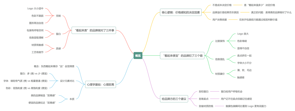
三、“看起来便宜”的品牌,犯了三个错
| 错误 | 具体表现 | 为什么致命 |
|---|---|---|
| 过度装饰 | Logo放大、色彩堆砌、花纹复杂 | 用户会觉得“你在用力过猛”,显得不自信 |
| 信息混乱 | 卖点挤在一起,字体大小不分 | 用户会觉得“你自己都没想清楚”,不值得信任 |
| 材质廉价 | 薄、软、毛边、色差 | 用户摸到的瞬间,就判了死刑 |
“看起来便宜”的品牌,问题出在“太想被看见了”。
太想被看见,所以Logo放大。太想被记住,所以色彩堆砌。太想被信任,所以信息堆满。结果适得其反。
四、一个核心逻辑:价格感知,来自“心理距离”
心理学里有一个概念叫“心理距离”。一个东西看起来离你“远”,你会觉得它贵。离你“近”,你会觉得它便宜。
| 设计元素 | 让人感觉“远”(贵) | 让人感觉“近”(便宜) |
|---|---|---|
| 留白 | 多 | 少 |
| 字体 | 细、轻、有气质 | 粗、重、普通 |
| 色彩 | 低饱和度、克制 | 高饱和度、鲜艳 |
| 材质 | 有质感、有温度 | 普通、廉价 |
| Logo | 小、低调 | 大、显眼 |
贵的品牌,在制造“距离感”。便宜的品牌,在拉近“距离感”。
这不是玄学。你想想:奢侈品店的导购不会太热情,因为“距离感”本身就是价值的一部分。而街边小贩会喊“走过路过不要错过”,因为他在拉近距离。
五、这不是“骗人”,是“尊重”
有人会说:“这不就是包装吗?产品好不就行了?”
这个观点,忽略了一个事实:用户没有机会拆开包装先“试用”再决定买不买。
在用户做决定的那几秒里,他只能看到包装、看到页面、看到陈列。他看不到产品内部。他只能通过“看起来”来判断“值不值”。
所以,“看起来贵”不是欺骗,而是对用户决策方式的尊重。
用户需要被帮助。他需要在0.3秒内得到一个信号:“这个东西值得我花这个钱。”设计的工作,就是发出这个信号。
六、给品牌方的三个建议
| 建议 | 说明 |
|---|---|
| 别怕留白 | 留白不是浪费空间,是给用户呼吸的机会 |
| 别堆卖点 | 用户记不住七个卖点,但能记住一个感觉 |
| 别省材质的钱 | 用户摸到包装的那一刻,比看到Logo更有说服力 |
价格不是由成本决定的,是由“用户觉得值多少”决定的。而“用户觉得值多少”,是由设计决定的。
七、结语
“看起来贵”不是玄学。是克制、是留白、是质感、是自信。
“看起来便宜”也不是命。是过度装饰、是信息混乱、是材质廉价。
同样的产品,换一套视觉系统,价格可以差三倍。
这不是在“骗人”,是在用专业能力,帮助用户做决策。
你觉得你的产品值多少钱?先看看它“看起来”值多少钱。
17vis全球首发 17Brand OS V3.2.0 品牌资产智能交付系统 / 再提升品牌变量VIS效能
English Version
Why Do Some Brands “Look Expensive” While Others “Look Cheap”?
Price is not determined by cost. It is determined by how much it “looks like it’s worth.”
Part One: A Commonly Overlooked Phenomenon
Have you noticed something?
Two face washes with nearly identical ingredients — one sells for 39 RMB, the other for 239 RMB. Two T-shirts with similar fabric — one sells for 59 RMB, the other for 599 RMB. Two robot vacuums with similar features — one sells for 999 RMB, the other for 3999 RMB.
Why?
Some say it is brand premium. But “brand premium” is not the cause. It is the result. The real question is: What did the expensive brands do right? What did the cheap brands do wrong?
The answer lies in the word “look.”
Part Two: Brands That “Look Expensive” Did Three Things Right
| Dimension | Specific Practice | Why It Works |
|---|---|---|
| Restraint | Logo not too large or too small, colors not too bright or too dull, graphics not too complex or too plain | Restraint equals confidence. No need to “shout” to prove yourself |
| Whitespace | Enough breathing room on packaging, information organized in layers | Whitespace equals composure. No need to cram all information onto the user |
| Texture | Materials feel good to touch, craftsmanship has details, edges are finished | Texture equals care. The moment the user touches it, they know it is worth it |
Brands that “look expensive” are not “adding things.” They are “subtracting things.”
Subtracting excess colors. Subtracting noisy information. Subtracting unnecessary decoration. What remains is clean, orderly, and confident.
Part Three: Brands That “Look Cheap” Made Three Mistakes
| Mistake | Specific Behavior | Why It Is Fatal |
|---|---|---|
| Over-decoration | Logo enlarged, colors piled on, complex patterns | Users feel “you are trying too hard,” which signals a lack of confidence |
| Cluttered information | Selling points crammed together, inconsistent font sizes | Users feel “you haven’t figured it out yourself,” which is not trustworthy |
| Cheap materials | Thin, soft, rough edges, color inconsistency | The moment the user touches it, the product is dead |
The problem with brands that “look cheap” is that they are “too desperate to be seen.”
Too desperate to be seen, so the logo gets bigger. Too desperate to be remembered, so colors get piled on. Too desperate to be trusted, so information gets crammed in. The result backfires.
Part Four: A Core Logic — Price Perception Comes from “Psychological Distance”
In psychology, there is a concept called “psychological distance.” When something feels “far” from you, you perceive it as expensive. When it feels “close,” you perceive it as cheap.
| Design Element | Makes It Feel “Far” (Expensive) | Makes It Feel “Close” (Cheap) |
|---|---|---|
| Whitespace | More | Less |
| Typography | Thin, light, refined | Bold, heavy, ordinary |
| Color | Low saturation, restrained | High saturation, bright |
| Material | Textured, warm | Ordinary, cheap |
| Logo | Small, understated | Large, prominent |
Expensive brands create “distance.” Cheap brands close the “distance.”
This is not mysticism. Think about it: Salespeople in luxury stores are not overly enthusiastic, because “distance” itself is part of the value. Street vendors shout “step right up, don’t miss out” because they are closing the distance.
Part Five: This Is Not “Deception.” It Is “Respect.”
Some might say: “Isn’t this just packaging? Isn’t product quality what really matters?”
This view ignores one fact: Users do not have the chance to open the package and “try” the product before deciding to buy it.
In those few seconds when the user makes a decision, all they can see is the packaging, the page, the display. They cannot see inside the product. They can only judge by “how it looks.”
So making something “look expensive” is not deception. It is respect for how users actually make decisions.
Users need help. They need a signal within 0.3 seconds: “This thing is worth this price.” The job of design is to send that signal.
Part Six: Three Suggestions for Brand Owners
| Suggestion | Explanation |
|---|---|
| Do not fear whitespace | Whitespace is not wasted space. It gives users room to breathe. |
| Do not pile on selling points | Users cannot remember seven selling points, but they can remember one feeling. |
| Do not skimp on materials | The moment a user touches the packaging is more persuasive than seeing the logo. |
Price is not determined by cost. It is determined by “how much the user feels it is worth.” And how much the user feels it is worth is determined by design.
Part Seven: Conclusion
“Looking expensive” is not mysticism. It is restraint, whitespace, texture, and confidence.
“Looking cheap” is not fate. It is over-decoration, cluttered information, and cheap materials.
The same product, with a different visual system, can command three times the price.
This is not “deception.” It is using professional skill to help users make decisions.
How much do you think your product is worth? First, look at how much it “looks” like it is worth.
为创作者 17vis 守护知识产权,转载必须保留完整出处信息 (侵权必究)
© 2026 17vis.com All Rights Reserved. Reprint with attribution required.