
Why Japanese Tea Packaging Seems to Have Nothing, Yet Looks So Valuable
两罐茶,并排放在桌上。
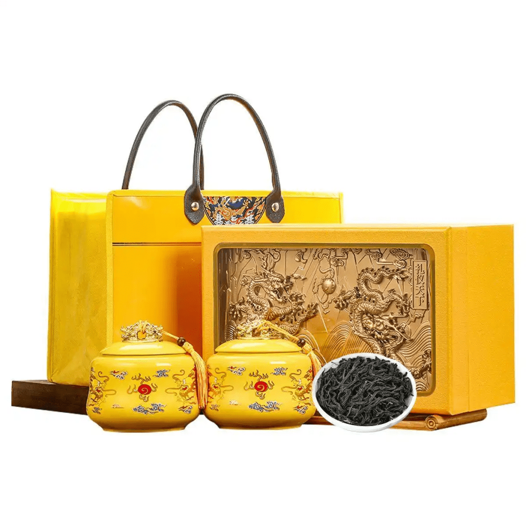
一罐印着龙纹、篆体、古诗句、认证标志、产区地图、品牌起源。三层盒子,两层锦袋,打开还有一张烫金证书。
另一罐,一张素色和纸,一行毛笔字。没了。
哪一罐让你想伸手去拿?
那个什么都没写的。
差在哪。
一、先过关技术
茶叶的生命,在离开枝头之后,开始倒数。
氧气、湿气、光线、挤压——这四样东西,是茶在包装里缓慢流逝的原因。
| 防护维度 | 技术手段 | 失效后果 |
|---|---|---|
| 隔氧 | 铝箔复合膜、充氮置换、脱氧剂包 | 茶多酚氧化,香气分子逸散,三个月后形在神亡 |
| 防潮 | 铝箔阻隔层、凹凸扣密封链、湿度指示卡 | 含水率超过7%,霉菌启动。梅雨季只需一周 |
| 避光 | 铝箔内衬、深色玻璃、马口铁罐 | 叶绿素光解,汤色变褐,滋味发陈 |
| 防碎 | EPE缓冲内托、独立充氮小袋、瓦楞隔板 | 条索断裂,碎末沉底,冲泡时苦涩溢出 |
这些不是设计。是包装的脊梁。
技术不过关,后面谈的一切都不成立。铝箔袋用最薄的那一档,密封条拉开三次就失效。铁罐内壁没有涂层——茶和金属直接接触,三个月后喝出一股铁锈味。透明玻璃罐摆在货架上好看,紫外线正一天天杀死里面的茶。
包装的第一句话,不是写在封面上的。
是三个月后,他打开袋子,茶香还在不在。
二、越用力,越可疑
茶叶有一个其他消费品没有的特点:信息极不对称。
他看不见茶园的海拔,看不见采青的天气,看不见萎凋的时长,看不见仓储的温湿度。包装是他和茶之间,唯一的媒介。
但大多数茶包装,正在挥霍这份信任。
| 包装传达的信息 | 接收到的信息 |
|---|---|
| “特级”“珍品”“大师手作” | 每家都这么说,字眼已经失效 |
| 龙纹、印章、泼墨山水 | 第十八家用的同一个素材库 |
| 三层盒体、两级抽屉、绸缎内衬 | 沉。且不环保。且和茶无关 |
| 一整面认证标志 | 不自信。像面试时把小学奖状都带上 |
他拆过太多这样的茶。
拆开之后,茶并没有因为包装的隆重而变得更好喝。一次。两次。第三次他不再拆了。
包装的用力过猛,在他眼里不是诚意。是心虚。
不是他挑剔。是他的眼睛已经被训练出来了。
三、当符号失效
龙纹、山水、篆体、古诗句。
十个茶品牌,九个在用。
问题不在于这些符号本身。龙纹是好的,山水是好的,古诗是好的。问题是,当所有品牌都在用同一套符号时,符号就失去了区分的能力。
它变成了一张背景墙。
贴在包装上,但没有走进心里。
他说不出哪里不对。他只是觉得:这个和那个,好像差不多。
都差不多。是品牌最怕的三个字。
文化没有被传达。文化只是被印刷了。
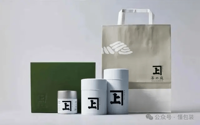
四、那些看起来什么都没做的品牌
一保堂。京都,1717年。
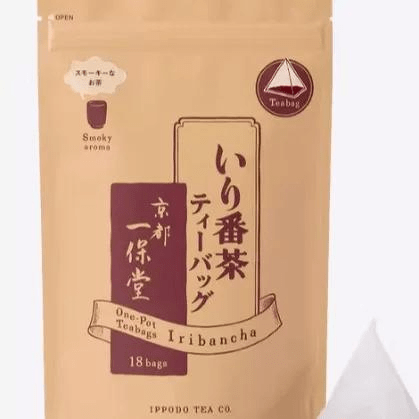
牛皮纸袋,毛笔字“一保堂”,半透明内袋,封口处一段胶带。看上去像从菜市场拎回来。
但那张牛皮纸的纤维肌理,那个毛笔字落笔时的枯笔飞白,那段胶带贴得整整齐齐的边缘——每一个细节都在说同一句话:我不需要证明自己。
三百年了。好就是好。
Lupicia。
粉的、绿的、蓝的铁盒。一个盒子只用一种颜色。图案是手绘植物,线描,纤细,大量留白。
不堆元素。一个盒子只传递一个信号。
Whittard。英国。
素色铁罐,一行衬线体英文。没有皇冠,没有米字旗,没有“Since 1886”。
但那个蓝,一眼就认出来。颜色本身成了识别。
Mariage Frères。法国。
黑色铁罐。素白标签。一行法文衬线体。用西式的克制,做东方的生意。
不需要在罐子上画一条龙。因为不需要向任何人证明“我是东方的”。
TWG。新加坡。
金色棉纸袋。缎带。蜡封。像珠宝盒一样拆开。
但它卖的是下午茶的仪式感,不是龙井,不是普洱。价值感来自殖民风格的混血气质,不是中式符号的堆砌。
这些品牌做对了同一件事:克制。
克制不是省。是知道什么不放。
他拿起一罐留白的茶包装,眼睛有地方停。手指在材质上多停了一秒。那一秒,好感已经进来了。
他拿起一罐堆满的,什么都写了,他什么都没记住。
五、拆的仪式
茶包装有一个其他品类没有的叙事窗口。
拆。
撕开外层绵纸——第一层。纸张纤维的触感,轻微的撕裂声。
旋开铁罐盖——第二层。金属螺纹的阻尼,盖子脱离罐口的闷响。
拉开铝箔密封袋——第三层。凹凸扣分离时的阻力,像拆一封重要的信。
将茶叶倒入茶则——第四层。条索碰撞的脆响,形状,色泽,干茶香升起。
注水。等。第一缕茶香——这是回报。
好的茶包装,不是拆完即弃的外壳。是设计这一连串动作的情绪曲线。
每一层拆开,期待加一分。期待到了顶点,茶香来了。
一保堂的牛皮纸,撕开的质感本身就让人安心——三百年的老铺,用一张朴素的纸告诉你:我的茶不需要多余的装饰。
Lupicia的彩色铁盒,盖子打开后,里面衬一张薄薄的半透明纸,印着这款茶的名字。像礼物。哪怕是自己买给自己,拆的时候也觉得自己被款待了。
反观市面上大多数茶包装。三层盒子拆完,一堆垃圾。锦袋上的烫金字一拆就没了。铝箔袋撕开费劲,扯得歪歪扭扭。茶叶装得太满,一开就洒。
仪式感不是堆出来的。是设计出来的。每一层拆开的动作,都是一次品牌和人的对话。好的对话,越聊越想聊。差的对话,只想快点结束。
六、被礼盒困住的市场
茶和咖啡,起点差不多。都曾经是送礼的主角。
咖啡走出来了。茶还没有。
| 阶段 | 咖啡市场 | 茶叶市场 |
|---|---|---|
| 第一阶段 | 速溶咖啡+咖啡礼盒 | 散茶+茶叶礼盒(当下) |
| 第二阶段 | 星巴克进入,现磨日常化 | 少数品牌尝试,未完成 |
| 第三阶段 | 精品咖啡浪潮,产地透明,风味标准化 | 零星出现,不成规模 |
| 第四阶段 | 瑞幸把咖啡变成日常消费品,去仪式化 | 还没出现 |
咖啡用了三十年,从“送礼的咖啡礼盒”变成“每天一杯的美式”。
茶叶还卡在第一阶段。市场被礼盒主导,买的人不喝,喝的人不买。包装不是为茶服务的,是为面子服务的。
礼盒养活了茶产业,但养不出茶品牌。
品牌是复购养出来的,不是送礼送出来的。一保堂三百年,包装越来越朴素——它的逻辑很简单:这次买了好喝,下次不需要再被说服。认准了,就一直买。不用每次做功课,不用每次比较,不用每次怀疑。
国内缺的不是好茶。缺的是一个让人“闭眼买”的牌子。
想喝好茶的人,现在靠什么?靠熟人推荐,靠茶农直购,靠自己试错。他没有一个朴素的、稳定的、每次买都不出错的选项。他想找到一个像一保堂那样的存在——包装简单,品质稳定,不需要懂茶,认准了就一直在那里。
这个机会,一定属于第一个敢把包装做简单、把品质做稳定的品牌。
不靠礼盒。靠复购。不靠一次隆重的面子。靠每一次朴素的安心。
七、未来的茶包装
茶叶市场,迟早会走到咖啡已经走完的那条路。
| 维度 | 当下(礼盒化) | 未来(日常化) |
|---|---|---|
| 购买动机 | 送礼、面子、人情 | 自己喝、好喝、稳定 |
| 决策方式 | 看盒子大不大、牌子响不响 | 看产区、品种、风味描述 |
| 复购逻辑 | 几乎不复购,下次送礼换一家 | 好喝就锁死,认准一个牌子一直买 |
| 包装需求 | 隆重、有面子、拆着有仪式感 | 朴素、可靠、隔绝空气、方便取用 |
| 品牌核心 | 名字、故事、文化背书 | 品质稳定性、风味一致性、渠道便利性 |
| 信息透明度 | 模糊。海拔、工艺、品种都不说 | 像精品咖啡一样:产区、处理法、风味轮 |
那时候,包装会回到它本来的功能:保护产品,传递信息,不多做一件事。
日式包装的今天,不是审美天生领先。是市场已经走到了那个阶段。一个成熟的市场,最终会奖励那些克制的品牌。
少印一个龙纹,换一种更透气的纸。少写一句古诗,换一个更好撕的密封条。少用一层盒子,把预算花在里面的铝箔袋上。
这些选择,不会让包装看起来更隆重。
但会让人更信。
信了,价值就有了。
那个价值,不在盒子上。在信任里。
English Version
Why Japanese Tea Packaging Seems to Have Nothing, Yet Looks So Valuable
Two cans of tea, side by side on the table.
One printed with dragon motifs, seal script, ancient poetry, certification marks, a map of the growing region, and the brand’s origin story. Three layers of boxes, two layers of brocade bags. Open it up, and there’s a gold-stamped certificate inside.
The other — a sheet of plain washi paper, a single line of calligraphy. Nothing else.
Which one makes you want to reach out and take it?
The one that says almost nothing.
What’s the difference?
I. Master the Technique First
The life of a tea leaf begins its countdown the moment it leaves the branch.
Oxygen. Moisture. Light. Pressure. These four forces are the reason tea slowly fades inside its packaging.
| Protection | Technical Solution | Consequence of Failure |
|---|---|---|
| Oxygen barrier | Aluminum foil composite film, nitrogen flush, oxygen absorber pack | Polyphenols oxidize, aroma molecules escape. After three months, the form remains but the spirit is gone |
| Moisture barrier | Aluminum foil barrier layer, zip-lock sealing strip, humidity indicator card | Moisture content exceeds 7%, mold activates. During the rainy season, one week is all it takes |
| Light protection | Aluminum foil inner liner, dark glass, tinplate canister | Chlorophyll photolysis, the liquor turns brown, the taste goes stale |
| Crush protection | EPE foam tray, individual nitrogen-flushed sachets, corrugated dividers | Whole leaves shatter, dust settles at the bottom, bitterness leaches out during brewing |
These are not design. These are the spine of packaging.
If the technique isn’t solid, nothing else that follows holds up. The thinnest grade of aluminum foil bag. A sealing strip that fails after three uses. A tin canister with no inner coating — the tea sits directly against the metal, and three months later, a faint taste of rust.
The first sentence of packaging isn’t written on the cover.
It’s whether the aroma is still there when he opens the bag three months later.
II. The Harder It Tries, the More Suspicious It Seems
Tea has a characteristic no other consumer product shares: extreme information asymmetry.
He cannot see the altitude of the plantation. Cannot see the weather on the day of picking. Cannot see the duration of withering. Cannot see the temperature and humidity of storage. The packaging is the sole medium between him and the tea.
But most tea packaging is squandering that trust.
| What the Packaging Communicates | What Is Received |
|---|---|
| “Premium Grade,” “Rare Treasure,” “Master’s Handcraft” | Every brand says this. The words have lost all meaning |
| Dragon motifs, seal stamps, ink-wash landscapes | The 18th brand to use the same stock image library |
| Three-tier box, two sliding drawers, silk lining | Heavy. Not environmentally friendly. And has nothing to do with tea |
| A full side of certification badges | Insecurity. Like bringing every certificate you ever earned to a job interview |
He has opened too many teas like this.
And after opening them, the tea did not taste any better because the packaging was elaborate. Once. Twice. The third time, he stopped opening them.
The excessive effort of the packaging is not sincerity in his eyes. It is a lack of confidence.
It’s not that he is picky. It’s that his eyes have been trained.
III. When Symbols Fail
Dragon motifs. Landscapes. Seal script. Ancient poetry.
Out of ten tea brands, nine use them.
The problem is not the symbols themselves. The dragon is good. The landscape is good. The poetry is good. The problem is that when every brand uses the same set of symbols, the symbols lose their power to differentiate.
They become wallpaper.
Printed on the packaging. But never entering the heart.
He cannot articulate what is wrong. He simply feels: this one and that one, they seem about the same.
“About the same.” Three words a brand fears most.
The culture is not being communicated. The culture is merely being printed.
IV. Those Brands That Appear to Have Done Nothing
Ippodo. Kyoto, est. 1717.
A kraft paper bag. Calligraphy reading “Ippodo.” A translucent inner pouch. A piece of tape sealing the opening. It looks like something carried home from a market.
But the fiber texture of that kraft paper. The dry-brush strokes of that calligraphy at the end of each character. The perfectly aligned edge of that strip of tape — every detail says the same thing: I have no need to prove myself.
Three hundred years. Good is simply good.
Lupicia.
Pink, green, blue tins. One tin uses only one color. The illustrations are hand-drawn botanicals, fine linework, slender, with generous white space.
No stacking of elements. One tin delivers one signal.
Whittard. England.
Plain-colored tin. One line of serif type in English. No crown. No Union Jack. No “Since 1886.”
But that shade of blue — recognized in a single glance. The color itself became the identifier.
Mariage Frères. France.
Black tin. Plain white label. One line of French in a serif font. Western restraint, doing Eastern business.
No need to paint a dragon on the canister. No need to prove to anyone that “I am Eastern.”
TWG. Singapore.
Gold cotton paper bag. Satin ribbon. Wax seal. Opened like a jewelry box.
But what it sells is the ceremony of afternoon tea — not Longjing, not Pu’er. Its sense of value comes from the hybrid temperament of colonial style, not from a pileup of Chinese motifs.
These brands have done one thing right: restraint.
Restraint is not cutting corners. It is knowing what to leave out.
He picks up a tea package that leaves room for the eye to rest. His fingers pause on the material for an extra second. In that second, affinity has already entered.
He picks up one that is crammed full. Everything was written on it. He remembers nothing.
V. The Ritual of Unwrapping
Tea packaging possesses a narrative window no other product category has.
The unwrapping.
Tear open the outer paper wrapper — first layer. The fiber feel of the paper, the soft sound of tearing.
Unscrew the tin lid — second layer. The resistance of the metal threading, the muffled pop as the lid separates from the body.
Pull apart the aluminum foil sealed bag — third layer. The resistance of the zip-lock separating, like opening an important letter.
Pour the tea leaves into the tea scoop — fourth layer. The crisp clatter of the whole leaves, their shape, their color, the dry fragrance rising.
Pour water. Wait. The first wisp of brewed aroma — this is the reward.
Good tea packaging is not an outer shell to be discarded after opening. It is the design of an emotional curve across this sequence of actions.
Each layer opened, anticipation rises one degree. When anticipation reaches its peak, the tea aroma arrives.
Ippodo’s kraft paper — the sensation of tearing it itself brings reassurance. A three-hundred-year-old shop, using a simple sheet of paper to tell you: my tea needs no extra decoration.
Lupicia’s colorful tin — after the lid comes off, a thin sheet of translucent paper inside bears the name of this particular tea. Like a gift. Even if bought for oneself, the moment of opening still feels like being treated well.
Look at the majority of tea packaging on the market. Three boxes torn open, a pile of trash. The gold-stamped lettering on the brocade bag disappears the moment the bag is opened. The aluminum foil pouch is difficult to tear, leaving a jagged mess. The tea is packed too full — it spills the moment it’s opened.
Ritual is not created by piling things on. It is designed. Every unwrapping action is a dialogue between the brand and the person. A good dialogue makes you want to keep talking. A bad one only makes you want it to end quickly.
VI. A Market Trapped by Gift Boxes
Tea and coffee started from roughly the same place. Both were once the stars of the gift-giving circuit.
Coffee walked out of it. Tea hasn’t yet.
| Stage | Coffee Market | Tea Market |
|---|---|---|
| Stage 1 | Instant coffee + coffee gift boxes | Loose tea + tea gift boxes (present day) |
| Stage 2 | Starbucks enters, fresh-brewed coffee becomes everyday | A few brands attempt it, not yet complete |
| Stage 3 | Specialty coffee wave, transparent origins, standardized flavor notes | Sporadic appearances, not at scale |
| Stage 4 | Luckin Coffee makes coffee an everyday consumable, de-ritualizes it | Has not yet appeared |
Coffee took thirty years to go from “coffee gift boxes for gifting” to “an Americano every single day.”
Tea is still stuck at Stage 1. The market is dominated by gift boxes. The person buying does not drink it, and the person drinking it did not buy it. The packaging is not in service of the tea. It is in service of face.
Gift boxes have fed the tea industry. But they cannot raise a tea brand.
A brand is raised by repeat purchases, not by gift-giving. Ippodo has thrived for three hundred years, and its packaging has only become more and more simple. Its logic is straightforward: if this one was good to drink, next time there’s no need for persuasion. Recognize it. Keep buying it. No homework each time. No comparing. No doubting.
What the domestic market lacks is not good tea. It lacks a brand one can trust with closed eyes.
How do people who genuinely want to drink good tea manage right now? They rely on connections. They buy directly from tea farmers. They learn through trial and error. There is no simple, stable, reliable option they can reach for every time without fail. They want to find an existence like Ippodo — simple packaging, consistent quality, no need to understand tea, just a name to trust that is always there.
This opportunity belongs to the first brand brave enough to make the packaging simple and the quality stable.
Not relying on gift boxes. Relying on repeat purchases. Not a one-time display of grandeur. A quiet reassurance, every single time.
VII. The Tea Packaging of the Future
The tea market will eventually walk the same road coffee has already completed.
| Dimension | Present (Gift Box Era) | Future (Everyday Era) |
|---|---|---|
| Purchase motive | Gifting, face, social obligation | Drinking oneself, good flavor, stability |
| Decision method | Judging by the size of the box, the loudness of the brand | Judging by the region, the cultivar, the flavor description |
| Repurchase logic | Almost no repurchase; next time gifting, switch to another brand | Lock onto what tastes good, trust one brand and keep buying |
| Packaging need | Grand, face-saving, ceremonious unwrapping | Simple, reliable, airtight, convenient to access |
| Brand core | Name, story, cultural endorsement | Quality consistency, flavor stability, channel convenience |
| Information transparency | Vague. Altitude, processing, cultivar — none are disclosed | Like specialty coffee: origin, processing method, flavor wheel |
By then, packaging will return to its original function: protect the product, convey information, and do nothing more.
The present state of Japanese tea packaging is not because their aesthetic sense is innately superior. It is because their market has already reached that stage. A mature market ultimately rewards those brands that practice restraint.
One less dragon motif, replaced by a more breathable paper. One less line of ancient verse, replaced by a better-sealing zip-lock strip. One less layer of boxing, with the budget shifted to the aluminum foil pouch inside.
These choices will not make the packaging appear more grand.
But they will make a person trust it more.
And once trust is earned, value is established.
That value doesn’t reside on the box.
It resides in the trust.
为创作者 17vis 守护知识产权,转载必须保留完整出处信息 (侵权必究)
© 2026 17vis.com All Rights Reserved.