
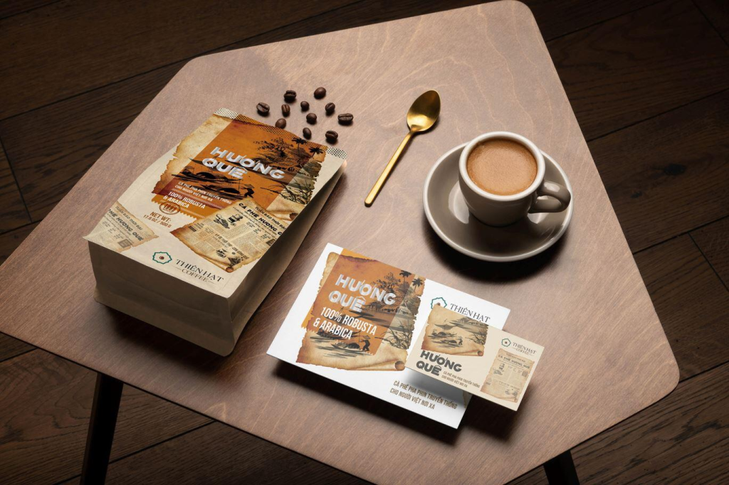
一袋咖啡豆的包装,和一瓶酒的包装,做的是同一件事。
每天小酌一杯的人,认准一个牌子,喝完了再买同一瓶。每天喝一杯咖啡的人,认准一袋豆子,喝完了再买同一袋。她们不是在“尝试”一个新品牌,她们是在“回购”一个信任的老朋友。
所以咖啡豆的包装,不需要在第一面就让她惊艳。需要的是——简约、强品牌、像她每天用的那个杯子一样自然。让她在第一百次伸手的时候,拿起的永远是同一袋。和茶叶一样,和每天小酌的那瓶酒一样。喝咖啡本身就是一种生活方式。包装不是诱惑,是信任。不是勾引第一次买的人,是陪伴第一百次买的人。
这就是咖啡豆包装设计的核心命题:保鲜和讲故事,两个任务挤在同一个袋子上。一个单向阀负责保鲜,一个标签负责信任。两者都不需要喧哗。两者都服务于同一件事——让她下次还买这袋。
一、过去:麻袋、铁罐与速溶时代
咖啡豆的包装,最初和品牌无关。
19世纪,咖啡生豆从非洲、南美、亚洲的种植园运往欧洲和北美。包装是麻袋——黄麻粗纤维,透气不密封,60公斤一袋。麻袋上印着产地名称、出口商商标、批次编号。不是给消费者看的,是给贸易商和海关看的。包装等于物流工具。
进入20世纪,商业烘焙兴起。咖啡从“买生豆回家自己炒”变成“买现成的烘焙豆”。包装需要从物流工具升级为商品容器。金属罐是这个时代的标志。illy的红色方块Logo印在铁罐上,1933年到现在没有变过。金属罐密封性好、避光、可以充氮加压,保鲜时间远超当时的纸袋。但金属罐是工业品,成本高,开罐之后密封性就没了。它适合高端定位,不适合大众日常。
速溶咖啡的出现改变了包装的路径。雀巢的玻璃罐——透明、可重复密封、放在厨房台面上就是一个品牌广告。速溶咖啡不需要单向阀,因为它在冻干或喷雾干燥之后几乎不释放气体。包装的任务从“保鲜”转向“品牌”。红色雀巢杯、绿色星巴克美人鱼、金色麦斯威尔——色彩成为识别符号。产地信息消失了,风味描述消失了,包装上最大的字是品牌名。
这个时代的视觉特征:品牌Logo主导一切。包装是品牌的容器,不是产品的容器。消费者记住的是牌子,不是豆子。
二、现在:单向阀、精品化与三股力量
过去二十年,咖啡豆包装被三股力量重塑。
第一股力量:单向阀。 单向阀是咖啡豆包装最关键的技术突破。1960年代由意大利企业Goglio发明,原理很简单——一个单向阀门,让袋内二氧化碳排出,同时阻止外部氧气进入。咖啡烘焙后48小时内释放的气体量最大,如果没有单向阀,密封袋会胀成气球甚至爆裂。单向阀解决了这个矛盾,让新鲜烘焙的咖啡豆可以提前包装、上架零售,不用等到完全排气。它把咖啡豆的货架寿命从几天延长到了几个月。精品咖啡的规模化零售,离不开这个不起眼的小塑料阀。
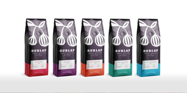
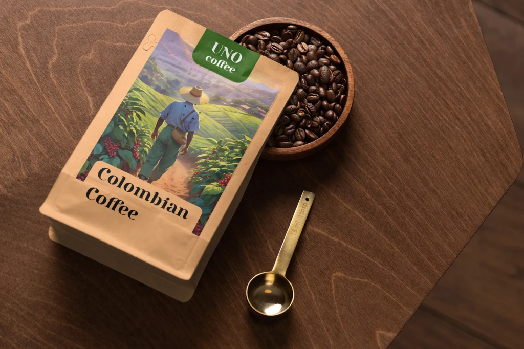
今天,单向阀袋装是精品咖啡的标准配置。材质结构通常是三层复合膜——外层PET负责印刷和保护,中层铝箔负责阻隔氧气和光线,内层PE负责热封。袋型有平底袋、侧插袋、八边封袋。八边封袋底部能撑开站立,正面面积大,印刷效果最好,是精品咖啡最常用的袋型。
第二股力量:精品咖啡浪潮。 2000年以后,精品咖啡从一个小众圈子变成了全球消费趋势。消费者开始关心这袋豆子产自哪个庄园、海拔多少、什么品种、水洗还是日晒、烘焙师是谁。这些信息都要印在包装上。咖啡豆包装的标签,越来越像葡萄酒的酒标——信息密度高,但排版克制。
色彩在咖啡包装中有一套行业惯例。红色代表传统和醇厚——illy的红色方块、雀巢的红杯。黑色代表高品质和专业——高端单品豆和精品烘焙商的首选色。金色和银色代表极品和限量——竞标豆和特殊批次。蓝色几乎成了低因咖啡的通用色,所有品牌的低因产品都用蓝色系。白色和米白代表极简和清新——北欧浅烘品牌偏爱这个方向。
但咖啡豆包装的配色逻辑,和冲动消费品不同。它不需要跳出来吸引新客——主力消费者已经是长期喝咖啡的人。色彩的作用不是“抢注意力”,是“强化品牌识别”。她不需要在货架上被一袋荧光橙的咖啡豆吸引。她需要的是在一排咖啡豆里,一眼认出她一直买的那袋。颜色服务于识别,不是服务于诱惑。
包装规格与消费场景有明确的对应关系。200克到250克袋装是家庭口粮豆最常见的规格,够一个人喝两到三周,风味不会明显下降。100克到150克袋装是精品尝鲜和小批量微批次,单价更高,包装设计更讲究。500克到1公斤袋装是商用和咖啡店用量装,包装设计偏简洁,功能性优先。10克到15克挂耳包是办公室和旅行的便携选择,独立小袋,撕开即冲。条装浓缩液和冻干粉杯是即时便捷的新形态,包装设计偏年轻化,色彩更跳跃。
第三股力量:全球品牌与本土创新的分化。
illy代表经典路线。金属罐,红色方块Logo,1933年到现在没有变过。它的包装不追随趋势,它就是趋势本身。蓝瓶咖啡代表极简路线。牛皮纸袋,蓝瓶子符号,没有多余信息。它的包装在说:好咖啡不需要解释。%Arabica把极简推到极致——白色袋,黑色字,品牌名就是一个百分比符号。Stumptown走复古插画路线,牛皮纸袋上印着产地信息和手绘风格图案,每一袋豆子有自己的视觉身份。三顿半彻底打破袋装传统——小塑料杯,像咖啡因胶囊。包装不再是袋子,是杯子本身。永璞走条装浓缩液路线,色彩鲜艳,便携优先。
中国精品咖啡品牌的包装设计,正在从“学习模仿”走向“独立表达”。隅田川用日式极简打大容量口粮市场。Manner用极简白色杯子和袋装建立“精品平替”的认知。越来越多的小型烘焙商在包装上使用插画、手写体、抽象图形,脱离国际品牌的视觉惯例,建立自己的审美语言。
三、未来:从保鲜容器到生活方式标签
咖啡豆包装的未来,不是“更好看的袋子”。是角色变了。
趋势一:透明化产地叙事。 包装上不再只印“埃塞俄比亚”四个字,而是印着庄园名称、海拔数字、品种名称、处理法、烘焙日期、风味轮。咖啡豆标签越来越像葡萄酒酒标——信息密度高,但排版克制。消费者不再满足于知道“这是非洲的豆子”,她想知道“这是埃塞俄比亚耶加雪菲产区、海拔1950米、原生种、水洗处理、浅度烘焙、风味是茉莉花和柑橘和蜂蜜”。这些信息不是堆在包装上的文字,是品牌和她之间的信任契约。每一项信息都在说:我经得起追溯。
趋势二:可持续包装。 咖啡豆包装是塑料和铝箔的重灾区。单向阀是塑料的,密封袋的内层是塑料的,铝箔层和塑料层热压在一起无法分离回收。功能越强,环保越难。但精品咖啡的消费者,恰恰是环保意识最高的人群。这个矛盾正在推动包装材料的变革。蓝瓶咖啡已经在推全纸化包装——用高阻隔性纸质复合材料替代铝箔,用纸质单向阀替代塑料单向阀。可降解复合膜、可重复密封的纸质包装、回收铝罐——这些不是未来的概念,是已经在货架上的产品。下一个十年,咖啡豆包装的可持续化不是选择题,是必答题。
趋势三:模块化与订阅制。 三顿半的“返航计划”提供了一个全新的包装逻辑——小杯子不是用完即弃,是品牌和她之间的长期触点。消费者收集空杯,在返航点换积分、换限定周边。包装变成了品牌社群的通行证。订阅制也在改变包装的设计思路。月度订阅的咖啡豆,包装不需要在货架上抢注意力——它已经在她的邮箱里了。包装可以更素、更克制、更像一封每月必来的信。
趋势四:视觉去惯例化。 新一代咖啡品牌不再遵守“黑色等于高端”“红色等于商业”“蓝色等于低因”的惯例。色彩选择更自由,风格更个性化。包装设计的竞争,从“符合品类惯例”转向“创造品牌识别”。但方向不是更花哨——是更简洁、更自信、更像奢侈品。简约和强品牌识别,才是复购型包装的终点。
四、规格与材质速查
| 包装形态 | 常见规格 | 材质结构 | 保鲜能力 | 适用场景 |
|---|---|---|---|---|
| 单向阀袋 | 100g/200g/250g/500g/1kg | PET+铝箔+PE复合膜 | 数月 | 精品豆、口粮豆 |
| 金属罐 | 200g/250g | 马口铁0.23-0.30mm | 12个月以上(充氮) | 高端礼品、品牌旗舰 |
| 挂耳包 | 10-15g×7-30包/盒 | 无纺布+铝箔外袋 | 数月 | 办公室、旅行 |
| 条装浓缩液 | 25-33ml/条 | 多层复合塑料 | 12个月以上 | 即时便捷 |
| 冻干粉杯 | 2-3g/杯 | PP塑料杯+铝箔封口 | 12个月以上 | 即时便捷、创新形态 |
五、咖啡豆包装与品牌资产
咖啡豆包装上承载的信息,是所有食品包装里密度最高的之一。
品牌Logo、产品名、产地、庄园、品种、海拔、处理法、烘焙度、风味描述、净含量、烘焙日期、保质期、单向阀、认证标志——十几种信息要在一张巴掌大的标签上找到自己的位置。做咖啡豆包装设计,本质上是在做信息优先级管理。
品牌识别排第一。她先认出你是哪个牌子。风味暗示排第二。她看到“茉莉花、柑橘、蜂蜜”就知道大概是浅烘。功能信息排第三。单向阀、烘焙日期、保存方式。产地信息是品牌叙事的一部分,不是功能信息。庄园名称、海拔、处理法——这些是给懂的人看的,不需要印在最显眼的位置。
咖啡豆包装有一个其他品类没有的节奏:它每一季都在变。新产季豆子到了,产地信息要更新。新的处理法批次来了,风味描述要调整。限定的竞标豆来了,包装要单独设计。但品牌识别不能变。Logo、品牌色、字体系统、版式逻辑——这些是品牌的根。包装在换,根不换。
在17Brand OS的视角里,咖啡豆包装是品牌资产库里最活跃的物料。它不像Logo那样百年不变,也不像名片那样模板化。它是一个动态的、季节性的、需要不断迭代的视觉载体。品牌资产库不是一堆静态文件,是让每一季的咖啡豆包装都能自动继承品牌基因、同时灵活适配新产季信息的系统。
一袋咖啡豆的包装,从麻袋到单向阀,走了一百多年。
从“包住豆子”到“传递风味”到“融入日常”,包装的角色一直在变。但不变的是——咖啡豆包装不是诱惑,是信任。
简约,强品牌,像她每天用的那个杯子一样自然。喝咖啡本身就是一种生活方式,和喝茶一样,和每天小酌一杯酒一样。包装不需要喧哗。她不需要在货架上被惊艳。她只需要在伸手的那一刻,拿起的永远是同一袋。
English Version
Coffee Bean Packaging: From Burlap to One-Way Valve, to Lifestyle
A bag of coffee beans. A bottle of wine. The packaging does the same job.
The person who drinks a small glass every day recognizes her brand. Finishes the bottle. Buys the same one again. The person who drinks a cup of coffee every day recognizes her beans. Finishes the bag. Buys the same one again. They are not “trying” a new brand. They are “repurchasing” a trusted old friend.
So the packaging of coffee beans does not need to dazzle her at first sight. What it needs is simplicity. A strong brand. As natural as the cup she uses every single day. On the hundredth time she reaches out her hand, what she picks up is always the same bag. Just like tea. Just like that small glass she drinks every day. Drinking coffee is itself a lifestyle. Packaging is not temptation. It is trust. It is not for seducing a first-time buyer. It is for accompanying the hundredth-time buyer.
This is the core proposition of coffee bean packaging design: preservation and storytelling, two tasks squeezed onto a single bag. A one-way valve handles the preservation. A label handles the trust. Neither needs to shout. Both serve the same purpose — making sure she buys this bag again next time.
I. The Past: The Era of Burlap, Tin Cans, and Instant Coffee
The packaging of coffee beans initially had nothing to do with branding.
In the 19th century, green coffee beans were shipped from plantations in Africa, South America, and Asia to Europe and North America. The packaging was burlap sacks — coarse jute fiber, breathable, not airtight, 60 kilograms per sack. Stamped on the burlap were the name of the origin, the exporter’s trademark, and the batch number. This was not for the consumer to see. It was for the traders and customs officers. Packaging was a logistics tool.
Entering the 20th century, commercial roasting arose. Coffee shifted from “buy green beans and roast them yourself at home” to “buy ready-roasted beans.” Packaging needed to upgrade from a logistics tool to a commodity container. The metal can was the icon of this era. illy’s red square logo, printed on a tin can, has remained unchanged from 1933 to this day. Metal cans are airtight, light-blocking, and can be pressurized with nitrogen. Their preservation ability far exceeded the paper bags of the time. But a metal can is an industrial product. High cost. Once opened, the seal is gone. It suits a premium positioning, not daily mass consumption.
The emergence of instant coffee changed the path of packaging. Nescafe’s glass jar — transparent, resealable, sitting on the kitchen counter as a brand advertisement in itself. Instant coffee does not need a one-way valve, because after freeze-drying or spray-drying, it releases almost no gas. The mission of packaging shifted from “preservation” to “branding.” The red Nescafe cup. The green Starbucks mermaid. The gold Maxwell House. Color became the recognition symbol. Origin information disappeared. Flavor descriptions disappeared. The largest text on the package was the brand name.
The visual characteristic of this era: the brand logo dominated everything. Packaging was the container for the brand, not the container for the product. What the consumer remembered was the brand, not the beans.
II. The Present: The One-Way Valve, Specialization, and Three Forces
Over the past two decades, coffee bean packaging has been reshaped by three forces.
The first force: the one-way valve. The one-way valve is the most critical technical breakthrough in coffee bean packaging. Invented by the Italian company Goglio in the 1960s, the principle is simple — a one-way valve allows carbon dioxide inside the bag to escape while preventing external oxygen from entering. Coffee releases the greatest volume of gas within 48 hours after roasting. Without a one-way valve, a sealed bag would inflate like a balloon or even burst. The one-way valve resolved this contradiction, allowing freshly roasted coffee beans to be packaged in advance and retailed on the shelf without waiting for complete degassing. It extended the shelf life of coffee beans from a few days to several months. The scaled retail of specialty coffee is inseparable from this unassuming little plastic valve.
Today, the one-way valve pouch is the standard configuration for specialty coffee. The material structure is typically a three-layer composite film — an outer PET layer responsible for printing and protection, a middle aluminum foil layer responsible for blocking oxygen and light, and an inner PE layer responsible for heat sealing. Bag types include flat-bottom pouches, side-gusset pouches, and quad-seal pouches. Quad-seal pouches can stand upright with a撑开的 bottom. They have a large front surface area and the best printing results. They are the most common bag type for specialty coffee.
The second force: the specialty coffee wave. After the year 2000, specialty coffee moved from a niche circle to a global consumption trend. Consumers began to care about which estate these beans came from, the altitude, the variety, whether it was washed or natural processed, and who the roaster was. All of this information had to be printed on the packaging. The label on a coffee bean bag increasingly resembles a wine label — high information density, but with restrained layout.
Color has a set of industry conventions in coffee packaging. Red represents tradition and body — illy’s red square, Nescafe’s red cup. Black represents high quality and professionalism — the preferred color for premium single-origin beans and specialty roasters. Gold and silver represent the pinnacle and limited editions — auction lots and special batches. Blue has almost become the universal color for decaf — every brand’s decaf product uses the blue family. White and off-white represent minimalism and freshness — favored by Nordic light-roast brands.
But the color logic of coffee bean packaging is different from that of impulse-purchase goods. It does not need to jump out and attract new customers — the core consumers are already long-term coffee drinkers. The role of color is not “grabbing attention.” It is “reinforcing brand recognition.” She does not need to be drawn in by a fluorescent orange bag of coffee beans on the shelf. What she needs is, among a row of coffee beans, to recognize at a single glance the one she always buys. Color serves recognition, not seduction.
Packaging specifications have a clear correspondence with consumption scenarios. The 200-gram to 250-gram pouch is the most common specification for household daily beans — enough for one person for two to three weeks, without a noticeable decline in flavor. The 100-gram to 150-gram pouch is for specialty tasting and small-batch micro-lots — higher unit price, more讲究 packaging design. The 500-gram to 1-kilogram pouch is for commercial and cafe use — packaging design leans simple, with functionality as the priority. The 10-gram to 15-gram drip bag is the portable choice for the office and travel — individual sachets, tear open and brew. Liquid concentrate strips and freeze-dried powder cups are new instant formats — packaging design skews younger, with more vibrant colors.
The third force: the divergence between global brands and local innovation.
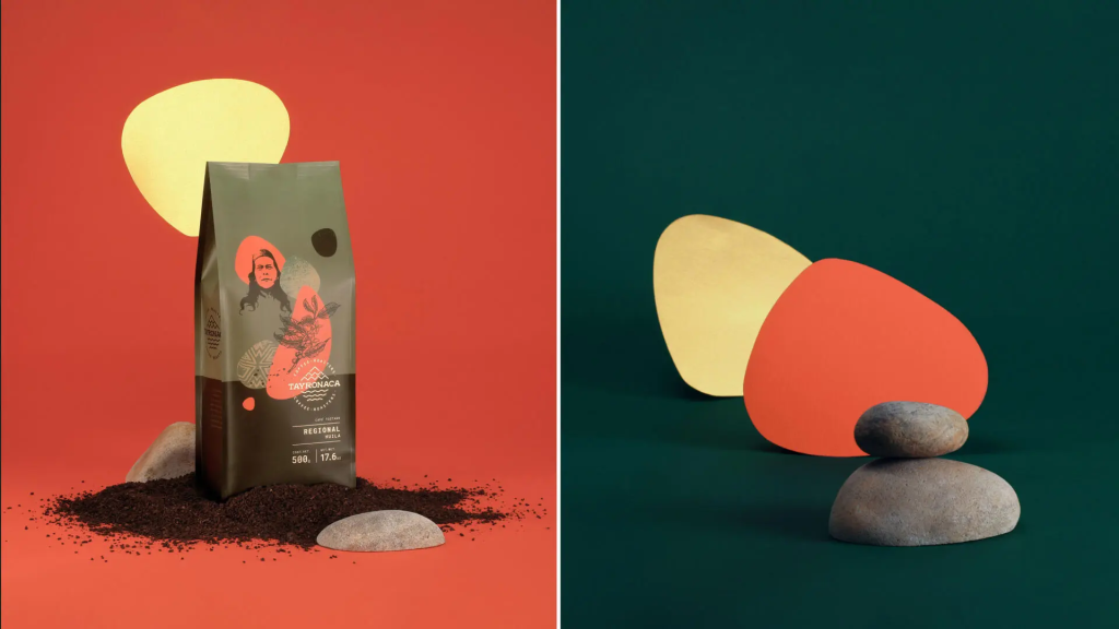
illy represents the classic route. Metal can. Red square logo. Unchanged from 1933 to today. Its packaging does not follow trends. It is the trend itself. Blue Bottle Coffee represents the minimalist route. Kraft paper bag. Blue bottle symbol. No excess information. Its packaging says: good coffee needs no explanation. %Arabica pushes minimalism to the extreme — white bag, black text, the brand name is simply a percentage symbol. Stumptown takes the retro illustration route — kraft paper bags printed with origin information and hand-drawn style graphics. Each bag of beans has its own visual identity. Saturnbird completely breaks the pouch tradition — a small plastic cup, like a caffeine capsule. The packaging is no longer a bag. It is the cup itself. Yongpu takes the liquid concentrate strip route — bright colors, portability first.
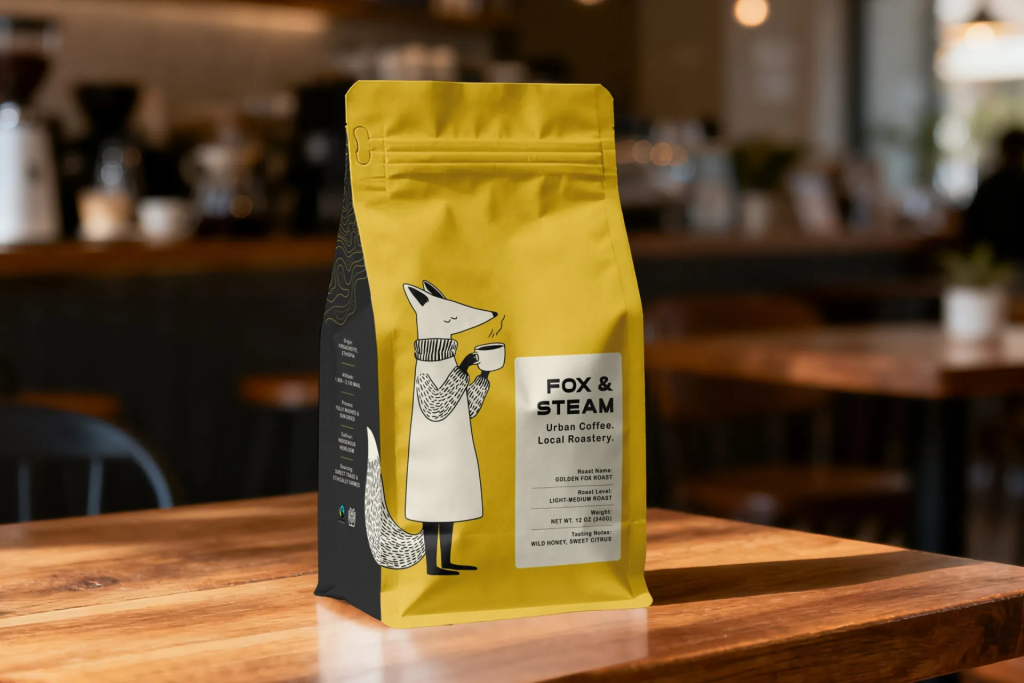
The packaging design of Chinese specialty coffee brands is moving from “learning and imitating” to “independent expression.” UCC uses Japanese minimalism to target the large-volume daily bean market. Manner uses minimalist white cups and pouches to establish the perception of “specialty affordable alternative.” More and more small roasters are using illustrations, handwritten typography, and abstract graphics on their packaging, breaking away from the visual conventions of international brands and establishing their own aesthetic language.
III. The Future: From Preservation Container to Lifestyle Label
The future of coffee bean packaging is not a “better-looking bag.” It is a changed role.
Trend One: Transparent origin storytelling. The packaging no longer prints just the word “Ethiopia.” It prints the estate name, the altitude figure, the variety name, the processing method, the roast date, and the flavor wheel. The coffee bean label is becoming more and more like a wine label — high information density, but with restrained layout. The consumer is no longer satisfied knowing “these are beans from Africa.” She wants to know “this is from the Yirgacheffe region of Ethiopia, altitude 1,950 meters, heirloom variety, washed process, light roast, flavor notes of jasmine, citrus, and honey.” This information is not text piled onto the packaging. It is a trust contract between the brand and her. Every piece of information says: I can be traced back.
Trend Two: Sustainable packaging. Coffee bean packaging is a disaster zone for plastic and aluminum foil. The one-way valve is plastic. The inner layer of the sealed bag is plastic. The aluminum foil layer and the plastic layer are heat-pressed together and cannot be separated for recycling. The stronger the functionality, the harder the environmental challenge. But the consumers of specialty coffee are precisely the demographic with the highest environmental awareness. This contradiction is driving变革 in packaging materials. Blue Bottle Coffee is already pushing all-paper packaging — using high-barrier paper-based composite materials to replace aluminum foil, and paper-based one-way valves to replace plastic ones. Degradable composite films, resealable paper packaging, recycled aluminum cans — these are not future concepts. They are products already on the shelf. In the next decade, the sustainability of coffee bean packaging is not a choice. It is a compulsory answer.
Trend Three: Modularity and subscription models. Saturnbird’s “Return Plan” provides a completely new packaging logic — the small cup is not disposable after use. It is a long-term touchpoint between the brand and her. Consumers collect empty cups. At return points, they exchange them for points and limited-edition merchandise. The packaging becomes a pass to the brand community. Subscription models are also changing the design thinking for packaging. For monthly subscription coffee beans, the packaging does not need to grab attention on the shelf — it is already in her mailbox. The packaging can be plainer, more restrained, more like a letter that arrives every month without fail.
Trend Four: Visual de-conventionalization. The new generation of coffee brands no longer obeys the conventions that “black equals premium,” “red equals commercial,” “blue equals decaf.” Color choices are freer. Styles are more personalized. The competition in packaging design is shifting from “conforming to category conventions” to “creating brand recognition.” But the direction is not more gaudy. It is simpler, more confident, more like luxury. Simplicity and strong brand recognition — that is the endpoint of repurchase-driven packaging.
IV. Specification and Material Quick Reference
| Packaging Format | Common Specifications | Material Structure | Preservation Capability | Applicable Scenario |
|---|---|---|---|---|
| One-way valve pouch | 100g/200g/250g/500g/1kg | PET + Aluminum foil + PE composite film | Several months | Specialty beans, daily beans |
| Metal can | 200g/250g | Tinplate 0.23-0.30mm | 12+ months (nitrogen-flushed) | Premium gift, brand flagship |
| Drip bag | 10-15g × 7-30 bags/box | Non-woven fabric + aluminum foil outer bag | Several months | Office, travel |
| Liquid concentrate strip | 25-33ml/strip | Multi-layer composite plastic | 12+ months | Instant convenience |
| Freeze-dried powder cup | 2-3g/cup | PP plastic cup + aluminum foil seal | 12+ months | Instant convenience, innovative format |
V. Coffee Bean Packaging and Brand Assets
The information carried on a coffee bean package is among the densest of all food packaging.
Brand logo. Product name. Origin. Estate. Variety. Altitude. Processing method. Roast level. Flavor description. Net weight. Roast date. Best-before date. One-way valve. Certification marks. Over a dozen pieces of information must find their place on a label the size of a palm. Designing coffee bean packaging is, at its core, managing information priority.
Brand recognition comes first. She recognizes which brand you are. Flavor暗示 comes second. She sees “jasmine, citrus, honey” and knows it is probably a light roast. Functional information comes third. The one-way valve, the roast date, the storage instructions. Origin information is part of the brand narrative, not functional information. The estate name, the altitude, the processing method — these are for those who understand. They do not need to be printed in the most prominent position.
Coffee bean packaging has a rhythm no other product category possesses: it changes every season. A new harvest arrives. The origin information must be updated. A new processing batch comes in. The flavor description must be adjusted. A limited auction lot arrives. The packaging must be designed separately. But the brand recognition cannot change. The logo. The brand colors. The typographic system. The layout logic. These are the roots of the brand. The packaging changes. The roots do not.
From the perspective of 17Brand OS, coffee bean packaging is one of the most active materials in the brand asset library. It is not like a logo that remains unchanged for a hundred years. It is not like a business card that is templated. It is a dynamic, seasonal visual carrier that requires constant iteration. A brand asset library is not a pile of static files. It is a system that allows each season’s coffee bean packaging to automatically inherit the brand’s visual DNA while flexibly adapting to new harvest information.
The packaging of a bag of coffee beans, from burlap to the one-way valve, has traveled over a hundred years.
From “wrapping the beans” to “conveying flavor” to “integrating into the everyday,” the role of packaging has been constantly changing. But what has not changed is this — coffee bean packaging is not temptation. It is trust.
Simplicity. A strong brand. As natural as the cup she uses every day. Drinking coffee is itself a lifestyle, just like drinking tea, just like that small glass she drinks every day. The packaging does not need to shout. She does not need to be dazzled on the shelf. All she needs is that in the moment she reaches out her hand, what she picks up is always the same bag.
为创作者 17vis 守护知识产权,转载必须保留完整出处信息 (侵权必究)
© 2026 17vis.com All Rights Reserved.