
Beyond La Dolce Vita: The Passion and Pride of Italian Design
La Dolce Vita 之外:意大利设计的热情与傲慢
提起意大利设计,很多人脑子里蹦出来的第一个词是”Dolce Vita”——甜蜜生活。他们想到的是罗马假日里的菲奥娜·亨特骑着VESPA兜风,是地中海的阳光、托斯卡纳的葡萄园、和一杯浓缩咖啡。
这就像说意大利人只会吃披萨和唱歌剧一样——没错,但太浅了。
意大利设计的美,藏在”form follows feeling”(形式追随感受)这条比”form follows function”更深邃的信条背后。它不只是好看——它是激情的、傲慢的、戏剧性的。一个意大利设计作品,可能下一秒就让你爱上它,也可能让你觉得”这也太狂妄了吧”。但无论如何,它绝不会让你无动于衷。
今天我想深入聊聊意大利设计的内核——不是旅游手册上的阳光海岸,而是背后的哲学。因为只有理解了这种矛盾的美学,才能真正理解意大利设计为什么那样做,以及我们能从中学到什么。
一、意大利设计的四大美学根基
意大利设计不是凭空出现的。它有四棵根,深深扎在意大利文化的土壤里。
1. 文艺复兴遗产(Renaissance Heritage)——艺术即设计
意大利是文艺复兴的发源地。达·芬奇、米开朗基罗、拉斐尔——这些名字不只是艺术史课本上的词汇,他们是真正的”全栈设计师”。达·芬奇画蒙娜丽莎的同时也在设计飞行器、城市规划和水利系统。米开朗基罗雕刻大卫像的同时也在设计圣彼得大教堂。
这种历史遗产给意大利设计留下了一个深刻的基因:**设计和艺术之间没有界限**。在意大利,一个椅子不只是家具——它是雕塑。一个水壶不只是工具——它是器物艺术。这种观念至今仍在影响意大利设计。当你看到意大利设计师的作品时,你会发现他们从不把自己局限在”功能性”的框架里——他们追求的是”美感与功能的统一”。
Gio Ponti 是这种理念的集大成者。这位意大利设计之父在1930年代创立了《Domus》杂志,提出了”pesante e leggero”(沉重与轻盈)的设计理念——好的设计应该在重量感和轻盈感之间找到平衡。他的Superleggera椅子重量不到2公斤,却坚固耐用,至今仍是设计史上的经典之作。
2. 意大利制造(Made in Italy)——品质即信仰
“Made in Italy”不仅仅是一个产地标签——它是一种信仰。从1950年代的”经济奇迹”开始,意大利制造就与高品质、精湛工艺、和无可挑剔的细节绑定在一起。意大利人不认为”便宜”是优势——他们认为”便宜”是对消费者智商的侮辱。
这种信仰渗透到意大利设计的每一个角落。一个意大利品牌愿意为一块皮革的多一道手工打磨工序花额外三天时间,愿意为一只咖啡壶的弧度反复修改二十个原型。这不是过度追求完美——这是对”美”的敬畏。意大利设计师相信:每一件物品都应该值得被凝视,值得被触摸,值得被传给下一代。
2024年,意大利经济部(MIMIT)正式通过了《意大利制造框架法》,将每年4月15日设立为”意大利制造日”。这不是一个形式主义的举动——它标志着意大利政府将”意大利制造”视为国家身份的核心组成部分。就像法国将”法式生活艺术”(Art de Vivre)视为文化遗产一样,意大利将”意大利制造”视为国家灵魂。
3. 后现代主义运动(Postmodernism)——打破规则的勇气
如果说法国设计的关键词是”优雅”,德国设计的关键词是”精确”,那意大利设计的关键词就是”大胆”。1970年代末到1980年代初,意大利设计师发起了一场被称为”后现代主义”的设计革命——其中最著名的就是孟菲斯集团(Memphis Group)。
埃托雷·索特萨斯(Ettore Sottsass)在1981年为孟菲斯集团设计了那个著名的Carlton书架——它看起来不像一个书架,更像一件波普艺术作品。鲜艳的色块、不对称的造型、塑料层压板材质——它在当时引起了巨大争议。有人称之为天才之作,有人称之为设计灾难。但无论如何,它改变了整个世界对”设计应该是什么样子”的认知。
孟菲斯集团的核心理念是:**设计不应该严肃**。索特萨斯有一句名言:”我拒绝相信功能主义。功能是从结果中衍生出来的,而不是从预设中产生的。”这种理念彻底颠覆了现代主义”形式追随功能”的铁律。意大利设计师说:形式可以追随激情,追随幽默,追随荒诞,追随任何让你心跳加速的东西。
4. 家族企业与手工艺传统(Family Craftsmanship)——代代相传的手
意大利设计的另一个根基是它的家族企业和手工艺传统。在意大利,一家工厂可能已经传了四代人。你走进托斯卡纳的一个皮革工坊,会发现墙上挂着祖父、父亲和儿子三代人的照片——每个人都在同一张工作台上,做着同一件事,只是工具从手工刀变成了电动切割机。
这种手工艺传统深刻影响了意大利设计的品质观。意大利设计师相信”手感”——不是电脑模拟出来的手感,而是手掌触摸到材料时的那种真实反馈。一块意大利皮革的纹理、一只水晶玻璃杯的边缘厚度、一件家具的榫卯精度——这些细节不是设计软件里调出来的参数,而是几代人用手感受、用心记忆的结果。
这也是为什么意大利设计在全球范围内无可替代的原因。你可以用机器批量生产任何意大利产品的外形,但你无法复制那种代代相传的”手感”。手感是一种身体记忆,它存在于工匠的手指之间,存在于材料与被触摸之间的对话之中。
二、意大利设计的核心特征
1. 雕塑感(Sculptural Quality)——万物皆可为雕塑
意大利设计最显著的特征是它的雕塑感。一件意大利设计作品,即使你闭上眼摸它,也能感受到那种流畅的曲线和rounded的体量感。这不是巧合——意大利设计师天生就把”三维思维”带入每一个项目。
看看阿莱西(Alessi)的水壶。它不是一个简单的盛水容器——它的曲线像芭蕾舞演员的肢体,它的把手像一个优雅的姿势,它的 whistle(鸣笛声)被设计成一个小丑头像。意大利设计师菲利普·斯塔克(Philippe Starck)设计的Juicy Salif榨汁器更是把”雕塑感”推向了极致——它几乎不能高效榨汁,但没人关心。因为它是一件艺术品,放在哪里都能成为房间的焦点。
2. 色彩的激情(Passionate Color)——地中海的调色盘
意大利设计的色彩运用是全世界最热情的。如果说德国设计偏爱黑白灰,英国设计偏爱海军蓝和墨绿,那意大利设计偏爱的是——一切让它心动的颜色。
地中海的阳光给了意大利设计师一种独特的色彩直觉。西西里岛的明黄色、阿玛菲海岸的天蓝色、托斯卡纳的赭石色、威尼斯的绯红色——这些颜色不是从色卡里挑出来的,它们是生活在地中海边上的人每天看到的颜色。意大利品牌深谙这一点,把地中海的色彩语言转化为了品牌的视觉基因。
范思哲(Versace)的金色美杜莎头像、古驰(Gucci)的双G交织图案中的红绿配色、宝格丽(Bulgari)珠宝中大胆的色彩碰撞——这些品牌从不害怕用强烈的色彩。因为它们知道:色彩不只是装饰,色彩是情感。
3. 材料实验(Material Experimentation)——什么都能变成设计
意大利设计师对材料的探索精神是世界闻名的。他们不局限于”传统设计材料”——木头、金属、玻璃。对他们来说,任何材料都可以是设计材料,只要它能承载美感。
阿切莱·卡斯蒂格利奥尼(Achille Castiglioni)设计的Toio台灯——一根可弯曲的金属管、一个摩托车灯罩、一个开关。没有复杂的技术,没有昂贵的材料,但它的简洁和巧妙让它成为了设计史上的经典。卡斯蒂格利奥尼说:”设计不是发明新的东西,而是用已有的东西创造新的意义。”
这种材料实验精神在孟菲斯集团那里达到了极致。索特萨斯和他的团队用塑料层压板、彩色大理石纹贴面、不对称几何形状——这些在当时被认为是”廉价”的材料,被意大利后现代主义者变成了前卫的象征。
4. 戏剧性表达(Theatrical Expression)——设计如舞台
意大利人热爱歌剧。这种对戏剧的热爱深深影响了意大利设计。一个意大利品牌的产品发布从来不只是”上架销售”——它是一场演出。米兰设计周(Milan Design Week)是全球设计界最重要的年度盛会,但它更像一场狂欢节而非展览会。
看看意大利品牌的秀场。古驰、普拉达、阿玛尼——它们的时装秀从来不只是展示衣服。它们构建一个完整的叙事世界:灯光、音乐、模特走位、场景布置——一切都是设计的一部分。意大利设计师深谙”展示”的力量:一个好的设计如果不被正确地展示,就像一首好歌没有被正确地演唱。
三、意大利文化偏好对设计的影响
理解意大利消费者,就是理解意大利设计。他们的文化偏好塑造了独特的设计品味。
1. La Bella Figura(美丽的形象)——外表就是一切
意大利有一个独特的文化概念叫”La Bella Figura”——字面意思是”美丽的形象”,但它远比”注重外表”深刻。在意大利文化中,La Bella Figura 意味着你在任何人面前都应该呈现出最好的自己——你的穿着、你的举止、你使用的物品、你待的空间,一切都在向你想要呈现的形象靠拢。
这个概念深刻影响了意大利消费者的设计偏好。一个意大利人可以选择便宜的衬衫,但他一定会确保衬衫熨得平整、扣子对齐、领子挺括。他买的不是衣服——是他向世界传递的那个”信号”。这种对”呈现”的重视,使得意大利市场对”好看”的要求远高于其他国家。
La Bella Figura 也解释了为什么意大利品牌如此重视包装。一个意大利产品的外包装往往比产品本身还精美——这不是浪费,这是一种文化仪式。包装是La Bella Figura的第一道门槛,它告诉消费者:这件东西值得被认真对待。
2. 对”传统”的自豪感
意大利消费者对”传统”有着深厚的自豪感。在意大利,一个品牌如果已经有几十年甚至上百年的历史,那不仅是优势——那是核心竞争力。意大利消费者相信”时间检验过的才是好的”。
这与美国消费者形成鲜明对比。美国消费者偏爱”新”——新技术、新品牌、新潮流。但意大利消费者偏爱”久”——悠久的历史、代代相传的工艺、经得起时间考验的设计。一个意大利品牌如果能在广告中强调”自18XX年成立以来”,那比任何明星代言都有效。
3. 地域认同(Regional Identity)——每个大区都是独立的王国
意大利是一个地域认同极强的国家。米兰人以身为米兰人为傲,佛罗伦萨人以身为佛罗伦萨人为傲,那不勒斯人也以身为那不勒斯人为傲。每个大区都有自己的设计语言和审美偏好。
米兰是意大利的设计之都——商业、现代、国际化。佛罗伦萨是工艺之都——手工艺、传统、文艺复兴。都灵是工业之都——汽车、机械、工程。这种地域多样性让意大利设计拥有了极其丰富的语言谱系。一个意大利品牌如果要打动不同地区的消费者,就需要理解这些差异。
四、意大利消费群体心理
1. “我要最好的”——品质至上的消费观
意大利消费者有一句口头禅:”Meglio poco ma buono”——”宁愿少一点,但要好”。这不只是一句格言,这是意大利消费心理的核心。
一个意大利家庭可能不会频繁更换家具,但每一件家具都是精挑细选的。他们宁愿花三个月时间找一把合适的椅子,也不愿随便买一把凑合用。这种消费观使得意大利市场对”品质”的定义远高于”价格”。一个意大利消费者如果认可了一件物品的品质,他愿意为之支付溢价——因为他买的不是物品本身,是那份”值得”。
2. 情感驱动的购买决策
意大利消费者的购买决策是高度情感驱动的。他们不是因为”需要”买东西——是因为”想要”。一个意大利人可能不需要买第二双鞋,但如果有一双鞋让他心动,他就会买。不是因为鞋子有用,是因为鞋子让他感觉良好。
这种情感驱动的消费心理对品牌设计提出了极高的要求。意大利品牌必须学会”讲故事”——不是讲产品的技术参数,而是讲产品带来的感受。一个意大利品牌的广告不会说”我们的皮革厚度是2毫米”——它会说”这双手套戴上之后,你摸到的一切都变得更温柔了”。前者是信息,后者是体验。
3. 对”原创”的执着
意大利消费者对”原创”有着近乎偏执的追求。抄袭在意大利设计史上是一个敏感话题——不是因为意大利没有遇到过抄袭,而是因为意大利人对”原创性”的捍卫极为激烈。
这种对原创的执着源于意大利的文化自信。意大利人相信自己是创造力的发源地——从文艺复兴到现代设计,意大利人觉得自己一直在引领世界。所以当一个意大利消费者看到一个”原创”的设计时,他感受到的不只是产品本身的吸引力,还有一种文化认同感:”这是意大利人创造的东西,我为此感到骄傲。”
五、意大利知名品牌案例(11个品牌深度解析)
1. Ferrari(法拉利)——速度的雕塑
法拉利的設計哲學是「讓速度擁有形狀」。每一輛法拉利跑車的線條都不是為了風阻係數計算出來的——它們是雕塑家手中的黏土,被設計師用手指勾勒出來。法拉利的前臉設計有一種掠食動物的兇狠感,側面的進氣口像肌肉的紋理,尾部的燈光是夜行時的警報。恩佐·法拉利本人說過:「我不設計汽車,我設計夢想。」法拉利的設計從來不只是工程學——它是情感的載體。一個意大利消費者選擇法拉利,不是因為它是最快的車,是因為它讓他感覺自己活在一場夢裡。
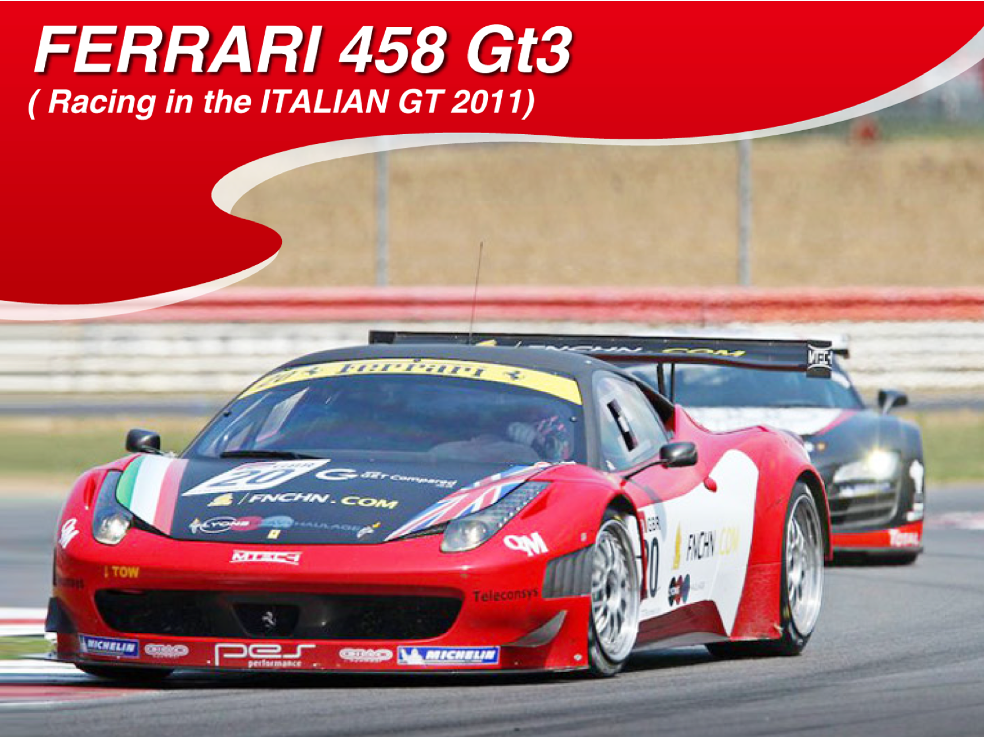
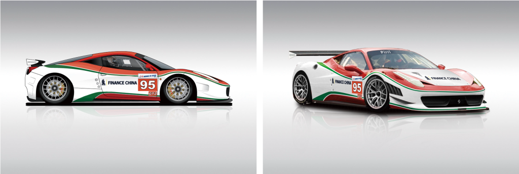
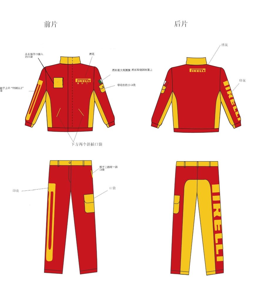
11. AsiaVantage上海亚优贸易有限公司——赛车涂装中的意大利基因
这个案例来自我的亲身经历——十几年前我在上海淮海路28楼的一家意大利公司上班时,做了Asiadvantage上海亚优贸易有限公司的赛车涂装、服装、物料设计项目。
设计以”速度、激情、专业”为核心理念,采用动感强烈的色调搭配,传递赛车运动的视觉冲击力。这恰恰是意大利赛车设计的精髓——法拉利、玛莎拉蒂、阿尔法·罗密欧的赛车涂装之所以让人热血沸腾,就是因为它们把速度、激情和专业这三个词变成了视觉语言。这个项目巧妙融入了品牌标识和赛车元素,图形元素简洁有力,服装物料设计充分考虑运动性能和透气排汗需求,体现了专业运动装备的设计理念。
这个项目让我深刻体会到意大利设计的强大之处:它不只属于意大利,它已经成为全球赛车设计的通用语言。一个中国赛车品牌的设计,同样可以运用意大利赛车美学的语言——速度感、激情、专业——来打造自己的视觉识别体系。这也是我在意大利公司工作时学到的最重要的一课。
当年与意大利老板的合影:

Asiadvantage赛车涂装设计作品:


2. Gucci(古馳)——極繁主義的王者
古馳的設計哲學是「越多越好」。從1921年開業以來,古馳就一直在挑戰「多少才算多」這個命題。雙G標誌、紅綠織帶、馬銜扣——這些元素單獨看每一個都不算特別,但當它們疊加在一起時,就創造出了一種無可比擬的視覺衝擊力。古馳證明了一件事:設計可以像音樂一樣有節奏感,像繪畫一樣有層次感,像戲劇一樣有張力。在創意總監亞歷山卓·米開萊(Alessandro Michele)時期,古馳把極繁主義推向了巔峰——混合性別、混合時代、混合風格,創造出一個屬於「不正常的人」的時尚王國。
3. Alessi(阿萊西)——廚房裡的波普藝術
4. Bulgari(寶格麗)——羅馬的彩色寶石
5. Olivetti(奧利維蒂)——辦公設備的詩人
6. Maserati(瑪莎拉蒂)——優雅的速度
7. Diesel(迪賽)——醜陋的時尚
8. De’Longhi(德龍)——咖啡文化的守護者
9. Benetton(貝納通)——色彩的政治
10. Pininfarina(賓法里納)——汽車設計的詩人
六、意大利产品包装样式
色彩即情感
意大利产品的包装设计以色彩丰富著称。一个意大利食品包装不会只用一种颜色——它会用番茄的红、橄榄油的绿、柠檬的黄,像一幅地中海风景画。这种色彩运用不是随意的——它直接唤起了消费者对”意大利生活”的情感联想。一个意大利消费者看到这样的包装,第一反应不是”这是什么产品”,而是”这让我想起了托斯卡纳的夏天”。
艺术化的标签设计
意大利品牌的标签设计普遍具有艺术感。葡萄酒标签、橄榄油瓶标、化妆品包装——这些标签不仅仅是产品信息载体,它们是微型艺术品。意大利消费者习惯于在货架前花几分钟欣赏一个标签的设计,就像在画廊里欣赏一幅画。这种对”视觉愉悦”的追求,使得意大利包装设计在全球范围内独树一帜。
家族传承的视觉语言
许多意大利品牌的包装保留了家族企业的视觉传统。一个帕尔马火腿的包装可能使用了和五十年前相同的字体和排版风格,只是材质升级了。这种”不变”不是守旧——而是一种文化自信。意大利品牌相信:如果你的设计在五十年前就足够好,那它今天依然足够好。不需要频繁更新,不需要追逐潮流,好的设计本身就是永恒的。
七、顶级设计师与设计公司
1. Gio Ponti(吉奥·蓬蒂)——意大利设计之父
蓬蒂是意大利设计史上最重要的人物。他不仅是一位设计师,更是一位作家、编辑、教育家。1928年他创立了《Domus》杂志,这本杂志至今仍是全球最具影响力的设计刊物之一。他的Superleggera椅子(1957年)重量不足2公斤,却坚固耐用——他用一根根纤细的胡桃木条编织出了令人惊叹的结构之美。蓬蒂的设计理念是”pesante e leggero”(沉重与轻盈的统一),他认为好的设计应该在功能与美感、传统与创新之间找到完美的平衡。
2. Ettore Sottsass(埃托雷·索特萨斯)——后现代主义的叛逆者
索特萨斯是20世纪最具影响力的设计师之一。他的职业生涯横跨多个领域:从为Olivetti设计经典的Valentine红色打字机,到创立孟菲斯集团掀起后现代主义革命。他的Carlton书架(1981年)用塑料层压板和彩色大理石纹贴面,创造了一个完全颠覆传统书架概念的物件。索特萨斯的设计哲学是”形式追随激情”——他拒绝功能主义的束缚,认为设计应该是情感、幽默和个性的表达。他说:”我相信直觉胜过逻辑,相信激情胜过理性。”
3. Achille Castiglioni(阿切莱·卡斯蒂格利奥尼)——极简的大师
卡斯蒂格利奥尼是意大利最具代表性的工业设计师之一。他的Toio可调节台灯(1962年)只用了一根可弯曲的金属管、一个摩托车灯罩和一个开关——没有复杂的技术,没有昂贵的材料,但它成为了设计史上的经典。他获得的Compasso d’Oro(金圆规奖,意大利最高设计奖项)数量之多,使他成为了该奖项历史上获奖最多的设计师。卡斯蒂格利奥尼的设计理念是:好的设计不需要复杂——它只需要一个巧妙的想法。
4. Philippe Starck(菲利普·斯塔克)——法国人做的意大利式设计
虽然斯塔克是法国人,但他与意大利品牌的关系密不可分。他为Alessi设计的Juicy Salif榨汁器(1990年)是工业设计史上最著名的作品之一——它几乎不实用,但它成为了流行文化的符号。斯塔克的设计理念是”设计应该让人微笑”,他与意大利品牌合作的作品无一例外地体现了这种哲学。斯塔克证明了:意大利设计的魅力不在于国籍,而在于一种看待世界的方式——用幽默、用激情、用不被规则束缚的眼光。
5. Alessandro Mendini(亚历山德罗·门迪尼)——装饰的复兴者
门迪尼是孟菲斯集团的核心成员,也是后现代主义设计运动的重要推动者。他提出了”重装饰”(poco ma poco,少但再多一点)的理念——在现代主义的极简基础上,加入一点点装饰、一点点幽默、一点点疯狂。他的Piano Super钢琴(1983年)被涂成了鲜红色,上面画满了彩色的圆点和线条——这把钢琴不再是一件乐器,而是一件波普艺术品。门迪尼证明了:装饰不是敌人,它是人性的表达。
6. Marcello Nizzori(马塞洛·尼佐里)——优雅的工程美学
尼佐里是意大利黄金时代最具代表性的工业设计师之一。他为Olivetti设计的Lettera 32便携式打字机(1950年)被誉为”有史以来最美的打字机”——它的流线型外壳、精密的机械结构、优雅的配色,将工程学与美学完美结合。尼佐里的设计理念是”优雅来自精确”——他不相信装饰可以掩盖设计的缺陷,他相信好的设计本身就是优雅的。他的作品集涵盖了从打字机到相机到照相机的各种产品,每一件都体现了意大利设计的核心理念:功能与美感的统一。
7. Mario Bellini(马里奥·贝利尼)——跨领域的多面手
贝利尼是意大利极少数在建筑、产品设计、时尚设计三个领域都取得卓越成就的设计师。他为Cassina设计的Camaleonda沙发(1970年)是一款模块化沙发——没有固定的腿,没有固定的形状,用户可以随意组合它。这款沙发至今仍在生产中,成为了意大利设计的标志性作品之一。贝利尼的设计哲学是”设计应该适应人,而不是人去适应设计”——他的作品始终以用户体验为核心。
8. Joe Colombo(乔·科隆布)——未来生活的预言家
科隆布是1960年代意大利最具前瞻性的设计师之一。他的Total Furnishing Unit(1969年)是一个将所有功能整合在一起的”生活单元”——厨房、浴室、卧室、工作区全部包含在一个圆柱形结构中。这个设计预见了今天”小户型一体化”的生活趋势,比同类概念早了几十年。科隆布的设计理念是”设计应该预测未来,而不是反映现在”——他的作品总是在挑战当下的可能性边界。
9. Piero Gatti, Cesare Paolini, Franco Teodoro(三人组合)——Sacco豆袋椅的革命
这三位设计师在1968年共同设计了Sacco豆袋椅——一款没有固定形状的椅子。它由一个装满聚苯乙烯珠粒的布套组成,用户可以随意坐在上面,椅子会自动适应身体的形状。Sacco椅是意大利设计民主化的象征——它打破了”椅子必须有腿”的传统观念,证明了”舒适”可以是一种设计语言。Sacco椅至今仍是全球27个现代艺术博物馆的永久藏品,2020年还获得了Compasso d’Oro奖——距离它诞生已经过去了52年。
10. Cassina(卡西纳)——意大利设计的百年传承
Cassina成立于1927年,是意大利最古老的家具公司之一。它的独特之处在于:它不仅生产自己的设计作品,还建立了”I Maestri”(大师系列)项目,复刻20世纪最伟大的设计师作品。从勒·柯布西耶的LC系列到奈尔森的ACM椅子,从马里奥·贝利尼到安东尼奥·斯坦特的作品——Cassina成为了意大利设计历史的活档案。这家公司证明了:尊重传统和推动创新并不矛盾。一个真正伟大的设计品牌,既能创造新的经典,也能守护旧的经典。
结语:意大利设计给中国设计师的启示
读完意大利设计的七个维度,你可能已经注意到一个贯穿始终的主题:意大利设计从不害怕”过度”。激情可以过度,色彩可以过度,戏剧性可以过度——但这种”过度”不是失控,而是一种自觉的选择。
对中国设计师而言,意大利设计最有价值的启示不是”怎么做出意大利风”,而是以下几个深层逻辑:
第一,感受比功能更重要。 意大利设计有一条比”形式追随功能”更深层的信条:”形式追随感受”。一个意大利设计师在做决定时,首先问的不是”这能用吗”,而是”这让人感受如何”。中国设计师经常陷入”功能优先”的思维陷阱——先把功能做足,再考虑好不好看。但意大利设计告诉你:功能只是入场券,感受才是决胜局。
第二,傲慢是一种设计品质。 听起来很奇怪?但意大利设计确实有一种”傲慢”——它不讨好所有人,它只做自己认为对的。一个意大利品牌敢说”我的设计就是最好的”,不是因为自大,而是因为它真的花了几年时间去打磨每一个细节。这种傲慢不是空洞的自信——它是用时间和耐心换来的底气。中国设计师经常过于谦逊,生怕自己的设计”不够好”。但意大利设计告诉你:有时候,你需要对自己的设计有足够的傲慢,别人才会认真对待它。
第三,传统不是包袱,是弹药。 意大利设计师从不把传统当作需要摆脱的包袱——他们把传统当作武器。文艺复兴的遗产、手工艺的传承、家族的积累——这些不是”老东西”,它们是意大利设计区别于其他国家的核心竞争力。中国设计师经常急于摆脱”传统”的标签,追求”国际化”和”现代化”。但意大利设计告诉你:你最独特的传统,恰恰是你最有竞争力的设计语言。
意大利设计教会我们的一件事是:最好的设计不是最理性的设计,而是最”像人”的设计。它不必完美——它必须有温度。它不必低调——它必须有态度。它不必遵循规则——它必须敢于打破规则。
这就是意大利设计的魔力:它不教你怎么做设计——它教你怎么做自己。而且做得足够大胆,足够真诚,足够让人无法忽视。
English Version
Beyond La Dolce Vita: The Passion and Pride of Italian Design
When you think of Italian design, the first word that probably pops into your head is “Dolce Vita” — sweet life. You picture Audrey Hepburn riding a Vespa through Rome, Mediterranean sunshine, Tuscan vineyards, and a shot of espresso.
That’s like saying Italians only eat pizza and sing opera — technically true, but way too shallow.
The beauty of Italian design hides behind “form follows feeling” — a creed far deeper than “form follows function.” It’s not just about looking good. It’s passionate, arrogant, theatrical. An Italian design piece might make you fall in love with it one second and think “that’s audacious” the next. But whatever happens, it will never leave you indifferent.
Today, I want to dive into the core of Italian design — not the postcard version of sunlit coastlines, but the philosophy underneath. Because only by understanding this contradictory aesthetics can you truly grasp why Italian design looks the way it does, and what we can learn from it.
Four Aesthetic Foundations of Italian Design
Italian design didn’t appear out of nowhere. It has four roots, deeply planted in Italian culture.
1. Renaissance Heritage — Art Is Design
Italy was the birthplace of the Renaissance. Da Vinci, Michelangelo, Raphael — these names aren’t just vocabulary from an art history textbook. They were true “full-stack designers.” While painting the Mona Lisa, Da Vinci was designing flying machines, urban plans, and hydraulic systems. While sculpting David, Michelangelo was designing St. Peter’s Basilica.
This historical legacy left Italian design with a profound genetic code: there is no boundary between design and art. In Italy, a chair isn’t just furniture — it’s sculpture. A kettle isn’t just a tool — it’s object art. This mindset still influences Italian design today. When you look at Italian designers’ work, you’ll notice they never confine themselves to the framework of “functionality” — they pursue the unity of aesthetics and utility.
Gio Ponti was the great synthesizer of this philosophy. This father of Italian design founded the magazine Domus in the 1930s and proposed the design concept of “pesante e leggero” (heavy and light) — good design should find balance between weight and airiness. His Superleggera chair weighs less than 2 kilograms yet is sturdy and durable, and it remains a classic in design history.
2. Made in Italy — Quality as Faith
“Made in Italy” is not just a country-of-origin label — it’s a faith. Since the “economic miracle” of the 1950s, Made in Italy has been bound together with high quality, masterful craftsmanship, and impeccable attention to detail. Italians don’t consider “cheap” an advantage — they consider it an insult to the consumer’s intelligence.
This faith permeates every corner of Italian design. An Italian brand will spend an extra three days on one additional hand-polishing pass for a piece of leather. It will revise twenty prototypes for the curve of a coffee pot. This isn’t over-perfectionism — it’s reverence for beauty. Italian designers believe: every object deserves to be gazed at, touched, and passed down to the next generation.
In 2024, Italy’s Ministry of Enterprises (MIMIT) formally passed the Made in Italy Framework Law, designating April 15 as “Made in Italy Day.” This isn’t a formalistic gesture — it marks the Italian government treating “Made in Italy” as a core component of national identity. Just as France treats Art de Vivre as cultural heritage, Italy treats Made in Italy as the soul of the nation.
3. Postmodernism — The Courage to Break Rules
If the keyword for French design is “elegance” and for German design it’s “precision,” then the keyword for Italian design is “boldness.” In the late 1970s and early 1980s, Italian designers launched a design revolution called “postmodernism” — the most famous example being the Memphis Group.
Ettore Sottsass designed the Carlton bookcase for Memphis in 1981 — it didn’t look like a bookshelf; it looked like a pop art installation. Vibrant color blocks, asymmetrical shapes, plastic laminate material — it caused enormous controversy at the time. Some called it a masterpiece; some called it a design disaster. But either way, it changed the world’s perception of “what design should look like.”
The core idea of the Memphis Group was: design shouldn’t be serious. Sottsass famously said, “I refuse to believe in functionalism. Function derives from results, not from presets.” This philosophy completely overturned the modernist iron law of “form follows function.” Italian designers said: form can follow passion, humor, absurdity — anything that makes your heart beat faster.
4. Family Craftsmanship — Hands Passed Down Through Generations
Another foundation of Italian design is its family enterprise and craft tradition. In Italy, a factory may have been passed down for four generations. Walk into a Tuscan leather workshop, and you’ll see photos on the wall of grandfather, father, and son — each working at the same bench, doing the same thing, only the tools evolved from hand knives to electric cutters.
This craft tradition profoundly shaped Italian design’s quality philosophy. Italian designers believe in “hand feel” — not the hand feel simulated by a computer, but the real feedback your palm gets when touching a material. The grain of Italian leather, the edge thickness of a crystal glass, the mortise precision of a piece of furniture — these details aren’t parameters tuned in software. They’re the result of generations feeling with their hands and memorizing with their hearts.
This is why Italian design is irreplaceable globally. You can mass-produce the shape of any Italian product by machine, but you can’t replicate that generational “hand feel.” Hand feel is a body memory. It lives between the craftsman’s fingers, in the dialogue between material and touch.
Core Characteristics of Italian Design
1. Sculptural Quality — Everything Can Be Sculpture
The most distinctive feature of Italian design is its sculptural quality. An Italian design piece, even if you close your eyes and feel it, carries smooth curves and rounded sense of volume. This isn’t coincidence — Italian designers bring “three-dimensional thinking” to every project from the start.
Look at Alessi’s whistling kettle. It isn’t just a vessel for holding water — its curves resemble a ballet dancer’s limbs, its handle strikes an elegant pose, and its whistle was designed as a clown’s head. Philippe Starck’s Juicy Salif citrus squeezer, designed for Alessi, pushes “sculptural quality” to an extreme — it barely juices efficiently, but nobody cares. Because it’s a piece of art. Wherever you put it, it becomes the focal point of the room.
2. Passionate Color — The Mediterranean Palette
Italian design’s use of color is the most passionate in the world. If German design favors black, white, and gray, and British design favors navy and forest green, then Italian design favors — whatever color moves its heart.
The Mediterranean sun gave Italian designers a unique color intuition. The bright yellow of Sicily, the sky blue of the Amalfi Coast, the ochre of Tuscany, the crimson of Venice — these colors weren’t picked from a swatch book. They’re the colors people see every day living on the Mediterranean coast. Italian brands deeply understand this, translating Mediterranean color language into their brand’s visual DNA.
Versace’s golden Medusa head, Gucci’s red-green-red Web stripe, Bulgari jewelry’s bold color clashes — these brands never fear strong colors. Because they know: color isn’t just decoration. Color is emotion.
3. Material Experimentation — Anything Can Become Design
Italian designers are world-famous for their exploratory spirit toward materials. They aren’t limited to “traditional design materials” — wood, metal, glass. To them, any material can be a design material, as long as it can carry beauty.
Achille Castiglioni’s Toio lamp — a flexible metal tube, a motorcycle headlight cover, a switch. No complex technology, no expensive materials — but its simplicity and cleverness made it a design classic. Castiglioni said: “Design isn’t about inventing new things. It’s about creating new meaning from what already exists.”
This material experimentation spirit reached its peak with the Memphis Group. Sottsass and his team used plastic laminates, colored marble-vein decals, asymmetrical geometric shapes — materials considered “cheap” at the time were turned by Italian postmodernists into symbols of the avant-garde.
4. Theatrical Expression — Design as Stage
Italians love opera. This passion for theater deeply influenced Italian design. An Italian brand’s product launch is never just “putting it on shelves” — it’s a performance. Milan Design Week, the most important annual event in the global design world, feels more like a carnival than an exhibition.
Look at Italian brand fashion shows. Gucci, Prada, Armani — their runway shows are never just about displaying clothes. They build complete narrative worlds: lighting, music, model choreography, set design — everything is part of the design. Italian designers understand the power of “presentation”: a great design, if not presented correctly, is like a great song sung poorly.
How Italian Culture Shapes Design Preferences
To understand Italian consumers is to understand Italian design. Their cultural preferences shape a distinctive aesthetic taste.
1. La Bella Figura — Appearance Is Everything
Italy has a unique cultural concept called “La Bella Figura” — literally “beautiful figure,” but it goes far deeper than “caring about appearance.” In Italian culture, La Bella Figure means presenting your best self to everyone — your clothing, your manners, the objects you use, the space you inhabit. Everything converges toward the image you want to project.
This concept profoundly influences Italian consumers’ design preferences. An Italian might choose a cheap shirt, but they’ll ensure it’s ironed flat, buttons aligned, collar crisp. They’re not buying clothes — they’re sending a signal to the world. This emphasis on “presentation” makes Italian consumers demand “good-looking” from products at a level higher than most other countries.
La Bella Figura also explains why Italian brands care so much about packaging. An Italian product’s outer packaging is often more beautiful than the product itself — this isn’t waste. It’s a cultural ritual. Packaging is the first threshold of La Bella Figura. It tells the consumer: this thing deserves to be taken seriously.
2. Pride in Tradition
Italian consumers have a deep pride in “tradition.” In Italy, if a brand has decades — or even centuries — of history, that’s not just an advantage — it’s a core competitive edge. Italian consumers believe “what has survived the test of time is what’s good.”
This contrasts sharply with American consumers, who favor “new” — new technology, new brands, new trends. Italian consumers favor “long” — long history, generational craftsmanship, designs that endure. An Italian brand that emphasizes “since 18XX” in its advertising is more effective than any celebrity endorsement.
3. Regional Identity — Every Region Is an Independent Kingdom
Italy is a country with extremely strong regional identity. Milanese people are proud of being from Milan. Florentines are proud of Florence. Neapolitans are proud of Naples. Each region has its own design language and aesthetic preferences.
Milan is Italy’s design capital — commercial, modern, international. Florence is the craft capital — handcraft, tradition, Renaissance. Turin is the industrial capital — automobiles, machinery, engineering. This regional diversity gives Italian design an incredibly rich linguistic spectrum. An Italian brand wanting to resonate with consumers across different regions needs to understand these differences.
Italian Consumer Psychology
1. “I Want the Best” — Quality-First Mindset
Italian consumers have a saying: “Meglio poco ma buono” — “Better less, but good.” This isn’t just a motto. It’s the core of Italian consumer psychology.
An Italian household might not frequently replace furniture, but every piece is carefully chosen. They’d rather spend three months finding the right chair than buy one on a whim. This consumer mindset means the Italian market defines “quality” far above “price.” An Italian consumer who recognizes quality in an item will pay a premium for it — because they’re not buying the item itself; they’re buying the feeling of “worth it.”
2. Emotion-Driven Purchase Decisions
Italian consumers’ purchase decisions are highly emotion-driven. They don’t buy things because they “need” them — they buy because they “want” them. An Italian might not need a second pair of shoes, but if a pair makes their heart skip, they’ll buy it. Not because the shoes are useful, but because they make them feel good.
This emotion-driven consumer psychology puts extremely high demands on brand design. Italian brands must learn to “tell stories” — not about technical specifications, but about feelings. An Italian brand ad won’t say “our leather is 2mm thick” — it’ll say “after putting on these gloves, everything you touch feels softer.” One is information. The other is an experience.
3. Obsession with Originality
Italian consumers have an almost obsessive pursuit of “originality.” Plagiarism is a sensitive topic in Italian design history — not because Italy hasn’t encountered plagiarism, but because Italians defend “originality” with extraordinary intensity.
This obsession with originality stems from Italian cultural confidence. Italians believe they are the birthplace of creativity — from the Renaissance to modern design, Italians feel they’ve always been leading the world. So when an Italian consumer sees an “original” design, they don’t just feel the product’s attraction — they feel a cultural identity: “This was created by Italians. I’m proud of that.”
11 Famous Italian Brand Cases
1. Ferrari — The Sculpture of Speed
Ferrari’s design philosophy is “giving shape to speed.” The lines of every Ferrari sports car aren’t calculated purely for aerodynamics — they’re sculpted like clay, shaped by a designer’s fingers. Ferrari’s front fascia carries a predator’s ferocity. Side air intakes read like muscle definition. Tail lights serve as nighttime warnings. Enzo Ferrari himself said: “I don’t design cars. I design dreams.” Ferrari’s design has never been just engineering — it’s an emotional vehicle. An Italian consumer chooses Ferrari not because it’s the fastest car, but because it makes them feel like they’re living inside a dream.
11. AsiaVantage Shanghai — Italian DNA in Racing Livery
This case comes from my personal experience — over a decade ago, while working at an Italian company on the 28th floor of Huaihai Road in Shanghai, I did the racing livery, clothing, and material design project for AsiaVantage Shanghai Yayou Trading Co., Ltd.
The design centers on “speed, passion, and professionalism” as its core concepts, using dynamic and intense color combinations to convey the visual impact of racing. This is precisely the essence of Italian racing design — Ferrari, Maserati, Alfa Romeo race liveries make people’s hearts race because they transform speed, passion, and professionalism into visual language. The project skillfully incorporated brand logos and racing elements, with graphic elements that are concise and powerful. The clothing and material design fully considered athletic performance, breathability, and sweat-wicking — embodying the design philosophy of professional sports equipment.
This project taught me the most important lesson: Italian racing design aesthetics transcend borders. A Chinese racing brand’s design can likewise employ the language of Italian racing aesthetics — speed, passion, professionalism — to build its own visual identity. This is precisely what makes Italian design so powerful: it doesn’t belong only to Italy. It has become the universal language of global racing design.
Photo with my Italian boss from that time:
AsiaVantage Racing Livery Design Portfolio:
2. Gucci — The King of Maximalism
Gucci’s design philosophy is “more is more.” Since opening in 1921, Gucci has continually challenged the question of “how much is too much.” The double-G logo, the red-green-red Web stripe, the horsebit buckle — individually, none of these elements is particularly remarkable. But layered together, they create an unparalleled visual impact. Gucci proved one thing: design can have rhythm like music, layers like painting, tension like theater. Under creative director Alessandro Michele, Gucci pushed maximalism to its zenith — mixing genders, eras, and styles, creating a fashion kingdom for “the beautifully abnormal.”
3. Alessi — Pop Art in the Kitchen
Alessi’s design philosophy is “everyday objects should make you smile.” Founded in 1921, this company turned kitchen utensils into design art. Philippe Starck’s Juicy Salif citrus squeezer is a classic — it barely juices efficiently, but nobody minds. Because Alessi doesn’t sell juicing function. It sells a lifestyle attitude. Alessi’s product line spans kettles, tableware, clocks, and more — everyday objects reinterpreted through a designer’s lens. It proved that even the most ordinary kitchen item can become the most eye-catching focal point in your home.
4. Bulgari — Rome’s Colored Jewels
Bulgari’s design philosophy is “bold is elegant.” Unlike Cartier’s subtlety or Tiffany’s freshness, Bulgari takes another path — saturated colors, exaggerated forms, undeniable presence. Bulgari’s Serpenti collection perfectly embodies its design language: the serpent coils around the wrist, scales shimmer gold, the head is a brilliant gemstone. This design doesn’t pursue “quiet luxury” — it pursues “undeniable luxury.” Bulgari’s consumers don’t hide their wealth; they display it. This candor is extremely rare in jewelry design and is precisely Bulgari’s core competitive edge over every rival.
5. Olivetti — The Poet of Office Equipment
Olivetti’s design philosophy is “technology should have warmth.” Founded in 1908, this company didn’t just manufacture typewriters and calculators — it redefined office aesthetics. Ettore Sottsass’s Valentine portable typewriter (1969) was a milestone: a vivid red casing, rounded edges, a portable handle design — this was a typewriter you could take to a bar. Olivetti believed: office equipment shouldn’t be cold white boxes. It should have its own personality. This philosophy was incredibly avant-garde at the time, and even today it remains one of the most brilliant crossover attempts in industrial design history.
6. Maserati — Elegant Speed
Maserati’s design philosophy is “speed should be elegant.” Unlike Ferrari’s wildness, Maserati pursues power within composure. The trident logo itself conveys mythological force — Neptune’s weapon, symbolizing mastery over the sea. Maserati’s body lines are fluid yet restrained. Interior materials are refined without being ostentatious. It doesn’t vent emotion like Ferrari — it’s like a gentleman in a tailored suit: outwardly calm, inwardly burning. An Italian consumer chooses Maserati because it represents another Italian quality: not everyone needs to be wild. Restrained beauty is equally captivating.
7. Diesel — The Fashion of Ugliness
Diesel’s design philosophy is “ugly can also be beautiful.” This denim brand, founded in 1978, has continually challenged aesthetic boundaries. Its ads never feature pretty models in glamorous outfits — they feature ordinary people, flawed people, people who look “wrong.” Diesel’s clothing deliberately preserves seam lines, wash marks, and asymmetrical cuts. This “imperfection” is precisely Diesel’s core competitive edge: it tells consumers that fashion isn’t about perfection — it’s about authenticity. Diesel proved: in design, “ugly” can be a revolution.
8. De’Longhi — Guardian of Coffee Culture
De’Longhi’s design philosophy is “let everyone make a good cup of coffee.” For Italians, coffee isn’t just a beverage — it’s the sacred ritual of daily life. De’Longhi’s mission is to make that ritual simple without sacrificing quality. From Alfonso Bialetti’s invention of the Moka Express in 1933, Italians have never looked back from this small, precise coffee device. De’Longhi continues this tradition — its product design is clean, purposeful, and built to last. A De’Longhi coffee machine can outlive twenty years, which is nearly unthinkable in consumer electronics. But for Italian consumers, that’s exactly what’s expected: good design should withstand the test of time.
9. Benetton — Color as Politics
Benetton’s design philosophy is “color can change the world.” This brand’s standout achievement isn’t its clothing — it’s its advertising. In the 1980s, Benetton hired photographer Oliviero Toscani to create a series of globally shocking ads: AIDS patients, death row inmates, newborn babies, victims of racial discrimination. These ads sparked enormous controversy, but they also made Benetton the most widely recognized apparel brand in the world. Benetton used color and imagery to express its stance: design isn’t just about looking good — design can be social commentary, a political manifesto, a force for changing the world.
10. Pininfarina — The Poet of Automotive Design
Pininfarina’s design philosophy is “give every car a soul.” Founded in 1930, this design company has styled countless vehicles for Ferrari, Maserati, Chevrolet, Suzuki, and more. It’s not a car manufacturer — it’s an automotive design consultancy. But precisely this “pure design company” identity allows Pininfarina to focus on one thing: giving machines life. Pininfarina’s Ferrari 250 GTO is hailed as “the most beautiful car ever made” — its curves flow like a sprinting cheetah. Every inch of bodywork tells a story of the perfect union between speed and elegance. Six generations of the Pininfarina family have worked in automotive design. This lineage itself is a legendary story about the Italian craft spirit.
Italian Product Packaging Styles
Color as Emotion
Italian product packaging design is known for its rich colors. An Italian food package rarely uses just one color — it uses tomato red, olive oil green, lemon yellow, like a Mediterranean landscape painting. This color use isn’t random — it directly evokes consumers’ emotional associations with “Italian life.” When an Italian consumer sees such packaging, their first reaction isn’t “what product is this?” — it’s “this reminds me of a Tuscan summer.”
Artistic Label Design
Italian brand label design is universally artistic. Wine labels, olive oil bottle stickers, cosmetic packaging — these labels aren’t just information carriers. They’re miniature artworks. Italian consumers are accustomed to spending minutes admiring a label’s design at the shelf, the way one admires a painting in a gallery. This pursuit of “visual pleasure” makes Italian packaging design stand out globally.
Family Heritage Visual Language
Many Italian brands’ packaging retains the visual traditions of their family enterprises. A Parma ham package might use the same typography and layout it did fifty years ago — only the materials have upgraded. This “sameness” isn’t conservatism — it’s cultural confidence. Italian brands believe: if your design was good enough fifty years ago, it’s still good enough today. No need for frequent updates, no need to chase trends. Good design is inherently timeless.
Top Designers and Companies
1. Gio Ponti — The Father of Italian Design
Ponti is the most important figure in Italian design history. He wasn’t just a designer — he was a writer, editor, and educator. In 1928, he founded Domus magazine, which remains one of the world’s most influential design publications today. His Superleggera chair (1957) weighs under 2 kilograms yet is sturdy — he wove astonishing structural beauty from slender walnut wood strips. Ponti’s design philosophy was “pesante e leggero” (the unity of heavy and light). He believed good design should find perfect balance between utility and beauty, between tradition and innovation.
2. Ettore Sottsass — The Rebel of Postmodernism
Sottsass was one of the most influential designers of the 20th century. His career spanned multiple fields: from designing the classic red Valentine typewriter for Olivetti to founding the Memphis Group and igniting the postmodernist revolution. His Carlton bookcase (1981) used plastic laminate and colored marble-vein decals to create an object that completely overturned the traditional concept of a bookshelf. Sottsass’s design philosophy was “form follows passion” — he rejected functionalism’s constraints, believing design should be an expression of emotion, humor, and personality. He said: “I believe in intuition over logic, in passion over reason.”
3. Achille Castiglioni — Master of Minimalism
Castiglioni was one of Italy’s most representative industrial designers. His Toio adjustable desk lamp (1962) used only a flexible metal tube, a motorcycle headlight cover, and a switch — no complex technology, no expensive materials — yet it became a design classic. He won more Compasso d’Oro awards (Italy’s highest design honor) than any other designer in the award’s history. Castiglioni’s design philosophy: good design doesn’t need complexity. It just needs a clever idea.
4. Philippe Starck — Frenchman Doing Italian-Style Design
Though French, Starck’s relationship with Italian brands is inseparable. His Juicy Salif citrus squeezer for Alessi (1990) is one of the most famous works in industrial design history — it barely works well, but it became a pop culture icon. Starck’s design philosophy is “design should make people smile.” His collaborations with Italian brands all embody this philosophy. Starck proved: Italian design’s appeal isn’t about nationality — it’s about a way of seeing the world: with humor, with passion, with eyes unbound by rules.
5. Alessandro Mendini — The Revivalist of Decoration
Mendini was a core member of the Memphis Group and a key driver of the postmodernist design movement. He proposed the concept of “poco ma poco” (a little more) — adding a touch of decoration, a touch of humor, a touch of madness atop modernist minimalism. His Piano Super piano (1983) was painted bright red and covered with colorful dots and lines — this piano wasn’t just an instrument anymore; it was a pop art piece. Mendini proved: decoration isn’t the enemy. It’s an expression of humanity.
6. Marcello Nizzoli — The Poet of Engineering Aesthetics
Nizzoli was one of the most representative industrial designers of Italy’s golden age. His Lettera 32 portable typewriter for Olivetti (1950) is hailed as “the most beautiful typewriter ever made” — its streamlined casing, precision mechanical structure, and elegant color scheme combined engineering and aesthetics flawlessly. Nizzoli’s philosophy was “elegance comes from precision” — he didn’t believe decoration could mask design flaws. He believed good design is inherently elegant. His portfolio spans typewriters, cameras, and more — every piece embodies the core Italian design philosophy: the unity of function and beauty.
7. Mario Bellini — The Multidisciplinary Master
Bellini is one of the rare Italian designers who achieved excellence in architecture, product design, and fashion design. His Camaleonda sofa for Cassina (1970) is a modular sofa — no fixed legs, no fixed shape, users can compose it freely. This sofa is still in production today, becoming an iconic work of Italian design. Bellini’s design philosophy is “design should adapt to people, not people to design” — his work always centers on user experience.
8. Joe Colombo — Prophet of Future Living
Colombo was the most forward-thinking designer of 1960s Italy. His Total Furnishing Unit (1969) was a “living unit” integrating all functions — kitchen, bathroom, bedroom, workspace, all contained within a cylindrical structure. This design predicted the modern “small-space integration” lifestyle decades before its time. Colombo’s philosophy was “design should predict the future, not reflect the present” — his works always challenged the boundaries of what was possible in the moment.
9. Piero Gatti, Cesare Paolini, Franco Teodoro — The Revolution of the Sacco Beanbag
These three designers jointly created the Sacco beanbag chair in 1968 — a chair with no fixed shape. Composed of a fabric cover filled with polystyrene beads, the user sits however they want, and the chair automatically adapts to the body’s shape. The Sacco chair is a symbol of Italian design democratization — it broke the tradition that “a chair must have legs,” proving that “comfort” can itself be a design language. The Sacco chair remains in the permanent collections of 27 modern art museums worldwide and received the Compasso d’Oro award in 2020 — 52 years after its creation.
10. Cassina — A Century of Italian Design Heritage
Cassina, founded in 1927, is one of Italy’s oldest furniture companies. Its uniqueness lies in this: it doesn’t just produce its own designs. It also runs the “I Maestri” (Masters) project, reproducing the greatest designers’ works of the 20th century. From Le Corbusier’s LC series to Nelson’s ACM chair, from Mario Bellini to Antonio Sant’Elia — Cassina has become a living archive of Italian design history. This company proved: respecting tradition and pushing innovation aren’t contradictory. A truly great design brand can both create new classics and guard old ones.
Conclusion: Lessons from Italian Design for Chinese Designers
After reading the seven dimensions of Italian design, you may have noticed a theme running through everything: Italian design never fears “excess.” Passion can be excessive. Color can be excessive. Theatricality can be excessive — but this “excess” isn’t loss of control. It’s a conscious choice.
For Chinese designers, the most valuable lessons from Italian design aren’t “how to make Italian style” — they’re the deeper logic below:
First, feeling matters more than function. Italian design has a creed deeper than “form follows function”: “form follows feeling.” When an Italian designer makes a decision, the first question isn’t “does it work?” — it’s “how does it make people feel?” Chinese designers often fall into the “function-first” trap — get the function right first, then worry about whether it looks good. But Italian design tells you: function is just the entry ticket. Feeling is the winning hand.
Second, arrogance is a design quality. Sounds strange? But Italian design does carry an “arrogance” — it doesn’t try to please everyone. It only does what it believes is right. An Italian brand dares to say “my design is the best” — not from vanity, but because it really spent years polishing every detail. This arrogance isn’t empty confidence — it’s earned through time and patience. Chinese designers are often too humble, afraid their design isn’t “good enough.” But Italian design tells you: sometimes, you need enough arrogance in your design for others to take it seriously.
Third, tradition isn’t a burden — it’s ammunition. Italian designers never treat tradition as something to shake off — they treat it as a weapon. Renaissance heritage, craft transmission, family accumulation — these aren’t “old things.” They’re Italian design’s core competitive edge that distinguishes it from every other country. Chinese designers often rush to shed the “traditional” label, pursuing “internationalization” and “modernity.” But Italian design tells you: your most unique traditions are precisely your most competitive design language.
Italian design teaches us one thing: the best design isn’t the most rational design — it’s the most “human” design. It doesn’t need to be perfect — it needs warmth. It doesn’t need to be low-key — it needs attitude. It doesn’t need to follow rules — it needs the courage to break them.
That is the magic of Italian design: it doesn’t teach you how to design. It teaches you how to be yourself. And to be bold enough, sincere enough, and impossible to ignore.
为创作者 17vis 守护知识产权,转载必须保留完整出处信息 (侵权必究)
© 2026 17vis.com All Rights Reserved.