Between Glass and Puppets: The Visual Narrative of Bohemian Folk Aesthetics
布拉格的街头,提线木偶在窗后轻轻摆动,橱窗里折射出百年前波西米亚水晶的璀璨光芒。在东欧的心脏地带,捷克用一种独特的视觉语言讲述着它的故事——玻璃是透明的诗篇,木偶是木头的戏剧,两者交织成波西米亚民间美学的视觉叙事。
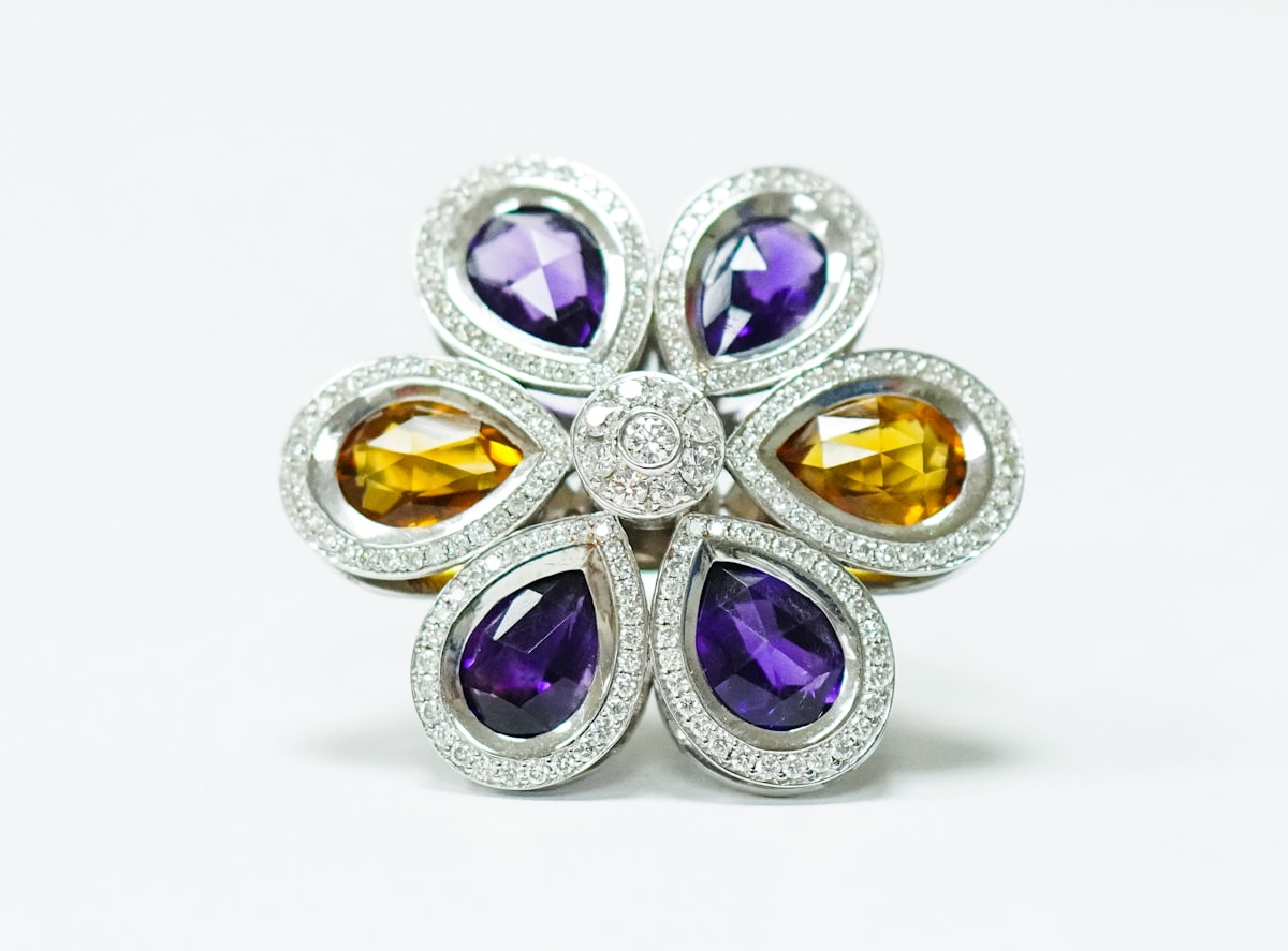
设计哲学:工艺即信仰
捷克的设计哲学可以概括为:工艺即信仰。这并非一句空洞的口号,而是深植于这个民族千年历史中的文化基因。从中世纪的玻璃吹制作坊到文艺复兴时期的木偶戏台,捷克人对手工技艺的执着追求从未停歇。
波西米亚地区自14世纪起就是欧洲玻璃制造的中心。鲁道夫二世将宫廷迁至布拉格,带来了文艺复兴的精致工艺与当地工匠的灵巧双手相结合,诞生了令人惊叹的玻璃艺术。这种对工艺的敬畏之心,渗透到了捷克设计的每一个维度——无论是装饰艺术(Art Deco)时期的大胆几何,还是现代主义的功能主义,都保留着一份对手工温度的坚持。
木偶戏同样是捷克文化的活化石。布拉格木偶剧院的表演已延续数个世代,提线木偶的面部表情、服饰纹样,每一个细节都经过精心设计。这种对细节的极致追求,与玻璃艺术中对光线折射的精微把控形成了奇妙的呼应——二者都是”光的艺术”:一个是捕捉光线的透明介质,一个是演绎光影的舞台装置。
设计风格:民间美学的现代转译
民间图案的几何化:波西米亚传统纹样以其丰富的几何图形著称——八角星、螺旋纹、几何花卉。这些传统图案在现代捷克设计中经历了大胆的几何化处理,被简化为纯粹的形式语言,应用于平面标识、纺织品和建筑设计之中。 色彩的二元性:捷克设计的色彩语言呈现出强烈的二元性——一方面是水晶玻璃的透明纯净,另一方面是民间彩绘的浓烈鲜艳。这种对比在设计中形成了一种独特的张力:现代品牌往往采用极简的黑白灰基色,但在点缀处使用波西米亚传统的高饱和色彩(如深红、宝蓝、翠绿),既保持了现代感,又保留了民族记忆。 材质对话:玻璃、木材、金属——这三种核心材质的对话构成了捷克设计的物质语言。透明玻璃与哑光木材的对比,冷峻金属与温暖木质的并置,创造出了丰富的触觉与视觉层次。这种材质观反映在产品包装、空间设计和建筑立面之上。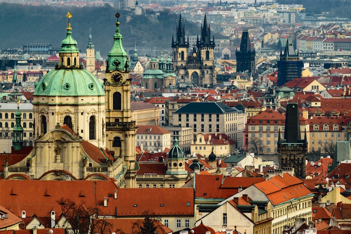
文化偏好:实用与诗意的平衡
捷克消费者在设计选择上展现出一种独特的平衡感:既要实用的功能性,又要诗意的审美性。这种文化偏好根源于波西米亚地区的特殊历史位置——作为东西方文明的交汇点,捷克人既继承了德国的严谨功能主义,又吸收了奥地利的浪漫装饰传统。 实用主义底色:受中欧地理位置和历史影响,捷克设计强调耐用性和功能性。消费者不追求浮夸的炫耀式消费,更注重产品的实际使用寿命和可维修性。这一特点体现在家具设计、日用器皿乃至电子产品的外观上——简洁、耐看、经得起时间考验。 诗意装饰需求:然而在实用主义的基底之上,捷克人对装饰有着天然的热爱。家中的餐具、墙壁的挂饰、节日的摆设,都带有浓厚的装饰意味。这种需求不是奢华的堆砌,而是一种生活品质的提升——”让日常变得美好”是捷克消费者的普遍诉求。 收藏文化:波西米亚水晶和捷克木偶都是值得收藏的艺术品。这种收藏文化延伸到现代消费中——消费者愿意为具有设计感和文化内涵的产品支付溢价,尤其是那些带有”手作温度”的作品。限量版的玻璃器皿、艺术家签名的木雕摆件,在市场上都备受追捧。消费者心理:身份认同的双重表达
捷克消费者的设计选择背后,隐藏着复杂的双重身份认同:既是中欧的实用主义者,又是波西米亚的浪漫艺术家。民族自豪感的内敛表达:经历过长期的外国统治和冷战时期的压抑,捷克人对于民族文化的表达往往是内敛而克制的。他们不会大面积地使用民族符号,而是在细节处悄悄流露——杯碟上的几何纹样、包装盒上的传统插画、产品包装中的波西米亚色彩点缀……这种”低调的民族主义”恰恰体现了捷克人的性格特质。
对独特性的珍视:经历过批量生产的共产主义时代,捷克消费者对”独一无二”有着特别的珍视。定制化的玻璃器皿、手工制作的小众品牌、限量发行的设计产品,都因其稀缺性和独特性而备受青睐。这种心理也推动了当代独立设计师群体的崛起——他们拒绝工业化量产,坚持手作小批量生产。
教育与审美的联结:捷克人有重视艺术教育的传统,从小学开始就有系统的艺术训练。这使得普通消费者具有较高的审美素养,能够理解和欣赏设计中的深层含义。品牌与消费者之间的沟通不再是单向的说教,而是一种基于共同审美语言的对话。
知名品牌案例
1. Moser(摩瑟水晶):成立于1857年的摩瑟是波西米亚水晶的顶级代表。其品牌标识以简洁优雅的字体呈现,瓶身上的切割纹理本身就是最华丽的装饰。Moserr的产品包装设计保持着一贯的低调奢华——深色天鹅绒礼盒搭配简约的白色标签,无需过多文字就能彰显品牌的历史尊贵感。
2. Ruckl(鲁克里):这家始于1859年的巧克力品牌将波西米亚传统纹样与现代平面设计完美结合。其经典款巧克力的包装采用了装饰艺术风格的几何图案,色彩鲜明而不失典雅,既吸引了年轻消费者,又保留了民族记忆的DNA。
3. Vitrafil(维特拉菲):捷克著名的灯饰品牌,将传统玻璃工艺与现代照明技术相融合。Vitrafil的产品本身就是一件件小型雕塑,其品牌标识采用手写体字体,传递出一种工匠的温度感。
4. CzechGump(捷克服饰):近年来崛起的独立服装品牌,将波西米亚印花与现代剪裁结合。CzechGump的视觉识别系统大胆使用高饱和度的传统纹样,通过数字化的方式重新解构,呈现出强烈的当代感。
5. Prague Puppet Theatre(布拉格木偶剧院):作为一个文化IP,木偶剧院的品牌形象成功地进行了现代化转译——传统的提线木偶形象被简化为一个几何轮廓的标志,既保留了辨识度,又适应了数字传播的需求。
产品包装风格
透明材质的运用:受玻璃传统的影响,捷克品牌的包装大量使用透明材料——玻璃瓶、透明塑料、开窗纸盒等。消费者希望”看见”产品本身,这种对透明的偏好反映了诚实、直接的民族性格。
结构与形式的统一:捷克包装设计注重结构的合理性与形式的美观性并重。一个优秀的包装不仅要保护产品,还要提供开箱的体验感。折叠结构、开窗设计、触感材料的选择,每一个细节都经过精心考量。
图文层次的丰富性:在平面信息传达上,捷克包装擅长构建多层次的视觉叙事。历史典故、工艺说明、品牌故事以图文结合的方式层层展开,既满足了消费者的信息需求,又增添了阅读的趣味性。
顶级设计师与机构
1. Jaroslav Behounek:捷克著名平面设计师,以其标志性的几何风格和色彩实验闻名。Behounek的作品将波西米亚图案与现代构成主义相结合,开创了独特的”新波西米亚”视觉语言。
2. Ondřej Sokol:品牌设计专家,曾为多个捷克和国际品牌打造视觉识别系统。Sokol擅长在传统文化元素与现代品牌需求之间找到平衡点,其作品兼具国际视野和本土深度。
3. Studio Archilab:布拉格领先的设计事务所之一,专注于品牌策略与视觉识别。Archilab的工作室理念强调”设计与生活的无缝连接”,其项目涵盖从大型公共空间到小众消费品包装的广泛领域。
4. Karel Sipa:插画与设计教育领域的泰斗级人物,其独特的线条风格影响了几代捷克设计师。Sipa的创作融合了民间艺术的质朴与现代设计的简洁,是捷克设计精神的典型代表。
5. Uměleckoprůmyslové museum(工艺美术博物馆):位于布拉格的核心文化机构,不仅收藏展示波西米亚艺术与工艺的最高成就,还通过展览和教育项目持续推动捷克设计的创新发展。该博物馆的视觉识别系统自身就是传统与现代成功融合的典范。
结语
捷克设计是一座桥梁——连接着波西米亚悠久的民间传统与现代设计的国际语言。在这个国家,玻璃不只是容器,它是光的诗歌;木偶不只是玩具,它是时间的雕塑。当这两个符号相遇,就诞生了属于捷克的视觉叙事:既有历史的厚度,又有当代的锐度。
对于中国品牌设计师而言,捷克设计的启示在于:传统不是包袱,而是可以被不断转译的资源;民族性不是封闭的壳子,而是可以与世界对话的语言。在不刻意媚外也不固步自封的前提下,找到属于自己的那条中间道路,或许就是捷克设计给我们最重要的课题。
Between Glass and Puppets: The Visual Narrative of Bohemian Folk Aesthetics
In the streets of Prague, marionettes sway gently behind shop windows while Bohemian crystal from centuries past sparkles in the display cases. At the heart of Eastern Europe, the Czech Republic tells its story through a unique visual language — glass is transparent poetry, puppets are wooden drama, and together they weave the visual narrative of Bohemian folk aesthetics.
Design Philosophy: Craft as Faith
“Craft is faith” succinctly encapsulates the Czech design philosophy. This is not an empty slogan but a cultural gene deeply rooted in the nation’s millennium-long history. From medieval glass-blowing workshops to Renaissance puppet stages, the Czech devotion to artisanal craft has never wavered.
The Bohemian region has been Europe’s glassmaking center since the 14th century. When Emperor Rudolf II moved his court to Prague, he brought Renaissance refinement that blended with local craftsmen’s nimble hands, producing astonishing glass art. This reverence for craftsmanship permeates every dimension of Czech design — whether it’s the bold geometry of Art Deco or modernist functionalism, a touch of handmade warmth persists.
Puppetry is equally a living fossil of Czech culture. Prague Puppet Theatre performances have continued across generations, with puppet facial expressions and costume patterns meticulously designed. This obsession with detail mirrors the precise light refraction control in glasswork — both are “arts of light”: one captures light through transparent medium, the other creates light-through-shadow drama on stage.
Design Style: Modern Translation of Folk Aesthetics
Geometric stylization of folk patterns: Bohemian traditional motifs feature rich geometric shapes — octagram spirals, geometric flowers. These have undergone bold geometric化处理 in contemporary Czech design, distilled into pure form language applied to graphic identities, textiles, and architectural elements.
Color duality: Czech design presents strong color duality — one side crystal-clear glass transparency, the other vibrant folk painting richness. This contrast creates unique tension in design: modern brands often use minimal black-white-gray bases but accentuate with Bohemian high-saturation colors (deep red, royal blue, emerald green), balancing modernity with ethnic memory.
Material dialogue: Glass, wood, metal — these three core materials constitute Czech design’s material language. Transparent glass contrasts with matte wood; cool metal juxtaposes warm wood, creating rich tactile and visual layers evident in product packaging, spatial design, and building facades.
Cultural Preferences: Balancing Practicality and Poetry
Czech consumers exhibit a unique balance in design choices: practical functionality paired with poetic aesthetics. This stems from Bohemia’s special historical position — as an East-West civilization crossroads, Czechs inherited German functionalist rigor alongside Austrian romantic decorative tradition.
Pragmatic foundation: Influenced by Central European geography and history, Czech design emphasizes durability and functionality. Consumers avoid flashy conspicuous consumption, focusing on product lifespan and maintainability. This appears in furniture, tableware, and even electronic device exteriors — simple, enduring, time-tested.
Poetic decorative desire: Yet above this pragmatic base, Czechs naturally love decoration. Tableware, wall hangings, festival ornaments all carry decorative meaning. This isn’t lavish accumulation but lifestyle enhancement — “making daily life beautiful” is a common consumer aspiration.
Collecting culture: Bohemian crystal and Czech puppets are collectible artworks. This extends to modern consumption — consumers pay premiums for designs with cultural and artistic meaning, especially those with “handmade temperature.” Limited-edition glasses, artist-signed wood carves fetch high prices.
Consumer Psychology: Dual Identity Expression
Behind Czech consumers’ design choices lies complex dual identity: both Central European pragmatists and Bohemian romantic artists.
Having experienced long foreign rule and Cold War repression, Czeches express national culture subtly and restrainedly. They don’t widely use ethnic symbols but reveal them in details — geometric patterns on dinnerware, traditional illustrations on packaging, Bohemian color accents in product packaging… This “subtle nationalism” reflects Czech character traits.
Precious uniqueness: Having endured mass production during communism, Czeches cherish “one-of-a-kind.” Customized glassware, small-batch artisanal brands, limited-design products appeal due to scarcity and uniqueness. This psychology fuels rising independent designer movements rejecting industrial output in favor of handmade small batches.
Connection between education and aesthetics: Czechs value artistic education from childhood, giving consumers high aesthetic literacy who understand deeper meanings in design. Brand-consumer communication becomes dialogue based on shared aesthetic language rather than one-sided preaching.
Well-known Brand Cases
1. Moser: Founded in 1857, Moser represents peak Bohemian crystal. Its brand uses elegant clean fonts, bottle cutting textures being the most luxurious decoration. Packaging maintains understated luxury — dark velvet boxes with minimalist white labels needing no excessive text to convey historical prestige.
2. Ruckl: This chocolate brand established in 1859 perfectly combines Bohemian traditional patterns with modern graphic design. Its classic packaging features Art Deco geometric patterns — vivid yet elegant, appealing to youth while retaining ethnic DNA.
3. Vitrafil: Famous Czech lighting brand integrating traditional glass工艺 with modern lighting technology. Products themselves become small sculptures, its brand logo using handwritten font conveying artisan warmth.
4. CzechGump: Emerging independent fashion brand combining Bohemian prints with modern cuts. Its visual identity system boldly uses high-saturation patterns digitally reinterpreted showing strong contemporary feel.
5. Prague Puppet Theatre: As cultural IP successfully modernized traditional marionette icon simplified to geometric contour maintaining recognizance while adapting digital transmission needs.
Product Packaging Style
Transparent material usage: Influenced by glass tradition, Czech brands extensively use transparent materials — glass bottles, transparent plastic, paper windows with views. Consumers want to “see” itself reflecting honest direct character.
Unity of structure and form: Czech packaging design balances rational structure with beautiful form. Excellent packaging protects product yet provides unboxing experience — folding structures, window designs, tactile material choices each carefully considered.
Richness of graphical hierarchy: In plane information delivery, Czech packaging skillfully builds multi-layered visual storytelling. Historical anecdotes, craft explanations, brand stories layered through text-image combinations satisfying consumer information needs while adding reading interest.
Top Designers and Agencies
1. Jaroslav Behounek: Famous Czech graphic designer renowned for distinctive geometric style and color experimentation. Behounek’s work combines Bohemian patterns with modern constructivism opening new “Neo-Bohemian” visual language.
2. Ondřej Sokol: Brand design expert creating visual identity systems for multiple Czech and international brands. Sokol excels finding balance between traditional cultural elements and modern brand demands works possessing both international vision and local depth.
3. Studio Archilab: Leading Prague design firm specializing in branding strategy and visual identity. Studio concept emphasizes “seamless connection between design and life” projects ranging from large public spaces to niche consumer product packaging broad scope.
4. Karel Sipa: Master figure in illustration and design education whose distinctive line style influenced generations of creators. Sipa’s creation fused folk art simplicity with modern design conciseness typical representation of Czech design spirit.
5. Uměleckoprůmyslové museum: Core cultural institution in Prague not only collecting and displaying highest achievements of Bohemian art and craft but also continuously promoting Czech creative innovation through exhibitions and educational programs. Its own visual identity system exemplifies successful fusion of tradition and modernity.
Conclusion
Czech design stands as bridge connecting long-standing Bohemian folk traditions with modern international design languages. In this country glass isn’t merely container it’s poem of light; puppets aren’t mere toys they’re sculptures of time. When these two symbols meet emerges uniquely Czech visual narrative possessing both historical thickness and contemporary sharpness.
For Chinese brand designers Czech design offers key insight: tradition isn’t burden but resource continually translatable; ethnicity isn’t closed shell but language engaging world dialogue. Finding middle path neither blindly worshipping foreigners nor sticking rigidly to old ways perhaps Czech design’s most important lesson for us.

为创作者 17vis 守护知识产权,转载必须保留完整出处信息 (侵权必究)
© 2026 17vis.com All Rights Reserved.