
China Salt Group – Series Product Packaging Design
导语:中盐集团系列产品包装设计,以纯净、健康、品质为核心理念,打造符合现代消费趋势的包装体系。
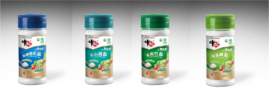
设计说明
本次设计为中盐集团系列产品包装设计项目,旨在打造符合现代消费趋势的食盐产品包装体系。
设计以”纯净、健康、品质”为核心理念,通过简洁的视觉语言和精准的材质选择,展现中盐集团作为行业领导者的品牌实力。
包装结构设计充分考虑了用户体验,便于开启、储存和重复使用,体现了人性化设计理念。
创意说明
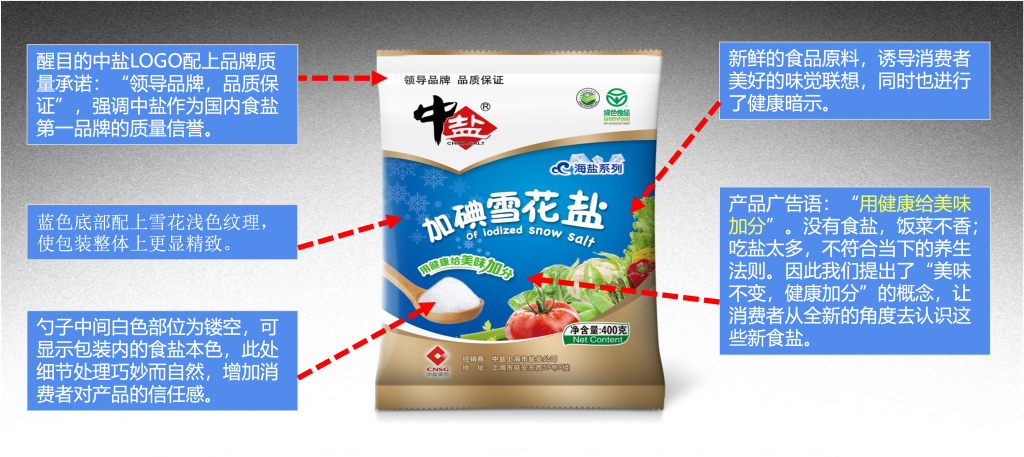
1. 视觉识别系统
采用蓝白配色方案,蓝色象征纯净与信任,白色代表洁净与健康,两者结合传递出产品的高品质形象。
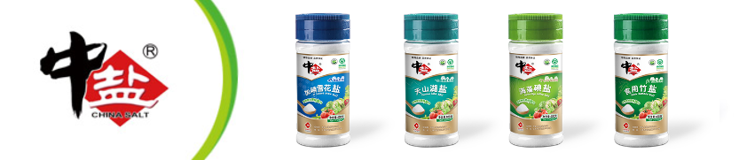
2. 品牌元素应用
巧妙融入中盐集团品牌标识,强化品牌识别度,同时保持整体视觉的简洁与优雅。
3. 材质与工艺
选用环保可回收材料,结合现代印刷工艺,确保包装既美观又实用,符合可持续发展理念。
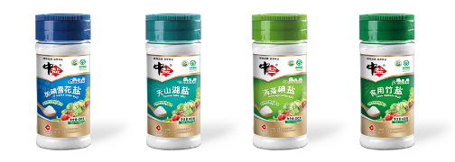
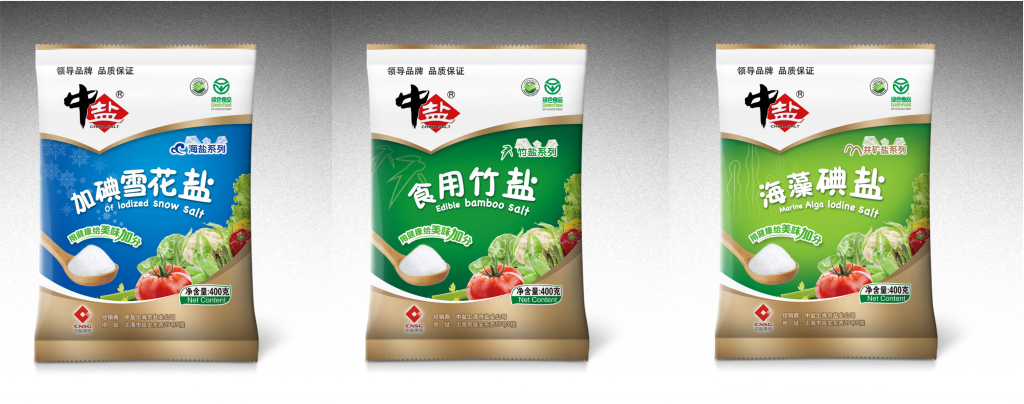
4. 系列化设计
针对不同产品线的特点,采用统一的设计语言,形成完整的视觉体系,提升品牌整体形象。
English Version
Design Description
This packaging design project is for China Salt Group’s series of salt products, aiming to create a salt product packaging system that aligns with modern consumer trends.
The design is centered on the core concept of “Purity, Health, and Quality,” showcasing China Salt Group’s brand strength as an industry leader through clean visual language and precise material selection.
The packaging structure fully considers user experience, with easy opening, storage, and reusable features, embodying human-centered design philosophy.
Creative Concept
1. Visual Identity System
The blue and white color scheme symbolizes purity and trust, while white represents cleanliness and health. Together, they convey the product’s premium image.
2. Brand Element Application
The China Salt Group brand logo is skillfully integrated to enhance brand recognition while maintaining overall visual simplicity and elegance.
3. Materials and Craftsmanship
Eco-friendly recyclable materials are selected, combined with modern printing techniques, ensuring the packaging is both beautiful and practical, aligning with sustainable development principles.
4. Series Design
Following a unified design language across different product lines, creating a complete visual system that elevates the overall brand image.
为创作者 17vis 守护知识产权,转载必须保留完整出处信息 (侵权必究)
© 2026 17vis.com All Rights Reserved.