
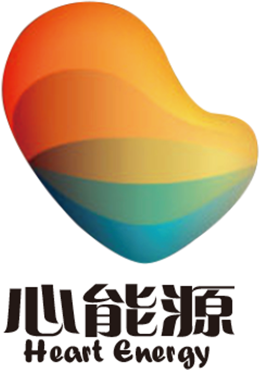
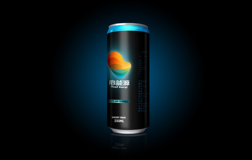
Heart Energy Functional Beverage Visual Design Logo and Packaging

“心”的能量
以“心”的图形元素为设计出发点,
经过艺术创作而成,充分彰显“心能源”的品牌感知;
发散的色彩渐变,构成能量波的形态,传达无限活力的品牌精神;
高明度的色彩构成,彰显品牌的现代感与国际化。
色彩诠释
活力红:传达强烈的情感和力量。
奢华金:辉煌华丽,高贵质感的色彩。
宁静蓝:天空和海洋的自然色,宁静而神秘。
English Version
“Heart Energy”
Using the “heart” graphic element as the design starting point,
created through artistic expression, fully showcasing the “Heart Energy” brand perception;
divergent color gradients forming energy wave patterns, conveying the infinite vitality brand spirit;
high-brightness color composition showcasing the brand’s modern feel and internationalization.
Color Interpretation
Vitality Red: Conveying strong emotions and power.
Luxury Gold: Magnificent and luxurious, noble textured colors.
Serene Blue: Sky and ocean natural colors, serene and mysterious.
为创作者 17vis 守护知识产权,转载必须保留完整出处信息 (侵权必究)
© 2026 17vis.com All Rights Reserved.