
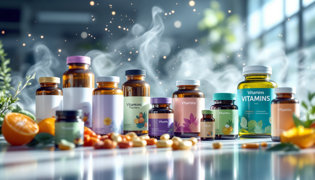
保健品,大概是包装设计最尴尬的品类。
它不像食品那样让人放松,不像药品那样让人信服,不像护肤品那样让人向往。但它偏偏同时承载着三种期待:要有食品的亲和、药品的权威、护肤品的仪式感。
大多数保健品包装,在这三者之间,一个都没够到。
一、全球市场格局
1.1 规模与增速
全球保健品市场在2023年已超过2800亿美元,预计到2030年将突破4000亿美元。年均增速保持在6%-8%之间,亚太地区增速最快,北美市场体量最大。
维生素和膳食补充剂是最大子品类,其次是体重管理、运动营养、传统滋补。中国市场有一个独特分支——传统滋补品,这个品类在国外几乎没有对应项。
1.2 中美日澳市场特征
| 维度 | 美国 | 中国 | 日本 | 澳洲 |
|---|---|---|---|---|
| 市场规模(2023) | ~550亿美元 | ~400亿美元 | ~120亿美元 | ~50亿美元 |
| 主要渠道 | 超市、亚马逊、DTC官网 | 电商、药店、直销 | 药妆店、便利店、通信贩卖 | 超市、药房、代购 |
| 包装风格 | 极简、透明、大字 | 两极化:礼盒 vs 药瓶 | 小包装、精致、日式克制 | 朴素、可信、像食品 |
| 消费者认知 | 日常补充,像食品 | 送礼 + 治病 + 养生 | 日常保健,像护肤品 | 日常补充,像食品 |
| 代表品牌 | Ritual、Nature Made、GNC | 汤臣倍健、东阿阿胶、Swisse | FANCL、DHC、ORIHIRO | Blackmores、Swisse |
1.3 渠道差异
美国的保健品摆在超市货架上,和牛奶、鸡蛋同一个购物动线。消费者买维生素像买菜一样日常。澳洲的保健品在药房和超市同时流通,Blackmores的瓶子和橄榄油瓶子共享同一排货架。
中国的保健品渠道经历过几轮更迭。最早是药店,然后是直销(安利、无限极),现在是电商为主。直播电商的崛起让保健品找到了新出口,但也带来了包装上的新问题——在线下,包装靠材质和重量传递价值;在直播间,包装靠大Logo和鲜艳配色抢注意力。
1.4 头部品牌阵营
| 阵营 | 代表品牌 | 包装特征 |
|---|---|---|
| 美国大众 | Nature Made、Centrum | 白标+大色块,超市快消风 |
| 美国DTC | Ritual、Care/of、HUM | 极简设计、透明胶囊、订阅制 |
| 日本 | FANCL、DHC | 小包装、白色为主、字体克制 |
| 澳洲 | Blackmores、Swisse | 朴素可信,像食品罐头 |
| 中国大众 | 汤臣倍健 | 从药瓶到白标,正在转型 |
| 中国滋补 | 东阿阿胶、燕之屋 | 红金礼盒、中式符号、送礼逻辑 |
二、包装设计流派
全球保健品包装,大致可以归入四个流派。
2.1 药品式
特征:白底、黑字或红蓝点缀、成分表显著、适应症描述清晰、药瓶或铝塑板装。
心理暗示:我有用。我是经过批准的。你应该按时吃。
代表:GNC、早期的汤臣倍健、Centrum。
信任机制:模仿药品包装,借用药物监管的权威感。消费者看到白底黑字+成分表,本能地觉得“这是正经东西”。但药品式包装有一个隐藏代价——它同时也在暗示“我是药”。药的潜台词是:你病了才需要我。没有人想长期吃一种暗示自己“有病”的产品。
2.2 食品式
特征:色彩丰富、包装形态接近零食或饮料、小包装便携、口感描述多于功效描述。
心理暗示:我是好吃的。我是日常的一部分。吃我没压力。
代表:FANCL的果冻型补充剂、DHC的小药丸式包装、ORIHIRO的软糖型保健品。
信任机制:降低心理门槛。把“吃药”这个动作重新定义为“吃一种对身体有好处的东西”。日本品牌在这方面做到了极致——FANCL的包装看起来像超市货架上的果冻,DHC的包装像精致的零食。你买它的时候不会觉得自己在买药,你觉得自己在对自己好一点。
2.3 极简生活式
特征:无衬线字体、大量留白、触感纸、磨砂瓶、强调成分溯源和透明度、订阅制。
心理暗示:我是诚实的。我不藏着掖着。我是你这个生活方式的人应该拥有的。
代表:Ritual、Care/of、Athletic Greens、HUM Nutrition。
信任机制:透明度=信任。Ritual的瓶子是透明的,胶囊里的成分颗粒肉眼可见。包装上不写“强效”“特效”,写的是每一种成分的来源、剂量、临床研究编号。Care/of用个性化问卷替代了货架逻辑——你回答关于生活方式的问题,品牌给你配好每日的补充包,包装上印着你的名字。这不是在卖保健品,是在卖“被科学对待”的感觉。
这个流派是当下全球保健品包装的审美高点。但它的门槛不在设计,在品牌对供应链的掌控力。透明包装的前提是内容物真的经得起看。
2.4 传统滋补式
特征:红金配色、中式纹样、书法字体、礼盒结构、丝绸或绒布内衬。
心理暗示:我是贵重的。我是有来历的。我是适合送给你在乎的人的。
代表:东阿阿胶、燕之屋、小仙炖。
信任机制:贵重感=价值感。这类包装逻辑上是靠物质感来传递价值的——盒子重、内衬软、配色富丽。但问题在于,贵重感不等于信任感。一个过于华丽的盒子,在年轻消费者眼里的潜台词是:你把钱花在了盒子上,里面的东西能有多好?
传统滋补式的包装正在经历代际撕裂。老一辈觉得红金礼盒体面,年轻一代觉得土。新一代滋补品牌(如小仙炖)已经开始转型——红金色减到只做点缀,白色做主调,瓶身设计向护肤品靠拢。但礼品逻辑仍然是这个品类的底色。
2.5 四派对比总结
| 流派 | 核心隐喻 | 信任来源 | 人群 | 弱点 |
|---|---|---|---|---|
| 药品式 | 治疗 | 监管权威感 | 中老年、功能刚需 | 暗示“你有病” |
| 食品式 | 日常 | 低门槛、亲切 | 年轻入门者 | 可能太像零食,缺乏说服力 |
| 极简生活式 | 生活方式 | 透明度、科学感 | 高知中产、DTC一代 | 需要强大的供应链支撑 |
| 传统滋补式 | 礼物 | 贵重感 | 送礼人群、中老年 | 过度包装、年轻一代反感 |
三、国际流行趋势
3.1 去药感
全球保健品包装最核心的趋势就一个词:去药感。
不是从“药”变“食品”,而是从“药”变“生活方式”。Ritual的包装放在护肤品牌旁边毫无违和感。Athletic Greens的袋装粉末看起来像高端蛋白粉,不像保健品。HUM Nutrition的瓶子是磨砂马卡龙色,像美妆品牌的精华液。
去药感不是放弃功能暗示。而是用一种更高级的方式暗示功能——褪黑素包装不做药瓶做软糖盒,益生菌包装不做铝箔板做每日独立条包。她拆开的不是“药”,是今天的“自我关怀”。
3.2 透明化
成分透明化是极简生活派的核心武器。但现在已经不止于成分列表。
Ritual的做法:每种成分的来源产地、供应商名称、临床研究摘要,全部印在包装内页或通过二维码链接到网页。Care/of的做法:包装上印着她的名字、她的问卷结果、每一天的补充组合是专属的。Athletic Greens的做法:75种成分,每一种的来源、作用、剂量全部公开。
透明化把信任从“品牌说了算”转向了“数据说了算”。包装不再是品牌单方面的宣言,而是品牌和消费者之间的信息契约。
3.3 个性化
Care/of是个性化保健品的代表——消费者在网站上做生活方式问卷,品牌根据答案匹配补充剂组合,每日装进印有名字的独立小袋。包装从一个“通用容器”变成了“专属配给”。
这种模式正在从维生素扩展到蛋白粉、功能性零食、甚至宠物保健品。个性化的本质是:我不再是卖给一百万人同一个瓶子。我是为你的睡眠、你的焦虑、你的饮食习惯,专门配了一套方案。
包装设计上的表达是——没有大Logo,没有产品名,只有“你的名字”和“今天的日期”。品牌把主角让给了消费者本人。
3.4 可持续
保健品包装是塑料重灾区。一个月的每日分装,可能产生30个小塑料壳。
可持续化正在从三个方向推进:一是去塑料——Ritual用玻璃瓶+铝盖,Care/of用小纸袋替代塑料分装壳;二是可补充装——品牌寄补充袋,消费者保留原瓶,用完了装进去,类似洗衣液的补充逻辑;三是全纸化——外部运输盒完全纸浆模塑,无塑料填充。
澳洲和欧洲市场对可持续包装有法规推动。美国DTC品牌把可持续作为品牌价值观的一部分。中国市场目前还在早期,但小仙炖的玻璃瓶回收计划是一个信号——滋补品品类,先于大众保健品,踩中了可持续的节点。
3.5 DTC品牌美学
过去十年,美国DTC保健品品牌的崛起重新定义了品类审美。
| 品牌 | 视觉特征 | 核心差异 |
|---|---|---|
| Ritual | 透明瓶身、黄色胶囊、极简衬线字体 | 看得见的信任 |
| Care/of | 个性化小袋、手写体名字、温暖配色 | 专属感 |
| HUM | 磨砂马卡龙色瓶、像精华液 | 美妆化 |
| Athletic Greens | 深绿+黑、袋装粉末 | 硬核透明+便捷 |
这些DTC品牌的共同点是:不卖“保健品”,卖“更好的日常”。包装说的是:你不需要额外的仪式,你只需要把它放进你已有的生活中。
四、中国市场的特殊性
4.1 送礼场景驱动的过度包装
中国保健品市场有一个全球独有的特征:送礼场景占极大比重。
脑白金是极端的例子,但不是孤例。燕窝、阿胶、虫草、参茸——这些品类的大部分销售来自送礼场景。送礼逻辑下的包装法则:盒子要大、颜色要红金、提在手里要有重量、拆开要有层次。
这个逻辑养活了滋补品行业,但也把包装困在了一种自我循环里——盒子越做越大,价格越来越高,信任越来越低。
4.2 直销渠道的信任透支
安利、无限极、完美的直销模式,曾经是中国保健品市场的绝对主力。直销模式的核心不是产品力,是人际关系信任。包装在直销渠道里不是面向消费者的沟通工具,而是面向代理商的销售道具。大Logo、醒目色彩、高端感——是为了让代理商在朋友圈拍照好看。
直销渠道的整体衰退,让一批依赖直销的品牌失去了渠道,也失去了包装更新的动力。包装仍然是十年前的样子,因为十年前的那套逻辑已经不成立了。
4.3 年轻养生一代的审美觉醒
90后、00后的养生焦虑催生了新的保健品消费群。她们吃褪黑素,喝胶原蛋白,买益生菌和护肝片。但她们不是在药店买的。她们在小红书被种草,在抖音直播间下单,在天猫国际比价。
这一代人的审美参照系不是药店货架,是DTC品牌、美妆品牌、生活方式品牌。她们要的保健品包装,不是“像药的保健品”,是“像护肤品的保健品”,是“可以晒在梳妆台上的保健品”。
Swisse在中国的成功,很大程度上得益于它的包装比国产保健品更接近“护肤品”的视觉语言——干净、留白、不堆砌。小仙炖的鲜炖燕窝,从品类上属于传统滋补,但包装设计完全跳出了红金礼盒逻辑——玻璃瓶、白色标签、冷链配送。这些品牌都在回应同一件事:年轻消费者不再为“送礼有面子”买单,她们为“自己觉得好”买单。
4.4 跨境与国货的包装较量
同一瓶Swisse护肝片,在澳洲超市货架上是朴素的白标瓶,在天猫国际旗舰店上变成了带中文标签、赠品小样、礼盒装。包装的“升级”反而让部分消费者产生了疑虑:为什么你们卖给老外的是简装,卖给我们的是礼盒?
这背后是跨境保健品的信任悖论。消费者购买进口保健品,要的是“原装进口”的纯正感。任何针对中国市场的包装改动——哪怕是加了一层看起来更高端的礼盒——都在稀释这份纯正感。而国货品牌面临的挑战正好相反:如何摆脱“国产=土”的刻板印象,在包装上建立国际感和信任感。
汤臣倍健在过去几年做了显著的包装升级——从药品式的白底蓝字,逐步向白标+大色块的国际风格靠拢。但品牌感知的转型比包装设计的转型更慢。货架上的瓶子变了,消费者心里的那个“老牌国货”还需要时间。
五、包装设计原则与趋势总结
5.1 信任公式
保健品包装的信任 = 专业感 × 透明度 × 克制度
三个变量缺一不可。有专业感但不透明,像高高在上的白大褂。透明但不克制,像把整本说明书印在瓶身上。克制但没有专业感,像果汁。
5.2 趋势速查表
| 趋势 | 表现 | 领先市场 |
|---|---|---|
| 去药感 | 从药瓶到软糖盒、果冻袋、精华瓶 | 日本、美国DTC |
| 透明化 | 成分溯源、临床数据、二维码看产地 | 美国DTC |
| 个性化 | 按需配给、印名独立袋 | 美国DTC |
| 可持续 | 玻璃瓶+铝盖、纸浆模塑、补充装 | 欧洲、澳洲、美国DTC |
| 美妆化 | 磨砂瓶、马卡龙色、像护肤品 | 美国DTC、日本 |
| 便捷化 | 条包、喷雾、软糖、即饮瓶 | 日本、美国 |
| 去礼盒化 | 从三层盒子到单层环保盒 | 中国市场初期 |
5.3 中国市场独特机会
中国保健品市场有两个全球独有的机会。
一是传统滋补品的现代化包装。燕窝、阿胶、虫草、参茸——这些品类有文化根基和消费习惯,但包装还在礼品时代。谁第一个把这些品类的包装从“送礼盒”升级到“日常瓶”,谁就拿到了下一个十年的入场券。小仙炖已经在做燕窝的日常化,但这个赛道还远未饱和。
二是年轻人的第一瓶保健品。25-35岁的年轻消费者正在大规模进入保健品消费,但她们心里还没有“默认品牌”。这一代人对包装的审美要求远高于上一代,对品牌的忠诚度远低于上一代。谁能用对的设计语言拿下她们的第一次,谁就能在她们未来的消费周期里占据心智。
5.4 最后
保健品包装的终极方向,和成人用品、茶叶一样——让包装不再为品类服务,而是为人服务。
不是“这是一个保健品”,是“这是我今天对自己好的方式”。不是“这盒送礼有面子”,是“这瓶放在桌上我每天都想拿起来”。
包装不再是信息的堆砌,不再是面子的载体。包装是日常仪式的一部分。它不需要被展示,但它值得被留在桌上。
English Version
Supplement Packaging: From Pill Bottle to Lifestyle — A Visual Transformation
Health supplements occupy perhaps the most awkward position in packaging design.
They are not as relaxing as food. Not as authoritative as medicine. Not as aspirational as skincare. Yet they are expected to carry all three qualities at once: the warmth of food, the authority of pharmaceuticals, and the ritual of beauty products.
Most supplement packaging reaches for all three. And catches none.
I. Global Market Landscape
1.1 Scale and Growth
The global supplement market surpassed 280 billion USD in 2023 and is projected to exceed 400 billion by 2030. Annual growth holds steady at 6-8%. Asia-Pacific is the fastest-growing region. North America remains the largest single market.
Vitamins and dietary supplements are the largest subcategory, followed by weight management, sports nutrition, and traditional herbal tonics. The Chinese market has a unique subcategory — traditional nourishing products — for which there is virtually no equivalent abroad.
1.2 Market Characteristics: USA, China, Japan, Australia
| Dimension | USA | China | Japan | Australia |
|---|---|---|---|---|
| Market size (2023) | ~55 billion USD | ~40 billion USD | ~12 billion USD | ~5 billion USD |
| Main channels | Supermarkets, Amazon, DTC websites | E-commerce, pharmacies, direct selling | Drugstores, convenience stores, mail order | Supermarkets, pharmacies, daigou |
| Packaging style | Minimalist, transparent, bold typography | Polarized: gift boxes vs. medicine bottles | Small format, refined, Japanese restraint | Simple, trustworthy, food-like |
| Consumer perception | Daily supplement, like food | Gifting + medicinal + wellness | Daily health, like skincare | Daily supplement, like food |
| Representative brands | Ritual, Nature Made, GNC | By-Health, Dong’e Ejiao, Swisse | FANCL, DHC, ORIHIRO | Blackmores, Swisse |
1.3 Channel Differences
In the United States, supplements sit on supermarket shelves alongside milk and eggs — part of the same shopping journey. Buying vitamins is as routine as buying groceries. In Australia, supplements move through both pharmacies and supermarkets. A bottle of Blackmores shares shelf space with olive oil.
China’s supplement channels have undergone several shifts. First, pharmacies. Then, direct selling — Amway, Infinitus. Now, e-commerce dominates. The rise of livestream commerce has created a new outlet, but also new packaging problems. Offline, packaging conveys value through material and weight. In a livestream, packaging fights for attention with large logos and bright colors.
1.4 Brand Landscape by Segment
| Segment | Representative Brands | Packaging Characteristics |
|---|---|---|
| US mass market | Nature Made, Centrum | White label + bold color blocks, supermarket FMCG style |
| US DTC | Ritual, Care/of, HUM | Minimalist design, transparent capsules, subscription model |
| Japan | FANCL, DHC | Small format, white-dominant, restrained typography |
| Australia | Blackmores, Swisse | Simple, trustworthy, like food jars |
| China mass market | By-Health | Transitioning from medicine bottle to white label |
| China herbal tonic | Dong’e Ejiao, Yan Zhi Wu | Red and gold gift boxes, Chinese motifs, gifting logic |
II. Packaging Design Schools
Global supplement packaging can be categorized into four schools.
2.1 Pharmaceutical Style
Characteristics: White background, black text with red or blue accents, prominent ingredient lists, clear indication of use, pill bottles or blister packs.
Psychological signal: I am effective. I am approved. You should take me on schedule.
Representatives: GNC, early By-Health, Centrum.
Trust mechanism: Mimics pharmaceutical packaging to borrow the authority of drug regulation. A consumer sees white background, black text, and an ingredient panel and instinctively thinks: “This is legitimate.” But the pharmaceutical style carries a hidden cost — it also signals “I am medicine.” The subtext of medicine is: you are sick. No one wants to take a product long-term that implies there is something wrong with them.
2.2 Food Style
Characteristics: Rich colors, packaging resembling snacks or beverages, portable single-serve formats, texture and flavor descriptions prioritized over efficacy claims.
Psychological signal: I taste good. I am part of everyday life. There is no pressure in consuming me.
Representatives: FANCL jelly supplements, DHC pill-style packaging, ORIHIRO gummy supplements.
Trust mechanism: Lowers the psychological barrier. Reframes the act of “taking medicine” as “eating something good for your body.” Japanese brands have taken this to the extreme — FANCL packaging looks like jelly cups from a supermarket shelf. DHC packaging resembles refined confectionery. When you buy it, you do not feel like you are buying medicine. You feel like you are being kind to yourself.
2.3 Minimalist Lifestyle Style
Characteristics: Sans-serif fonts, generous white space, textured paper, frosted glass bottles, emphasis on ingredient traceability and transparency, subscription-based.
Psychological signal: I am honest. I hide nothing. I belong to someone with your kind of lifestyle.
Representatives: Ritual, Care/of, Athletic Greens, HUM Nutrition.
Trust mechanism: Transparency equals trust. Ritual’s bottle is transparent. The ingredient particles inside the capsule are visible to the naked eye. The packaging does not say “potent” or “maximum strength.” It lists the source of each ingredient, the dosage, and clinical study references. Care/of replaces shelf logic with a personalized questionnaire — you answer questions about your lifestyle, the brand formulates your daily supplement packs, and your name is printed on each one. This is not selling supplements. This is selling the feeling of being treated with scientific rigor.
This school represents the aesthetic ceiling of global supplement packaging today. But its barrier to entry is not design capability. It is supply chain control. Transparent packaging only works if the contents can truly withstand scrutiny.
2.4 Traditional Herbal Tonic Style
Characteristics: Red and gold color palette, Chinese motifs, calligraphy typography, multi-layered gift box structure, silk or velvet inner lining.
Psychological signal: I am precious. I have heritage. I am meant to be given to someone you care about.
Representatives: Dong’e Ejiao, Yan Zhi Wu, Xiaoxiandun.
Trust mechanism: Perceived preciousness equals perceived value. This packaging logic relies on material weight to convey worth — heavy boxes, soft inner linings, opulent colors. But the problem is that preciousness is not the same as trust. An overly ornate box, in the eyes of a younger consumer, carries a different subtext: you spent the money on the box. How good can the contents really be?
The traditional tonic style is experiencing a generational rift. Older consumers find red and gold gift boxes dignified. Younger consumers find them outdated. New-generation tonic brands like Xiaoxiandun have begun to shift — red and gold are reduced to accent colors, white becomes the dominant tone, and bottle design leans toward skincare aesthetics. But the gifting logic remains the undercurrent of this category.
2.5 Four Schools Comparison
| School | Core Metaphor | Source of Trust | Target Audience | Weakness |
|---|---|---|---|---|
| Pharmaceutical | Treatment | Regulatory authority | Seniors, functional needs | Implies “you are sick” |
| Food | Everyday | Low barrier, warmth | Young beginners | May seem too casual, lacks persuasive power |
| Minimalist Lifestyle | Lifestyle | Transparency, scientific rigor | Educated middle class, DTC generation | Requires strong supply chain |
| Traditional Tonic | Gift | Sense of preciousness | Gifting audiences, seniors | Over-packaging, alienates younger consumers |
III. International Trends
3.1 De-medicalization
The single most important trend in global supplement packaging can be summed up in one phrase: removing the sense of medicine.
Not from “medicine” to “food.” From “medicine” to “lifestyle.” Ritual’s packaging sits next to skincare brands without any sense of mismatch. Athletic Greens’ pouch looks like premium protein powder, not a supplement. HUM Nutrition’s bottles are frosted macaron colors, resembling beauty brand serums.
De-medicalization is not about abandoning functional cues. It is about signaling function in a more sophisticated way — melatonin in a gummy box instead of a pill bottle, probiotics in daily tear strips instead of blister packs. What she opens is not “medicine.” It is today’s act of self-care.
3.2 Transparency
Ingredient transparency is the core weapon of the minimalist lifestyle school. But it has now moved beyond the ingredient panel.
Ritual’s approach: the source of each ingredient, the supplier name, clinical study summaries — all printed on the inner packaging or accessible via QR code. Care/of’s approach: the packaging bears her name, her questionnaire results, and the day’s customized supplement combination. Athletic Greens’ approach: all 75 ingredients, each with source, function, and dosage, fully disclosed.
Transparency shifts trust from “the brand says so” to “the data says so.” Packaging is no longer a unilateral declaration from the brand. It is an information contract between the brand and the consumer.
3.3 Personalization
Care/of is the representative of personalized supplements. The consumer completes a lifestyle questionnaire on the website. The brand matches a supplement combination based on the answers. Each day’s dose is packed into an individual sachet printed with her name. Packaging transforms from a “universal container” into a “personal allocation.”
This model is expanding from vitamins into protein powders, functional snacks, and even pet supplements. The essence of personalization is: I am no longer selling the same bottle to a million people. I am formulating a specific regimen for your sleep, your anxiety, your eating habits.
The design expression: no large logo. No product name. Only “her name” and “today’s date.” The brand cedes the protagonist role to the consumer herself.
3.4 Sustainability
Supplement packaging is a plastic minefield. A month’s supply in daily sachets can generate thirty small plastic shells.
Sustainability is advancing on three fronts. First, de-plastification — Ritual uses glass bottles with aluminum caps. Care/of uses small paper sachets instead of plastic blister packs. Second, refill systems — the brand ships refill pouches. The consumer keeps the original bottle. Like laundry detergent refill logic. Third, full paperization — outer shipping boxes are entirely molded pulp, zero plastic cushioning.
Australia and Europe have regulatory momentum driving sustainable packaging. US DTC brands treat sustainability as part of brand values. The Chinese market is still in early stages, but Xiaoxiandun’s glass bottle recycling program is a signal — the herbal tonic category, ahead of mass-market supplements, has touched the sustainability inflection point.
3.5 DTC Brand Aesthetics
Over the past decade, the rise of US DTC supplement brands has redefined category aesthetics.
| Brand | Visual Identity | Core Differentiator |
|---|---|---|
| Ritual | Transparent bottle, yellow capsule, minimalist serif font | Trust you can see |
| Care/of | Personalized sachets, handwritten name, warm color palette | Sense of exclusivity |
| HUM | Frosted macaron-colored bottles, like serums | Beauty-ification |
| Athletic Greens | Deep green + black, pouch format | Hardcore transparency + convenience |
The common thread across these DTC brands: they do not sell “supplements.” They sell “a better daily routine.” What the packaging communicates is: you do not need extra ritual. You just need to fit this into the life you already have.
IV. The Uniqueness of the Chinese Market
4.1 Gift-Driven Over-Packaging
The Chinese supplement market has a feature unique in the world: the gifting scenario accounts for an enormous share of sales.
Melatonin gift boxes are the extreme example, but not the only one. Bird’s nest. Ejiao. Cordyceps. Ginseng. A significant portion of sales in these categories comes from gifting. The packaging law under gifting logic: the box must be large. The colors must be red and gold. It must feel heavy when carried. It must reveal layers when opened.
This logic has fed the herbal tonic industry. But it has also trapped packaging in a self-reinforcing loop — boxes grow larger, prices climb higher, and trust sinks lower.
4.2 Trust Deficit from Direct Selling
Amway, Infinitus, Perfect — the direct selling model was once the absolute backbone of China’s supplement market. The core of direct selling is not product strength. It is interpersonal trust. In the direct selling channel, packaging is not a communication tool for the consumer. It is a sales prop for the distributor. Large logos. Eye-catching colors. A sense of premium quality — all designed so the distributor’s photo on social media looks impressive.
The overall decline of the direct selling channel has left a cohort of brands without their channel, and without the motivation to update their packaging. The packaging remains what it was a decade ago. Because the logic that sustained it a decade ago no longer holds.
4.3 The Aesthetic Awakening of Young Wellness Consumers
The wellness anxiety of the post-90s and post-00s generations has spawned a new consumer base for supplements. They take melatonin. They drink collagen. They buy probiotics and liver support formulas. But they do not buy them at the pharmacy.
They are seeded on Xiaohongshu. They place orders in Douyin livestreams. They compare prices on Tmall Global.
This generation’s aesthetic reference is not the pharmacy shelf. It is DTC brands. Beauty brands. Lifestyle brands. The supplement packaging they want is not “a supplement that looks like medicine.” It is “a supplement that looks like skincare.” It is “a supplement that can be displayed on the vanity table.”
Swisse’s success in China owes significantly to its packaging being closer to “skincare” visual language than domestic competitors — clean, with white space, uncluttered. Xiaoxiandun’s fresh-stewed bird’s nest belongs to the traditional tonic category by product, but its packaging design has completely broken free from the red-and-gold gift box logic — glass bottles, white labels, cold chain delivery. These brands are all responding to the same thing: young consumers are no longer paying for “gifting face.” They are paying for “I think this is good for me.”
4.4 Cross-Border vs. Domestic: The Packaging Contest
The same bottle of Swisse liver support. On an Australian supermarket shelf, it is a simple white-label bottle. On Tmall Global, it becomes a Chinese-labeled, gift-boxed set with sample sachets. The packaging “upgrade” has paradoxically planted doubt in some consumers: why do you sell the simple version to foreigners and the gift box to us?
Behind this lies the trust paradox of cross-border supplements. Consumers buying imported supplements want the authenticity of the original import. Any packaging modification for the Chinese market — even adding a seemingly more premium gift box — dilutes that authenticity. Domestic brands face the exact opposite challenge: how to shed the stereotype of “domestic equals unsophisticated” and build a sense of international credibility and trust through packaging.
By-Health has undergone a significant packaging upgrade in recent years — moving from the pharmaceutical white-and-blue to a more international white-label style with bold color blocks. But brand perception shifts more slowly than packaging design. The bottle on the shelf has changed. The “old domestic brand” in the consumer’s mind still needs time.
V. Design Principles and Trend Summary
5.1 The Trust Formula
Trust in supplement packaging = Professionalism × Transparency × Restraint
All three variables are non-negotiable. Professionalism without transparency feels like a distant figure in a white coat. Transparency without restraint feels like printing the entire instruction manual on the bottle. Restraint without professionalism feels like fruit juice.
5.2 Trend Quick Reference
| Trend | Expression | Leading Markets |
|---|---|---|
| De-medicalization | From pill bottles to gummy boxes, jelly pouches, serum bottles | Japan, US DTC |
| Transparency | Ingredient traceability, clinical data, QR codes to origin | US DTC |
| Personalization | On-demand formulation, individually named sachets | US DTC |
| Sustainability | Glass + aluminum caps, molded pulp, refill pouches | Europe, Australia, US DTC |
| Beauty-ification | Frosted bottles, macaron colors, skincare-adjacent | US DTC, Japan |
| Convenience | Stick packs, sprays, gummies, ready-to-drink bottles | Japan, US |
| De-gifting | From three-layer boxes to single-layer eco-boxes | China, early stage |
5.3 Unique Opportunities in the Chinese Market
The Chinese supplement market has two opportunities that do not exist anywhere else in the world.
The first is the modernization of traditional herbal tonic packaging. Bird’s nest. Ejiao. Cordyceps. Ginseng. These categories have cultural roots and established consumption habits, but their packaging remains stuck in the gifting era. The first brand to upgrade the packaging of these categories from “gift box” to “daily bottle” will claim the entry ticket for the next decade. Xiaoxiandun is already making bird’s nest an everyday product. But this track is far from saturated.
The second is a young consumer’s first bottle of supplements. Consumers aged 25 to 35 are entering supplement consumption at scale. But they do not yet have a “default brand” in their minds. This generation’s aesthetic expectations for packaging are far higher than the previous generation’s. Their brand loyalty is far lower. Whoever captures their first purchase with the right design language will occupy their mindshare for the entire consumption cycle ahead.
5.4 In Closing
The ultimate direction of supplement packaging is the same as adult products, the same as tea — to make packaging no longer serve the category, but to serve the person.
Not “this is a supplement.” “This is how I take care of myself today.” Not “this gift box has face.” “This bottle on my desk — I want to pick it up every single day.”
Packaging is no longer the stacking of information. It is no longer the carrier of face. It is part of the daily ritual. It does not need to be displayed. But it deserves to be left on the table.
为创作者 17vis 守护知识产权,转载必须保留完整出处信息 (侵权必究)
© 2026 17vis.com All Rights Reserved.