
Ge Diao Jia – Life’s Beauty Album Design Works
导语:《格调家 · 生活之美》画册设计作品,以简约雅致的视觉风格,为艺术品与藏家之间搭建审美桥梁。设计以”让艺术走进生活”为核心理念,通过克制的设计语言展现作品本身的力量。

《格调家 · 生活之美 》画册设计说明
一、设计理念
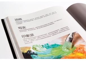
本画册是为艺术品及书画作品销售而设计,旨在搭建作品与藏家之间的审美桥梁。“格调家”代表拥有高雅品位的收藏群体,“生活之美”强调艺术不应是高高在上的陈列,而应融入日常,“印象派”则点明画册所承载作品的艺术风格——捕捉瞬间的光色与情感。
整体设计以“让艺术走进生活”为核心理念,拒绝过度包装,用简约、克制的方式呈现作品本身的力量。
二、视觉风格
| 维度 | 设计思路 |
|---|---|
| 整体调性 | 简约、雅致、有呼吸感,突出作品本身 |
| 色彩体系 | 以留白为主,辅以低饱和度的高级灰或米色,避免喧宾夺主 |
| 字体选择 | 标题选用具有人文气息的衬线体,正文选用清晰易读的无衬线体 |
| 版式布局 | 大量留白,图文比例约为 6:4,让每一幅作品都有充足的“呼吸空间” |
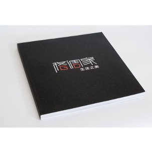
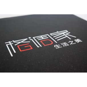
三、封面设计
封面采用“少即是多”的策略:
- 以“格调家”三个字作为视觉焦点,字体经过精心设计,兼具现代感与书卷气
- “生活之美”以小字形式置于下方,形成层级对比
- “印象派”作为风格标识,以印章或手写体形式呈现,点明画册的艺术调性
- 封面材质建议选用有肌理感的特种纸,搭配烫哑金或压印工艺,提升触感与品质感
四、内页设计
1. 开篇页
- 以大幅留白搭配一句关于艺术与生活的引言,营造仪式感
- 可选用印象派大师的名言或一首短诗作为开篇
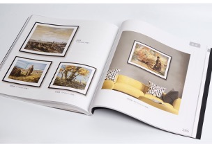
2. 作品展示页
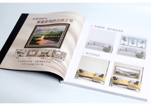
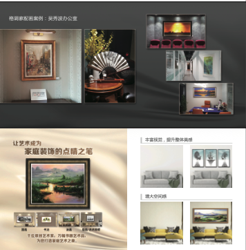
- 每幅作品独立成页或跨页呈现,确保作品不被切割
- 作品信息(名称、作者、尺寸、材质、创作年份)以极小字号置于角落,不干扰画面
- 每 4-5 幅作品后穿插一页“留白页”或“细节放大页”,调节阅读节奏
3. 系列分组
- 按主题或风格将作品分为若干系列,每个系列以隔页区分
- 隔页可选用与系列气质匹配的色彩或肌理纸
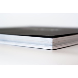
五、装帧工艺建议
| 项目 | 建议 |
|---|---|
| 开本 | 方形开本(250mm×250mm 或 280mm×280mm),适合画册展示 |
| 纸张 | 内页选用 150g-200g 哑粉纸或艺术纸,还原色彩且不反光 |
| 装订 | 锁线胶装,可 180 度平摊,跨页作品不受影响 |
| 封面 | 精装硬壳,覆哑膜或触感膜,局部 UV 或烫金 |
六、设计亮点总结
销售导向:每幅作品信息清晰完整,便于藏家了解与决策;结尾可附收藏索引或二维码,引导购买
以作品为中心:所有设计元素均为“退让”,让作品成为绝对主角
节奏感:通过留白、隔页、细节放大等手法,控制阅读节奏,避免审美疲劳
品质感:通过纸张、工艺、字体的精细化选择,传递“格调家”的品牌调性
English Version
**Design Description** **I. Design Philosophy** This album is designed for the sale of artworks and calligraphy/painting pieces, aiming to build an aesthetic bridge between the works and collectors. “Ge Diao Jia” (Style Home) represents the collector group with refined taste, “Life’s Beauty” emphasizes that art should not be a lofty display but should integrate into daily life, and “Impressionism” indicates the artistic style of the works featured in the album—capturing the momentary interplay of light, color, and emotion. The overall design centers on the core concept of “bringing art into life,” rejecting excessive packaging and presenting the power of the works themselves through simple, restrained means. **II. Visual Style** **Dimensional Design Approach** – Overall tone: Simple, elegant, with a sense of breathing space, highlighting the works themselves – Color system: Primarily white space, supplemented by low-saturation advanced grays or beige tones, avoiding overwhelming the main content – Font selection: Titles use serif fonts with a humanistic touch, body text uses clear, readable sans-serif fonts – Layout design: Extensive white space, image-to-text ratio approximately 6:4, allowing each work ample “breathing space” **III. Cover Design** The cover adopts a “less is more” strategy: – “Ge Diao Jia” (Style Home) as the visual focal point, with carefully designed fonts combining modern sensibility and scholarly elegance – “Life’s Beauty” placed below in smaller type, creating hierarchical contrast – “Impressionism” presented as a stylistic identifier in seal or handwritten form, indicating the album’s artistic tone – Cover material: Recommended textured specialty paper, paired with matte gold foil stamping or embossing to enhance tactile feel and quality **IV. Interior Page Design** **1. Opening Page** – Large white space paired with a quote about art and life, creating a sense of ceremony – May use famous quotes from Impressionist masters or a short poem as the opening **2. Work Display Pages** – Each work presented on a single page or spread, ensuring works are not cut – Work information (name, artist, dimensions, materials, creation year) in minimal font size placed in corners, not interfering with the visuals – Insert a “blank page” or “detail enlargement page” every 4-5 works to adjust reading rhythm **3. Series Grouping** – Group works into several series by theme or style, separated by divider pages – Divider pages may use colors or textured paper matching the series’ character **V. Binding Process Recommendations** **Project Suggestions** – Format: Square format (250mm×250mm or 280mm×280mm), suitable for album presentation – Paper: Interior pages use 150g-200g matte coated paper or art paper, reproducing colors without glare – Binding: Thread-sewn perfect binding, allowing 180-degree flat opening without affecting spread works – Cover: Hardcover case, matte or tactile film lamination, partial UV or gold foil stamping **VI. Design Highlights Summary** **Sales Orientation:** Clear and complete information for each work, facilitating collector understanding and decision-making; may include collection index or QR code at the end to guide purchases **Work-Centered Approach:** All design elements “recede,” allowing the works to be the absolute protagonists **Rhythm Control:** Through white space, divider pages, detail enlargements, and other techniques, controlling reading rhythm to avoid aesthetic fatigue **Quality Feel:** Through refined selection of paper, processes, and fonts, conveying the brand tone of “Ge Diao Jia” **Design: Shanghai 17vis Brand Design Co., Ltd.**
为创作者 17vis 守护知识产权,转载必须保留完整出处信息 (侵权必究)
© 2026 17vis.com All Rights Reserved.