
Jucheng Fine Chemical Co., Ltd. – Brochure Design
✅ 市场验证:相关信息点击巨成化工网站
——WIN-WIN FUTURE · 智慧与共赢
巨成精细化工有限公司是一家专注于精细化工领域的现代化企业。画册旨在传递公司的专业实力、技术沉淀以及与客户共赢未来的合作理念。
目标受众:国内外合作伙伴、潜在客户、政府及行业机构。
二、设计理念
“WIN-WIN FUTURE” —— 智慧与共赢。
画册整体调性定位为稳重、专业、有国际视野。设计围绕“精细化工”的行业属性,突出“精准、科技、环保、合作”四个关键词,既展现企业的硬实力,又传递开放包容的合作态度。
三、视觉体系
| 维度 | 设计策略 |
|---|---|
| 整体调性 | 专业、稳重、国际化 |
| 主色调 | 科技蓝 + 深灰 + 白色 |
| 辅助色 | 金色(用于“共赢”主题的点缀,象征价值与合作) |
| 字体 | 标题:黑体或无衬线体(稳重有力),正文:宋体或无衬线体(清晰易读) |
| 版式风格 | 网格系统,图文分区清晰,留白充足 |
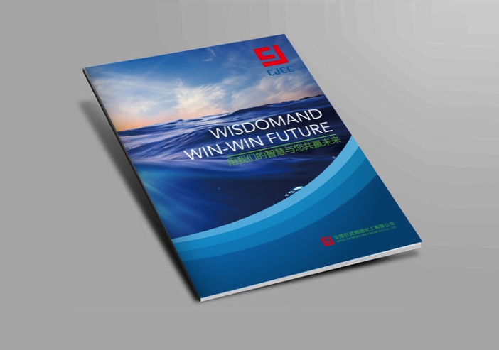
四、封面设计
- 主视觉:“WIN-WIN FUTURE”与“巨成精细化工”组合
- 辅助元素:可选用分子结构、线条、或抽象几何图形,体现“精细”与“化工”属性
- 工艺建议:Logo 烫金或压凹,封面覆哑膜,提升品质感
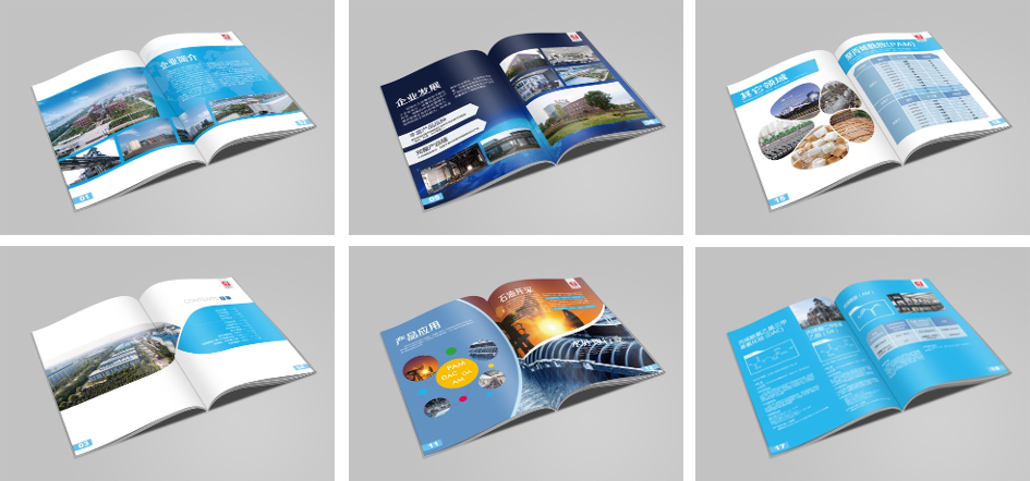
五、内页版式规划
| 版块 | 内容 | 设计要点 |
|---|---|---|
| 开篇 | 企业简介、发展历程 | 跨页大图 + 时间轴设计 |
| 核心业务 | 产品系列、应用领域 | 产品卡片式展示,应用场景配图 |
| 技术与研发 | 实验室、专利、设备 | 突出科技感,可加入实景拍摄图 |
| 品质与环保 | 认证、安全、可持续发展 | 图标化呈现,简洁有力 |
| 合作与案例 | 合作伙伴、成功案例 | Logo 墙 + 案例摘要 |
| 未来展望 | 愿景、使命、共赢理念 | 以“我们的智慧与您共赢未来”作为收尾 |
| 封底 | 联系方式、二维码 | 简洁留白 |
六、设计亮点
- 品牌色贯穿:科技蓝贯穿全册,金色作为点缀,强化“共赢”主题
- 数据可视化:产能、市场占有率等数据以图表呈现,直观易懂
- 中英双语:标题及关键信息采用中英文对照,体现国际化视野
- 工艺质感:封面烫金 + 哑膜,内页特种纸,提升整体档次
七、印刷与工艺建议
| 项目 | 建议 |
|---|---|
| 开本 | A4 竖版(210×285mm)或 方形(250×250mm) |
| 纸张 | 内页 150g 哑粉纸,封面 300g 特种纸 |
| 装订 | 锁线胶装 |
| 工艺 | 封面 Logo 烫金 + 压凹,局部 UV |
English Version
——WIN-WIN FUTURE · Wisdom and Win-Win
Jucheng Fine Chemical Co., Ltd.是一家专注于精细化工领域的现代化企业。The brochure aims to convey the company’s professional strength, technical accumulation, and the concept of win-win cooperation with customers for the future.。
Target audience: domestic and international partners, potential customers, government agencies, and industry organizations.。
二、Design Concept
“WIN-WIN FUTURE” —— 智慧与共赢。
The overall tone of the brochure is positioned as steady, professional, and with an international perspective.。The design revolves around the industry attributes of ‘fine chemicals’.,Highlighting the four key words: ‘precision, technology, environmental protection, cooperation’.,Both showcasing the company’s hard strength and conveying an open and inclusive cooperative attitude.。
三、Visual System
DimensionDesign StrategyOverall ToneProfessional, Steady, InternationalMain ColorTech Blue + Dark Gray + WhiteAuxiliary ColorGold (used as an embellishment for the ‘win-win’ theme, symbolizing value and cooperation)FontTitle: Heiti or Sans-serif (steady and powerful), Body: Songti or Sans-serif (clear and easy to read)Layout StyleGrid system, clear text and image zones, sufficient white space
四、Cover Design
Main Visual:”WIN-WIN FUTURE” combined with “Jucheng Fine Chemical”
Auxiliary Elements:Molecular structures, lines, or abstract geometric shapes can be used to reflect the attributes of ‘fine’ and ‘chemical’
Craft Suggestions:Logo gold stamping or embossing, cover matte film, enhance quality
五、Inner Page Layout Planning
SectionContentDesign PointsOpeningCompany introduction, development historyFull-page large image + timeline designCore BusinessProduct series, application areasProduct card display, application scenario imagesTechnology and R&DLaboratory, patents, equipmentHighlight technology feel, can add real scene photosQuality and Environmental ProtectionCertification, safety, sustainable developmentIcon presentation, concise and powerfulCooperation and CasesPartners, successful casesLogo wall + case summariesFuture OutlookVision, mission, win-win conceptEnding with ‘Our wisdom wins the future with you’Back CoverContact information, QR codeSimple white space
六、Design Highlights
Brand color throughout:Tech blue throughout the book, gold as an embellishment, strengthening the ‘win-win’ theme
Data Visualization:Data such as production capacity and market share are presented in charts, intuitive and easy to understand
Chinese-English Bilingual:Titles and key information adopt Chinese-English correspondence, reflecting an international perspective
Craft Texture:Cover gold stamping + matte film, special paper for inner pages, enhancing overall quality
七、印刷与Craft Suggestions
ItemSuggestionFormatA4 vertical (210×285mm) or square (250×250mm)PaperInner pages 150g matte paper, cover 300g special paperBindingSewn perfect binding工艺封面 Logo 烫金 + 压凹,Local UV
为创作者 17vis 守护知识产权,转载必须保留完整出处信息 (侵权必究)
© 2026 17vis.com All Rights Reserved.