
Sugar Workshop Courtyard Series Brown Sugar Packaging Design


一、设计哲学:克制的书写
“包装不是一块广告牌,而是一张纸。纸上写字,字就成了全部。”
红糖的包装设计,长久以来陷入两种困境:要么是乡土符号的堆砌(红灯笼、老农、甘蔗田),要么是功能信息的暴力排列(卖点、口号、认证标识)。二者都忘记了包装的原始身份——它是产品的衣服,不是产品的大声公。
“糖坊大院”的设计,从一张白纸开始。我们问自己:如果只允许做一件事,做什么?答案是:好好写字。
竖排文字,是中文最古老、最克制的排版方式。它不模仿“传统”,它本身就是传统。将“糖坊大院”四个字竖排于画面中央,不做特效、不描边、不加阴影。字是主角,其余全部退后。
二、信息层级:减法即加法
“好的排版,是让读者不知道排版的存在。”
我们分析了市面红糖包装的信息噪音——平均每款产品有9-12条信息(品牌、品名、口味、净含量、卖点、认证、配料、生产日期、二维码……)。消费者在货架前只有3秒。
“糖坊大院”的信息策略是:只保留三条。
| 层级 | 内容 | 视觉处理 |
|---|---|---|
| 第一层级 | 品牌“糖坊大院” | 竖排,最大字号,位于视觉中心 |
| 第二层级 | 口味/品类(纯享产妇红糖 / 山姜老红糖 / 小枣阿胶红糖) | 竖排,中等字号,紧邻品牌下方 |
| 第三层级 | 品类说明(古法红糖 / 老红糖)及净含量 | 最小字号,置于底部或侧面 |
其余信息(ISO认证、配料表、生产信息)全部移至包装背面。正面的任务只有一个:让消费者记住这是谁、是什么。
三、系列识别:统一与差异
“一个家族,不同的面孔,同一个姓氏。”
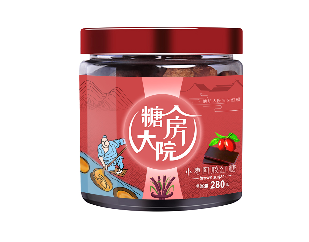
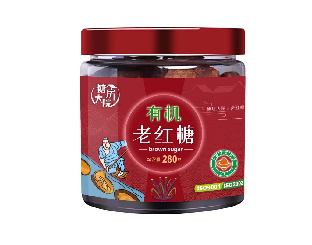
“糖坊大院”系列包含多个产品线:纯享产妇红糖、山姜老红糖、小枣阿胶红糖、古法老红糖等。
我们的处理方式是:
- 统一元素:品牌名“糖坊大院”的字体、大小、位置在所有产品上保持绝对一致。这是家族的姓氏。
- 差异元素:通过副文案(纯享产妇 / 山姜 / 小枣阿胶)来区分不同产品。不依赖颜色变化(避免破坏整体调性),不依赖图形变化(避免增加成本),仅靠文字本身完成识别。
这意味着印刷时只需要更换一张菲林(副文案),其余全部共用。这是设计的效率,也是商业的智慧。
四、字体与排版:中文的尊严
“中文不是英文的仿制品。”
许多包装设计将中文强行套入英文排版逻辑——左对齐、右对齐、居中对齐,却忘了中文是方块字,竖排才是它的自然流向。
“糖坊大院”采用纯竖排布局。品牌名“糖坊大院”四字竖向排列,视觉上形成一根“立柱”,稳定、安静、有力。下方以更小字号延续竖排,列出口味或品类。这种排版方式在现代货架上形成强烈反差——在一堆横向阅读的包装中,竖排是“停下来”的信号。
字体选择上,我们使用一款带有手写温度但结构严谨的宋体。它既不粗糙到像毛笔字(乡土感),也不冰冷到像印刷体(工业感)。它是“人的字”,不是“机器的字”。
五、色彩与材质:不言不语
“最好的颜色,是纸的颜色。”
包装主色调为米白,近乎于纸浆原色。品牌名使用深棕——红糖本身的颜色。没有红色、没有金色、没有黑色。
为什么不用红色?红糖不是婚礼,不需要喜庆。红糖是日常的温暖,是疲惫时的一杯热水。米白 + 深棕,是克制、是安静、是“我不说话,你也会看我”。
材质上,选用带有细微纤维肌理的环保纸张。触摸时不是光滑的塑料感,而是纸张的温润。这是设计向触觉的延伸——你拿起它,就知道它不一样。
六、结论
“糖坊大院”的包装设计,是一篇关于“少”的作文。
少一点颜色,多一点留白。少一点口号,多一点信任。少一点设计,多一点尊重。
我们相信,红糖不需要被包装成“礼品”,也不需要被包装成“土特产”。它只需要被包装成“糖”——一块干净的、温暖的、来自土地的糖。
剩下的,让消费者自己决定。
English Version
I. Design Philosophy: Restrained Writing
“Packaging is not a billboard, but a piece of paper. When you write on paper, the words become everything.”
Brown sugar packaging has long fallen into two traps: either the piling up of rustic symbols (red lanterns, old farmers, sugarcane fields), or the aggressive arrangement of functional information (selling points, slogans, certifications). Both forget the original identity of packaging — it is the clothing of the product, not its loudspeaker.
The design of “Sugar Mill Courtyard” starts with a blank sheet of paper. We asked ourselves: If we could only do one thing, what would it be? The answer: write well.
Vertical text is the oldest and most restrained form of Chinese typography. It does not imitate “tradition” — it is tradition. Placing the four characters “糖坊大院” vertically at the center of the composition, without special effects, outlines, or shadows, makes the characters the protagonist, while everything else recedes.
II. Information Hierarchy: Subtraction as Addition
“Good typography is typography the reader doesn’t notice.”
We analyzed the information noise on brown sugar packaging — an average of 9–12 pieces of information per product (brand, product name, flavor, net weight, selling points, certifications, ingredients, production date, QR code…). Consumers have only 3 seconds in front of the shelf.
The information strategy for “Sugar Mill Courtyard” is: keep only three lines.
| Hierarchy | Content | Visual Treatment |
|---|---|---|
| First | Brand name “糖坊大院” | Vertical, largest font size, visual center |
| Second | Flavor/Category (Pure Joy Maternal Brown Sugar / Ginger Brown Sugar / Jujube & Donkey-Hide Gelatin Brown Sugar) | Vertical, medium font size, directly below the brand name |
| Third | Category description (Ancient Method Brown Sugar / Traditional Brown Sugar) & net weight | Smallest font size, placed at the bottom or side |
All other information (ISO certifications, ingredient list, production details) is moved to the back of the packaging. The front has only one task: make consumers remember who this is and what it is.
III. Series Identity: Unity and Difference
“One family, different faces, the same surname.”
The “Sugar Mill Courtyard” series includes multiple product lines: Pure Joy Maternal Brown Sugar, Ginger Brown Sugar, Jujube & Donkey-Hide Gelatin Brown Sugar, Ancient Method Brown Sugar, and others.
Our approach:
- Unifying elements: The font, size, and position of the brand name “糖坊大院” remain absolutely consistent across all products. This is the family surname.
- Differentiating elements: Different products are distinguished by the subtitle (Pure Joy Maternal / Ginger / Jujube & Donkey-Hide Gelatin). We do not rely on color changes (to avoid disrupting the overall tone) or graphic variations (to avoid increasing costs). Identification is achieved through text alone.
This means only one piece of film (for the subtitle) needs to be changed during printing; everything else is shared. This is design efficiency — and business wisdom.
IV. Typography and Layout: The Dignity of Chinese Script
“Chinese is not an imitation of English.”
Many packaging designs force Chinese characters into English typographic logic — left-aligned, right-aligned, centered — forgetting that Chinese is a script of square characters, and vertical flow is its natural direction.
“Sugar Mill Courtyard” adopts a purely vertical layout. The four characters of the brand name “糖坊大院” are arranged vertically, visually forming a “pillar” — stable, quiet, and powerful. Below, in smaller type, the vertical arrangement continues, listing the flavor or category. This typographic approach creates a strong contrast on the modern shelf — among a sea of horizontally read packages, vertical text is a signal to “stop.”
For the typeface, we chose a Songti (宋体) that carries the warmth of handwriting but with a rigorous structure. It is neither as crude as brush calligraphy (which feels rustic) nor as cold as standard print type (which feels industrial). It is “human writing,” not “machine writing.”
V. Color and Material: Silent Expression
“The best color is the color of paper.”
The primary packaging color is off-white, close to the raw color of paper pulp. The brand name uses dark brown — the color of brown sugar itself. No red, no gold, no black.
Why no red? Brown sugar is not a wedding; it does not need festivity. Brown sugar is everyday warmth, a cup of hot water when you are tired. Off-white + dark brown is restraint, is quietness, is “I don’t speak, but you will still look at me.”
For the material, we chose an eco-friendly paper with a subtle fiber texture. When touched, it does not feel like smooth plastic, but rather the warmth of paper. This is an extension of design into tactility — you pick it up, and you know it is different.
VI. Conclusion
The packaging design of “Sugar Mill Courtyard” is an essay on “less.”
Less color, more white space.
Less shouting, more trust.
Less design, more respect.
We believe brown sugar does not need to be packaged as a “gift,” nor does it need to be packaged as a “local specialty.” It only needs to be packaged as what it is — sugar. A clean, warm sugar that comes from the earth.
The rest, let the consumer decide.
为创作者 17vis 守护知识产权,转载必须保留完整出处信息 (侵权必究)
© 2026 17vis.com All Rights Reserved.